bathroom, blog, floors, interior design tips, kitchen, walls
A calm home is something many of us want, especially when life outside feels busy and overwhelming. The good news is that the right choice of tiles and colours can do more than just decorate your space. They can shape how you feel every day. By using colour psychology and thoughtful tile selections, you can design rooms that feel peaceful and balanced.
Table of Content:
Why Colour Psychology Matters in Your Space
Choosing Tiles for a Calm Home
Soft Neutrals to Build Balance in a Calm Home
Bringing Nature Indoors with Green and Earthy Tones
Using Blue for Calm and Relaxation
How to Tie It All Together: Creating a Calm Home
Why Colour Psychology Matters in Your Space
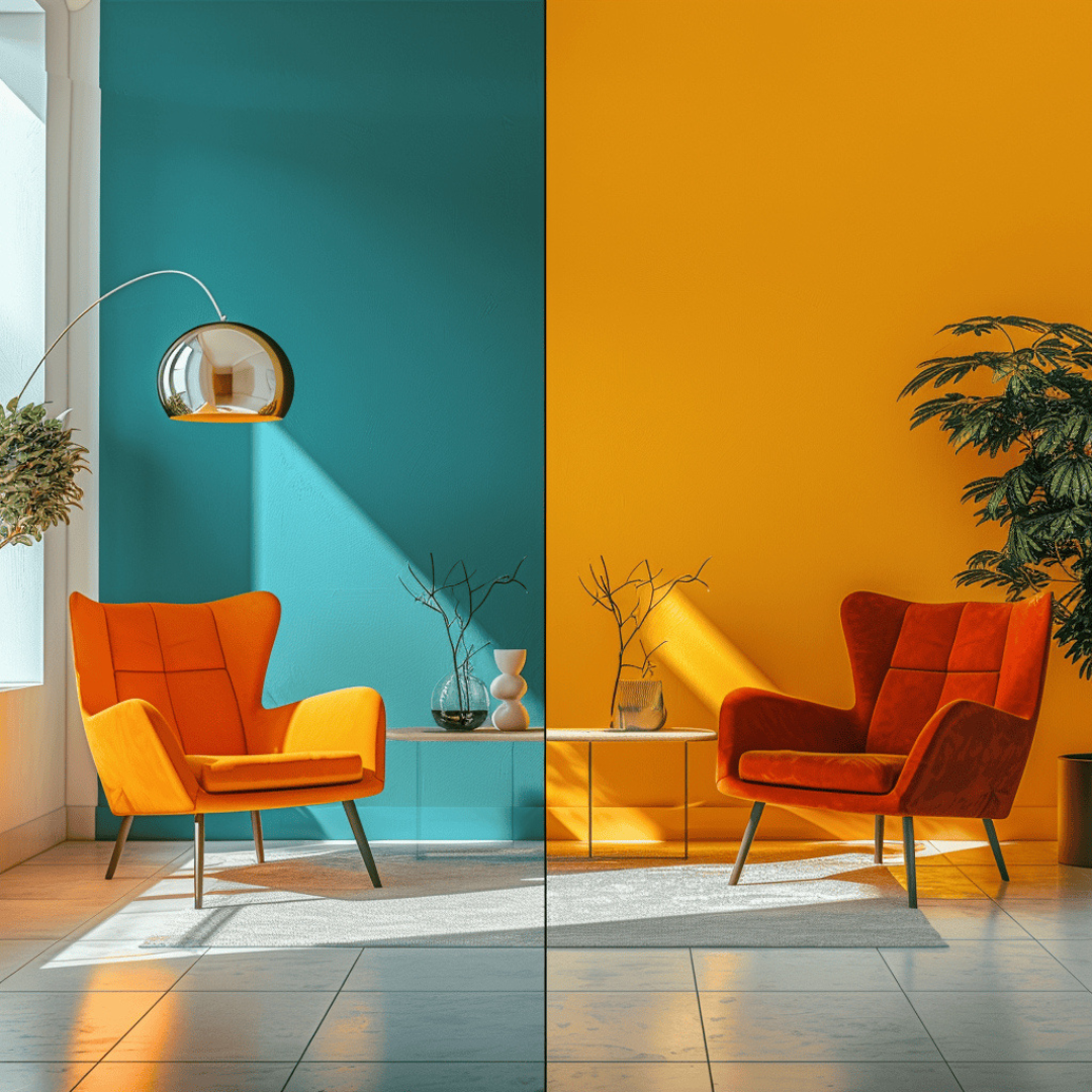
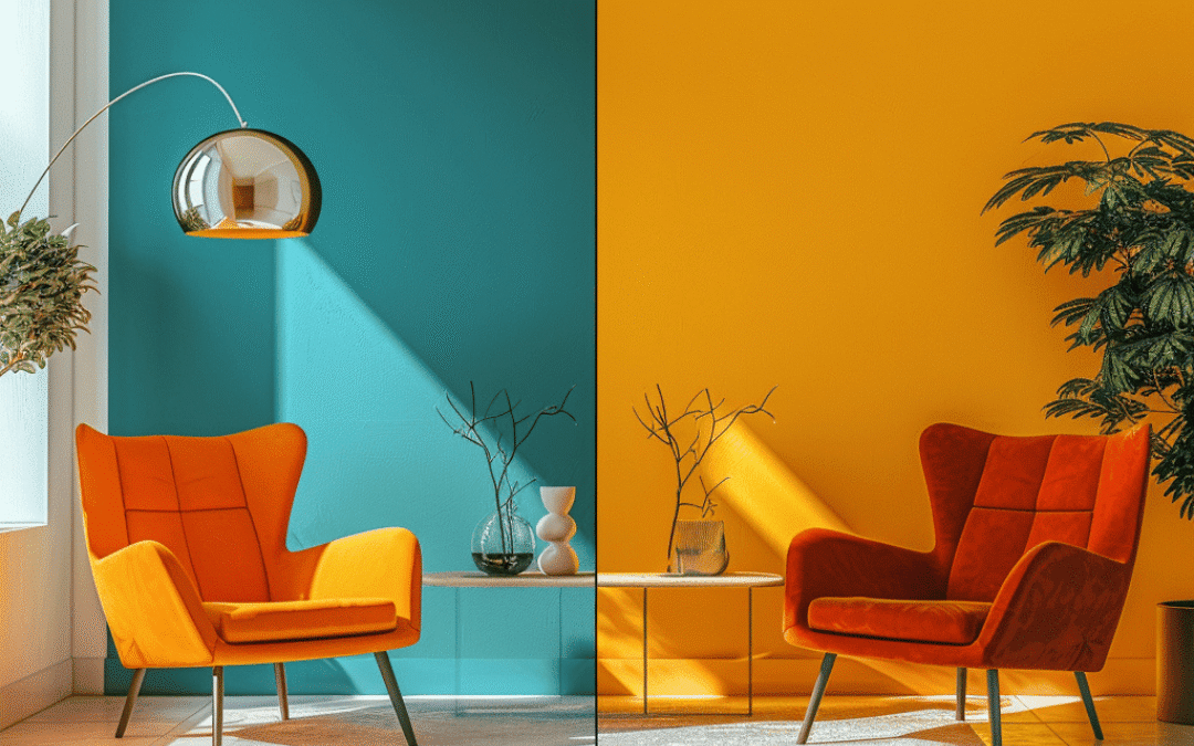
Colours affect mood in ways we often don’t notice. Warm tones like reds and oranges energise while cooler shades like blue and green create relaxation.
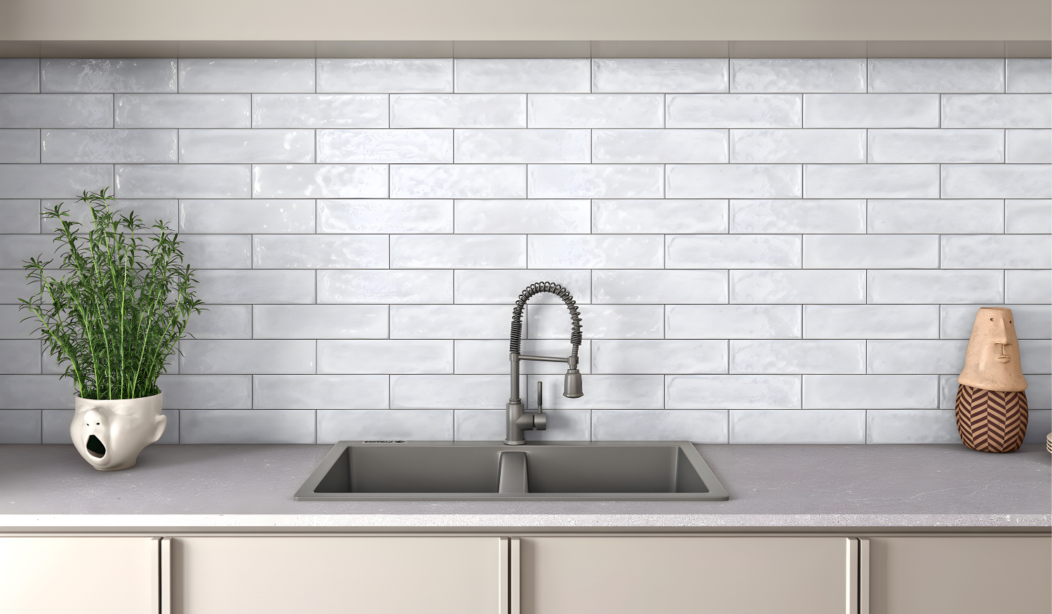
In your home, colour psychology helps set the tone for how each room feels. For example, a soothing bathroom with soft blues can make mornings less rushed while a kitchen with fresh whites and light neutrals can feel clean and uncluttered.
Choosing Tiles for a Calm Home
Tiles are more than just a practical choice. They set the backdrop for your rooms and influence the atmosphere.
Large format tiles in neutral shades reduce visual clutter and create a seamless flow.
Textured tiles in soft stone or wood-look finishes add warmth and a natural element.
Slip resistant tiles in light tones are also great for bathrooms and outdoor areas where safety and calm living go hand in hand.
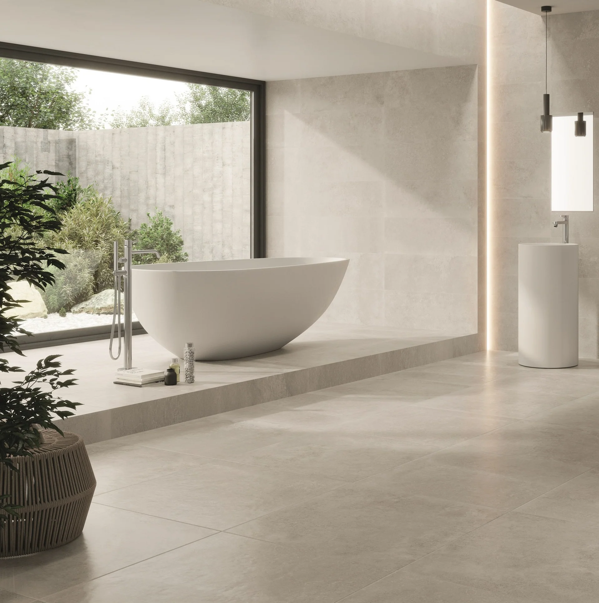
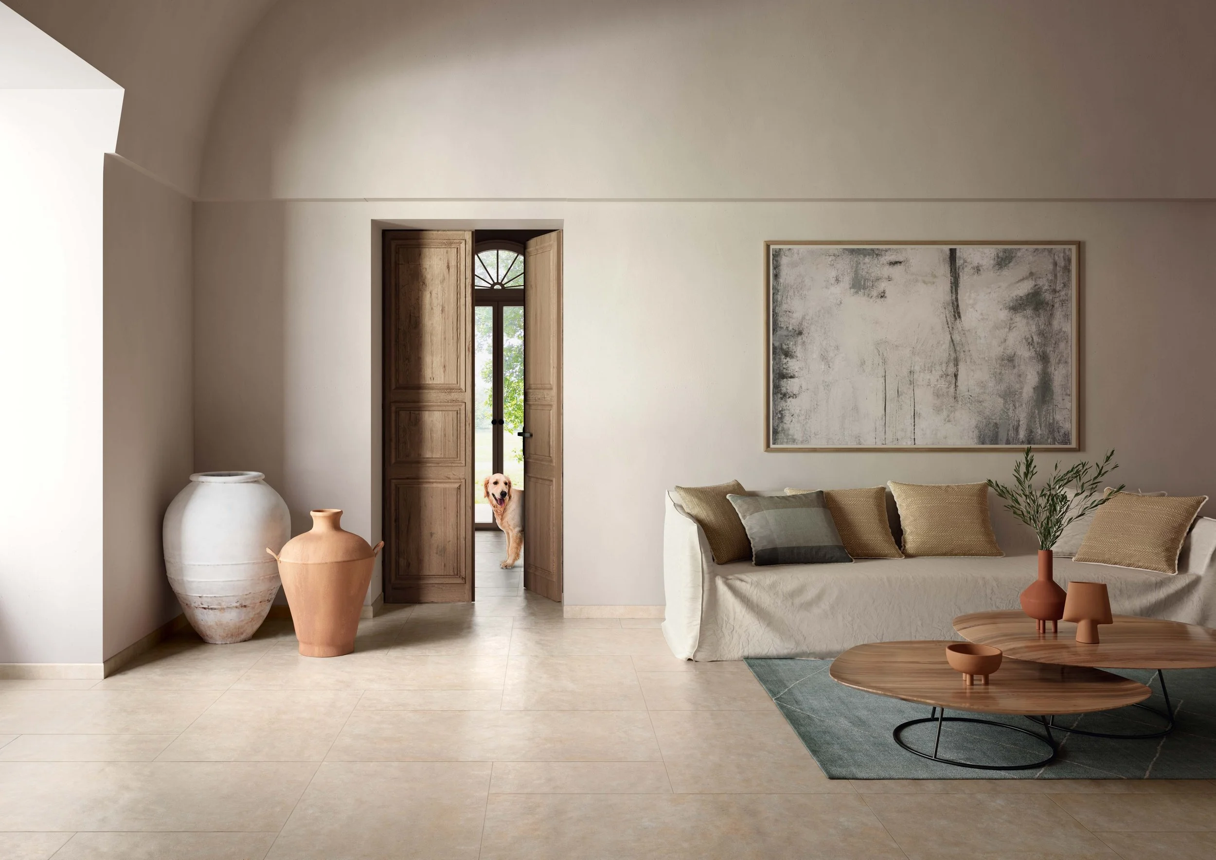
Soft Neutrals to Build Balance in a Calm Home
Neutral colours work well when you want a balanced and inviting home. Shades like beige, cream and warm grey are timeless and calming.
Using these colours on floor tiles or wall tiles helps ground your space.
Once you have a neutral base you can layer in subtle accents with décor pieces or mosaic tiles for texture without overwhelming the room.
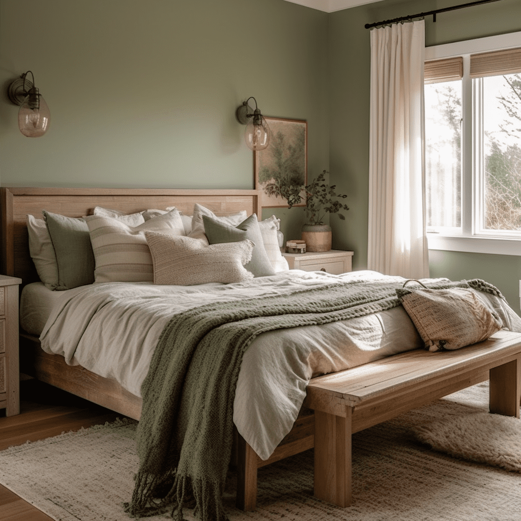
Bringing Nature Indoors with Green and Earthy Tones
Green is strongly linked to renewal and harmony which makes it a great choice for a calm home.
Olive or sage green wall tiles in a bathroom or kitchen can instantly refresh the space.
Earthy terracotta or sand-coloured floor tiles are another way to connect your interiors to nature and give a grounding effect.
These tones work especially well in outdoor areas or open-plan living spaces.
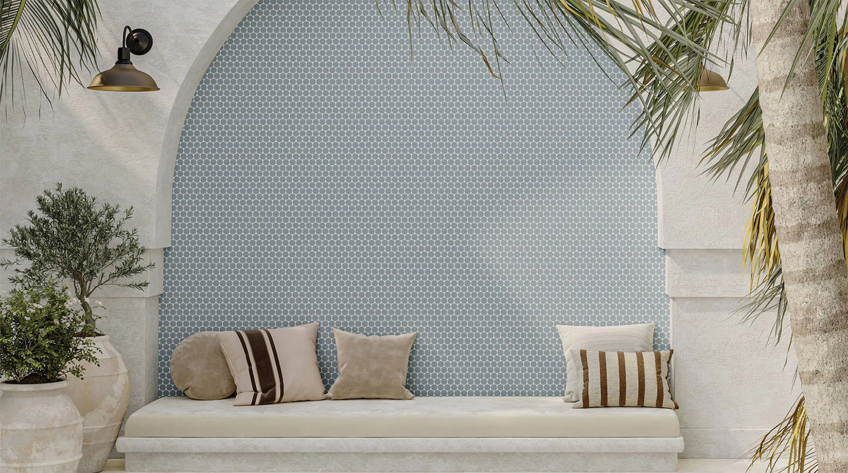
Using Blue for Calm and Relaxation
Blue is one of the most calming colours in psychology. Soft sky blue or muted navy tiles create a sense of serenity, especially in bedrooms and bathrooms.
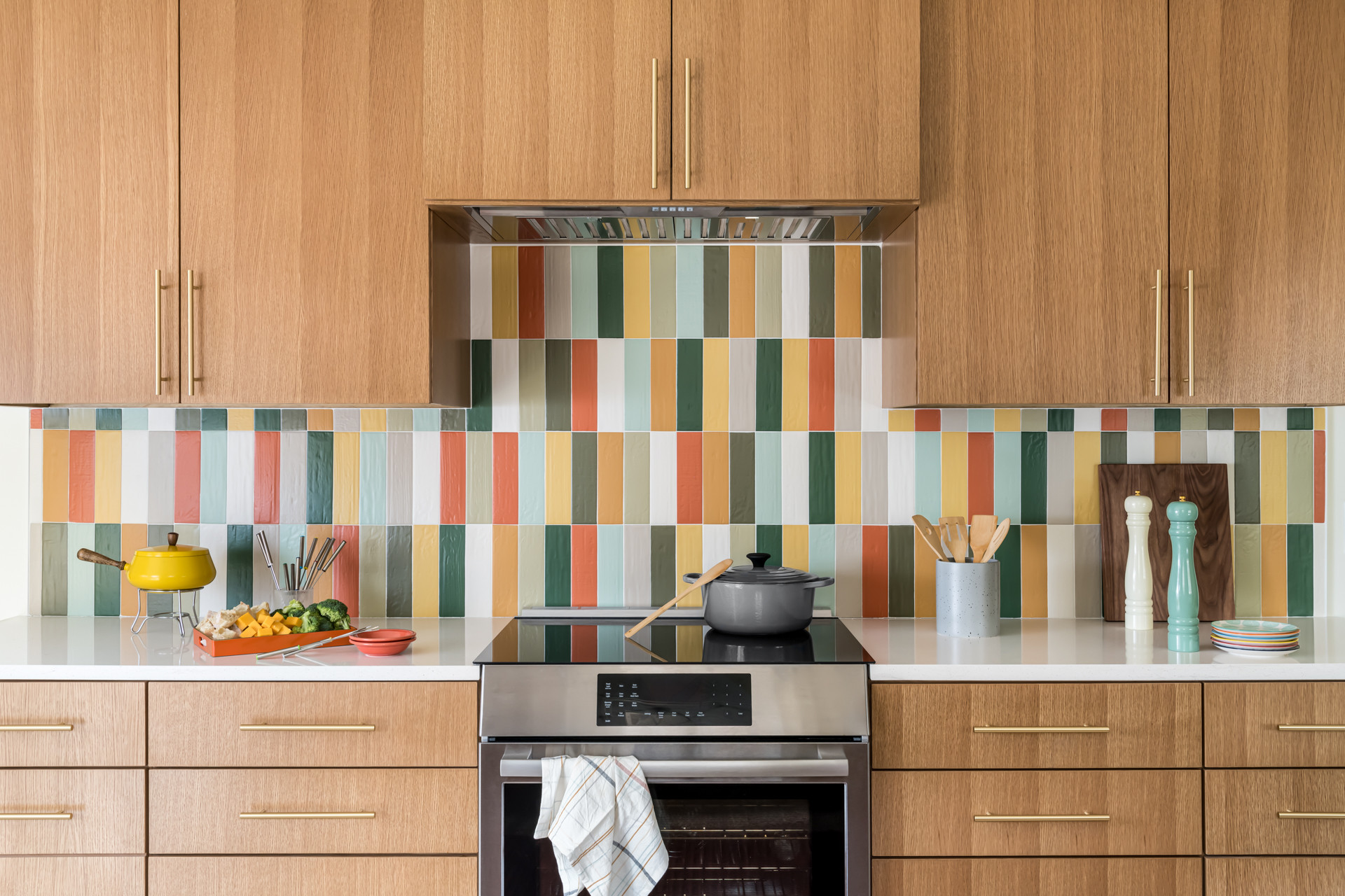
A blue splashback in the kitchen or a feature wall in mosaic tiles can also make a subtle but soothing statement.
How to Tie It All Together: Creating a Calm Home
Creating a calm home with tiles and colour psychology is about balance. Start with a clear vision for each room. Use tiles as your foundation and layer in colours that support the feeling you want. Neutrals for grounding, blues for relaxation and greens for harmony all work together to create a home where you feel at ease.
blog, floors, interior design tips, walls
Spring colour palettes have the power to transform any room and bring fresh energy into your home. After months of dull winter tones, spring is the perfect time to brighten your space with colours that feel uplifting and new. Whether you’re updating your tiles, painting your walls or adding new accessories, spring is the perfect season to experiment with fresh colours.
Table of Content:
Why Spring Colour Palettes Work So Well
Fresh Neutrals with a Twist
Pastel Spring Colour Palettes
Bold Spring Shades
Mixing Patterns with Spring Colour Palettes
Simple Ways to Update Your Home
How to Bring It All Together
Why Spring Colour Palettes Work So Well
Spring brings longer days, warmer weather and more natural light. Lighter colours reflect that energy, making rooms feel bigger and more inviting. Think of soft pastels, warm neutrals and bold accents inspired by nature. Using these tones in your home can instantly lift your mood and create a space that feels balanced and stylish.
Fresh Neutrals with a Twist
Neutral tones are a great starting point for any spring colour palette. Soft beige, creamy white and light grey create a calming foundation that feels timeless. Once you’ve set this base, you can layer in brighter accents through cushions, rugs or wall art to bring energy into the space. The mix of neutral backdrops with splashes of colour keeps your home modern, light and welcoming. For added depth, pair these tones with textured finishes such as wood or natural stone-look tiles. Fresh neutrals work beautifully in kitchens and living rooms where you want a relaxed yet stylish atmosphere.
Pastel Spring Colour Palettes
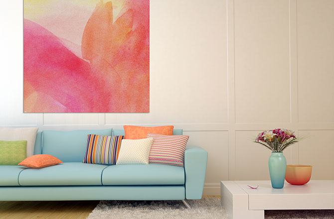
Pastels are a classic choice for spring because they’re light, airy and versatile. Soft pinks, mint greens and powder blues look stunning in bathrooms and bedrooms. You can use pastel wall tiles as a feature or bring in pastel tones through décor such as cushions, rugs, wallpaper or even kitchen accessories. Pastels also pair beautifully with white or light grey flooring, making them easy to layer into existing spaces.
Bold Spring Shades
Not every spring colour scheme needs to be soft. Bright accents like yellow, coral or turquoise can energise a space without overwhelming it. Consider adding a bold splashback in the kitchen or a feature wall in the living room. You can even use colourful mosaic tiles to create unique patterns that feel playful yet sophisticated. These accents work best when balanced with neutral or pastel backgrounds.
Nature-Inspired Shades
Bringing the outdoors in is one of the biggest interior trends, and spring is the ideal time to embrace it. Think leafy greens, earthy terracotta or ocean blues. These colours connect your home to nature and create a sense of calm. Outdoor spaces also benefit from this palette — slip-resistant tiles in earthy shades can turn your patio or pool area into a natural extension of your home.
Mixing Patterns with Spring Colour Palettes
Image credit: havenprints.com.au
Patterns are an easy way to show off your spring colour palette. Floral prints, soft stripes and geometric shapes look great when paired with seasonal colours. Try patterned cushions or a statement rug to tie your palette together. Patterns bring movement into a room and make the colours feel more dynamic.
Simple Ways to Update Your Home
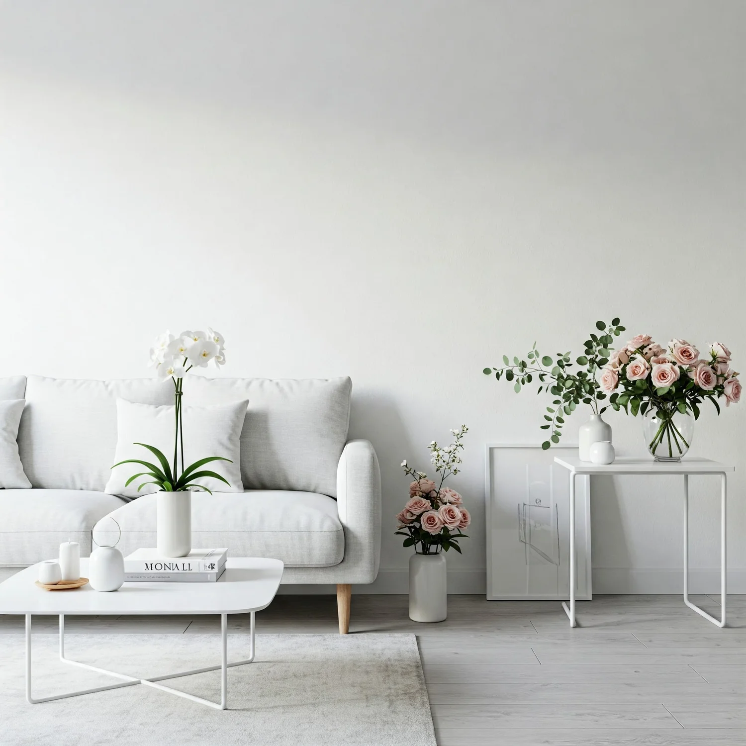
Image credit: lorddecor.com
You do not need to repaint every wall to enjoy the benefits of spring colours. Small changes can have a big impact. Swap out heavy winter curtains for light linen ones, add pastel cushions to your sofa or place colourful flowers in a neutral vase. These small updates refresh your space and make it feel instantly brighter.
How to Bring It All Together
When working with spring colour palettes, the key is balance. Choose a base shade for your main surfaces like floors and walls, then add layers of colour through tiles, accessories and furniture. If you’re unsure where to start, focus on one room and build from there. Bathrooms and kitchens are great spaces to experiment with colour because tiles make a big impact.
blog, floors, interior design tips, walls
There’s something incredibly satisfying about walking into a space where everything just feels right. Often, you can’t immediately tell why — but your brain knows. More often than not, it comes down to symmetry. Symmetry in interior design plays a powerful role in how we perceive a space. When it comes to tile layouts, symmetrical patterns have a calming effect that makes rooms feel more balanced, welcoming and visually appealing.
Let’s explore why symmetrical tile designs feel so relaxing and how you can use them to create harmony in your home.
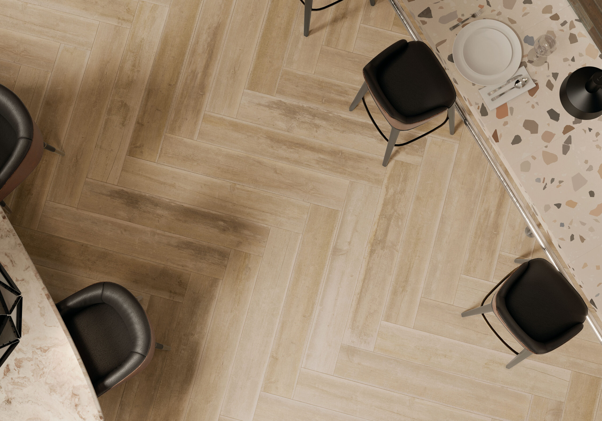
Table of Content:
Why Our Brains Love Symmetry
The Role of Symmetry in Tile Design
Spaces That Benefit Most from Symmetrical Tile Layouts
Symmetry Doesn’t Mean Boring
When to Break the Rules
Why Our Brains Love Symmetry
Humans are hardwired to find symmetry pleasing. From nature to architecture, our brains constantly seek order and balance. Symmetrical patterns are easy to process because they give our brains a sense of predictability and stability. In contrast, asymmetrical or chaotic layouts can sometimes feel disjointed or overwhelming.
In psychology, this is known as processing fluency — the idea that the easier something is to understand visually, the more we tend to like it. When tiles are laid in symmetrical, repeating patterns, our minds relax. The space feels more put together, and that ease translates to comfort.
The Role of Symmetry in Tile Design
When planning a tile layout, symmetry can show up in a few different ways:
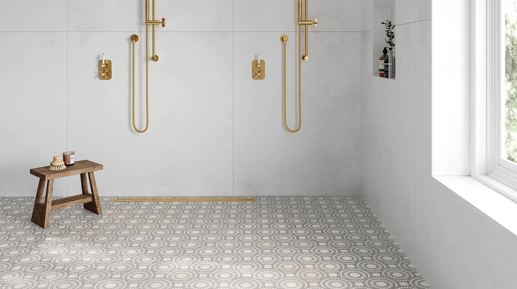
Grid patterns: Classic, clean and simple.
Tiles are lined up in rows and columns, creating a sense of order.
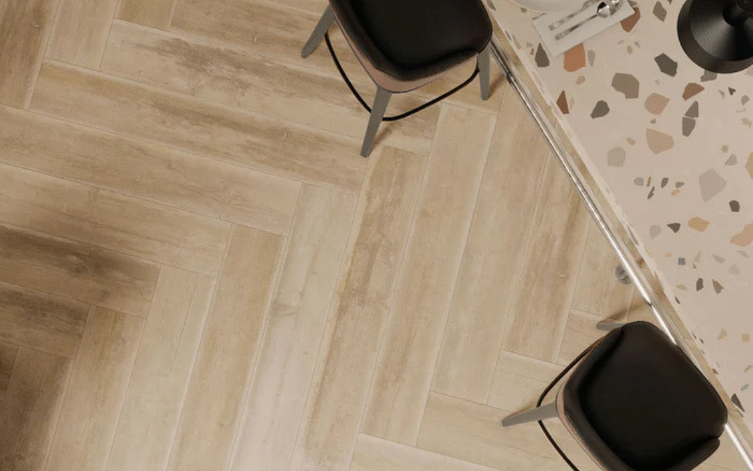
Herringbone and chevron layouts: These offer a dynamic yet balanced feel.
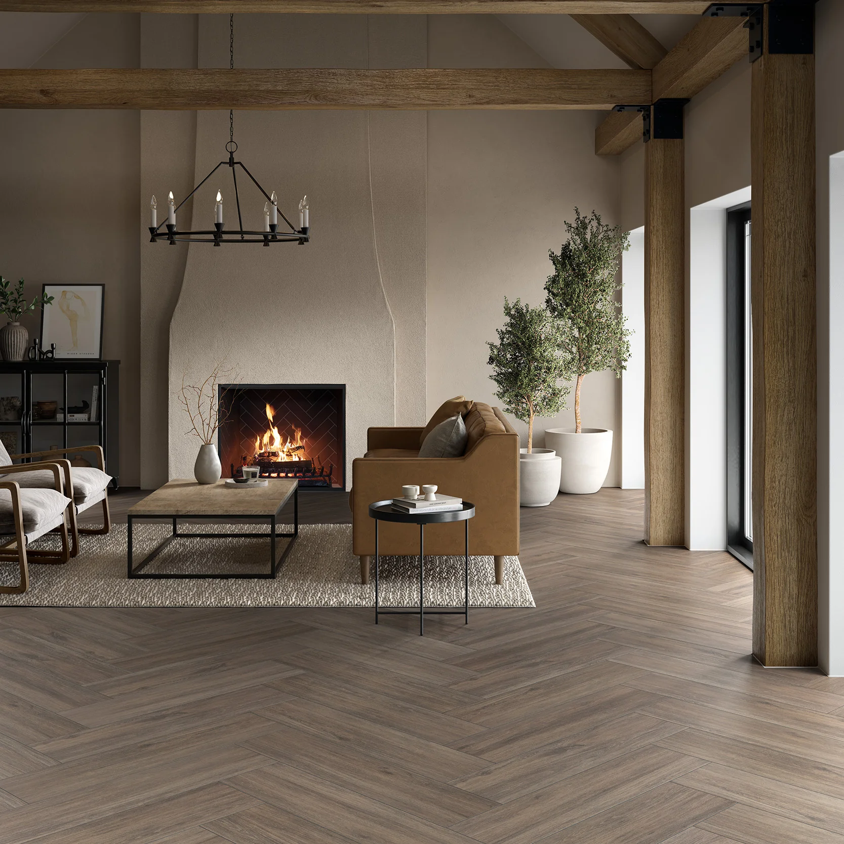
They add interest while still keeping the overall design cohesive.
Mirror layouts
These involve reflecting a pattern on either side of a centre line, which adds elegance and structure to a space.
Whether you’re tiling a bathroom, kitchen or outdoor area, symmetrical layouts provide a foundation that feels intentional and soothing.
Spaces That Benefit Most from Symmetrical Tile Layouts
Bathrooms and ensuites
tiletoria, paarden eiland showroom
These are places where people go to unwind and reset. A symmetrical tile pattern in the shower or around the vanity instantly adds to the spa-like vibe.
Living areas
Floor tiles laid in a grid or balanced pattern can make an open-plan space feel more grounded and connected.
Kitchens
Splashbacks with a symmetrical layout not only look clean but also help small or busy kitchens feel less chaotic.
Symmetry Doesn’t Mean Boring
Some people worry that symmetrical designs might look too rigid or predictable. But that’s far from true. You can still play with colour, texture and tile size while keeping the layout balanced.
For example, mix glossy and matte finishes or alternate shades within a grid. You get the structure of symmetry with the personality of a more creative design.
When to Break the Rules
While symmetry brings a calming effect, there’s also beauty in breaking the pattern — strategically. Asymmetrical layouts work well in bold feature walls, artistic mosaics or contemporary interiors where movement and energy are the focus. The key is to balance symmetry and asymmetry throughout your home so that one complements the other.
Symmetry in tile design goes beyond just aesthetics — it taps into how our minds perceive and respond to visual information. By choosing symmetrical tile layouts, you’re creating more than just a pretty space. You’re building an environment that feels peaceful, organised and easy to live in.
If you’re planning a renovation or simply looking to refresh a room, consider how the layout of your tiles could impact the feel of your space. A little balance can go a long way.
Need help choosing the perfect tile layout?
Visit your nearest Tiletoria showroom or chat with one of our experts for personalised advice. Your dream space starts with the right pattern.
bathroom, blog, interior design tips, kitchen, trends
There’s a new style on the interior design scene, and it’s winning over homeowners and designers alike. Meet Japandi — the perfect blend of Japanese minimalism and Scandinavian functionality. If you’re looking for a calm, clutter-free and timeless look in your home, Japandi might be exactly what you need.
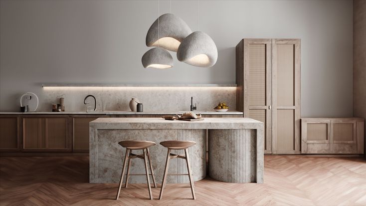
Table of Content:
What Is Japandi Style?
Why Is Japandi Gaining Popularity?
How to Bring Japandi into Your Home
Japandi in Every Room
Tiles and Japandi
Browse our collection of Japandi-inspired pieces
What Is Japandi Style?
Japandi is a fusion of two design philosophies.
On one side, you have Japanese interior design — simple, elegant and rooted in nature.
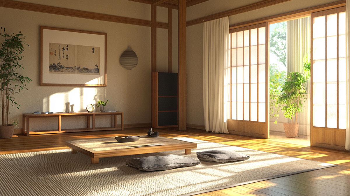
Image credit: awedeco.com
On the other, you have Scandinavian style — warm, functional and focused on comfort.
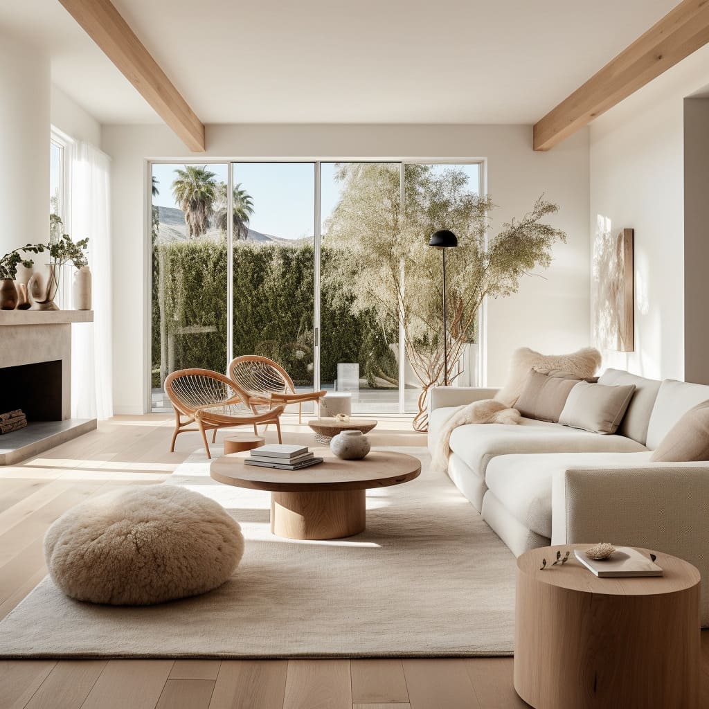
Image credit: fancyhouse-design.com
Together, they create a space that feels both modern and lived-in.
The Japandi trend focuses on clean lines, natural materials and muted colours. It values craftsmanship over mass production and encourages intentional living — only keeping what’s necessary and meaningful.
Why Is Japandi Gaining Popularity?
In today’s fast-paced world, many people are looking for ways to create a more calming and grounded home environment. Japandi offers exactly that. It’s not about filling your home with things — it’s about choosing the right things.
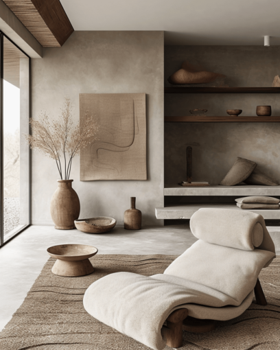
Image credit: edwardgeorgelondon.com
Minimalist yet cosy, Japandi interiors promote wellbeing. Think soft linen throws, warm wood tones and stone finishes. Neutral colour palettes dominate the look, with shades of beige, taupe, sage green and charcoal taking centre stage.
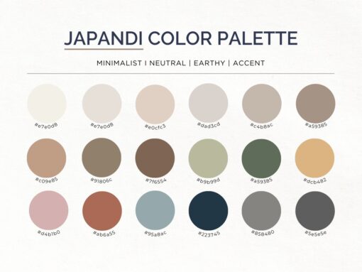
Image credit: global.fujioh.com
The rise in sustainable living has also played a role. Japandi leans into eco-conscious design — using natural fibres, recycled materials and quality over quantity.
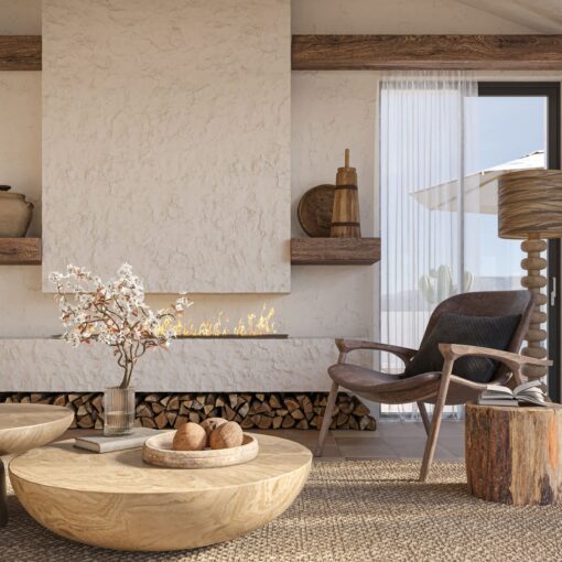
Image credit: annarosemann.com
How to Bring Japandi into Your Home
You don’t need a full renovation to try this trend. Small changes can go a long way.
Start with decluttering
Image credit: edmontonrealestatepro.ca
Keep only the essentials and clear your surfaces.
Choose quality materials
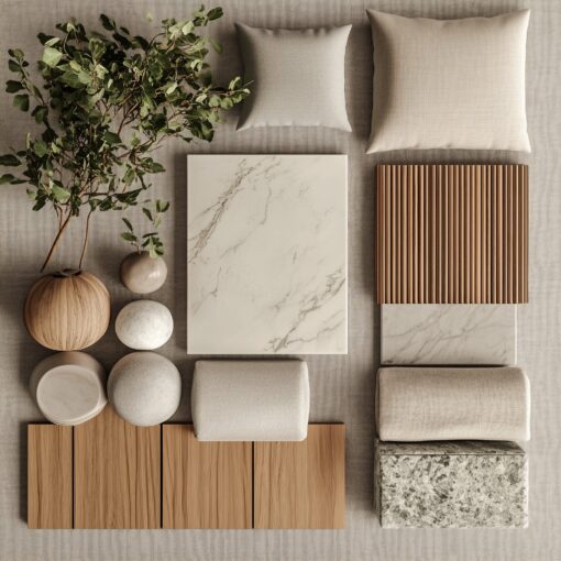
Image credit: global.fujioh.com
Invest in wood, linen, stone and ceramic.
Use a muted colour palette
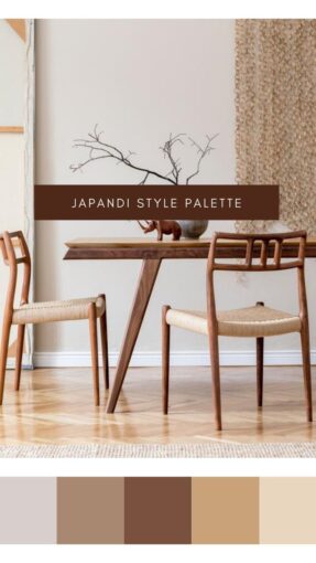
Image credit: Pinterest:@KunitsaHome
Stick to earthy tones like terracotta, sand and grey.
Add plants
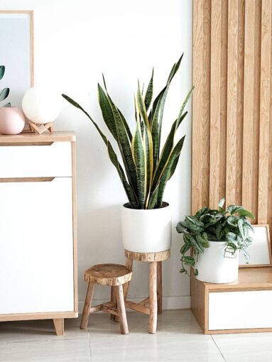
Image credit: thursd.com
Nature is central to Japandi, so bring in greenery with simple planters.
Focus on function
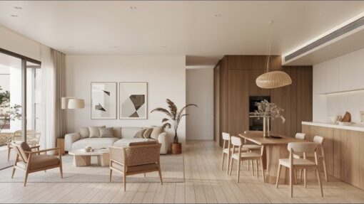
Image credit: houseploy.com
Every piece should serve a purpose and look good doing it.
Japandi in Every Room
Living Room
Image credit: livingetc.com
Go for low-profile furniture, woven textures and neutral cushions.
Bedroom
Image credit: edwardgeorgelondon.com
Keep it serene with soft lighting, crisp bedding and a calming palette.
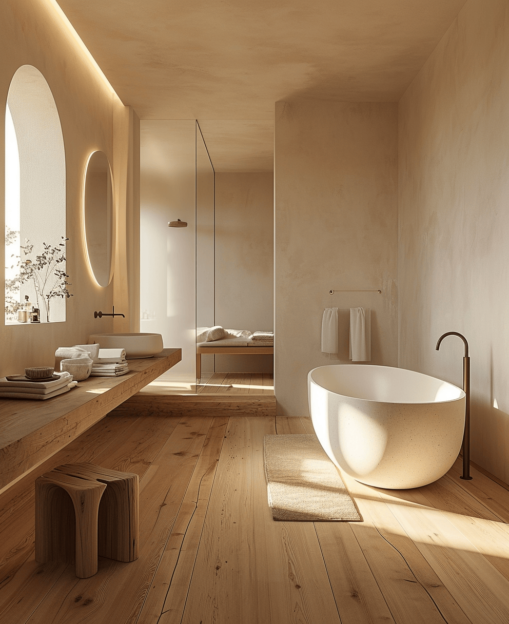
Image credit: edwardgeorgelondon.com
Choose clean finishes, minimal décor and natural touches like wood or stone.
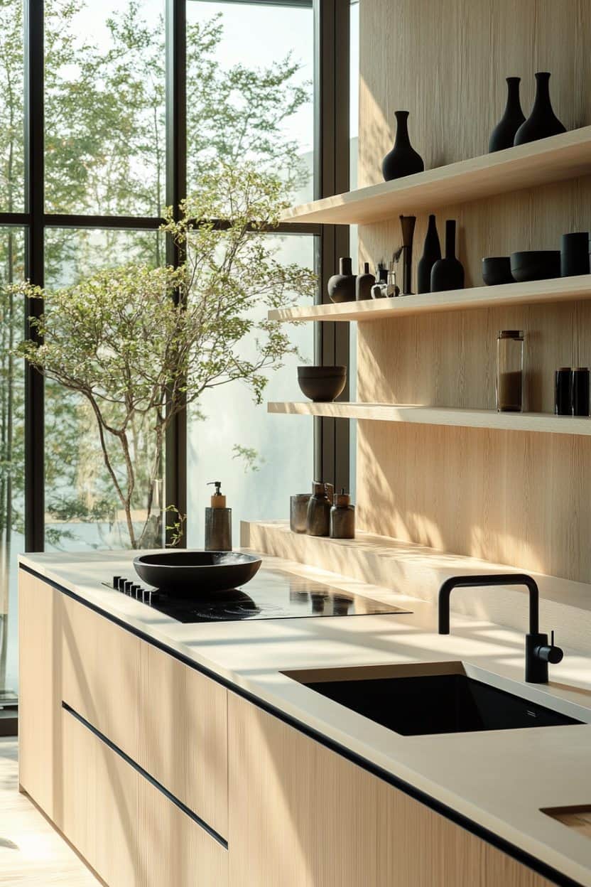
Image credit: hello-hayley.com
Pair sleek surfaces with warm wood cabinets and matte black fixtures.
Tiles and Japandi
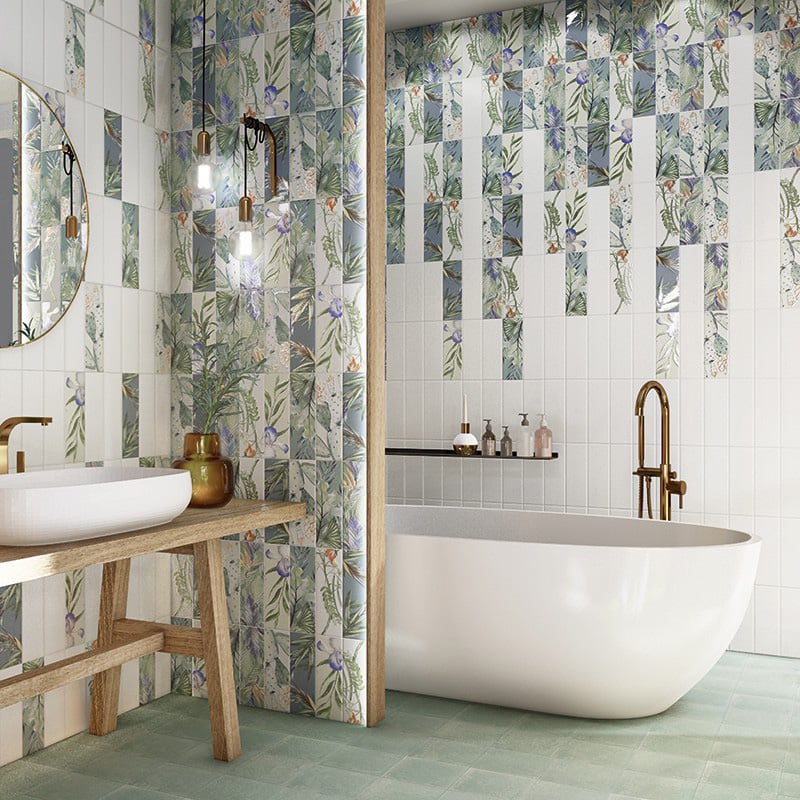
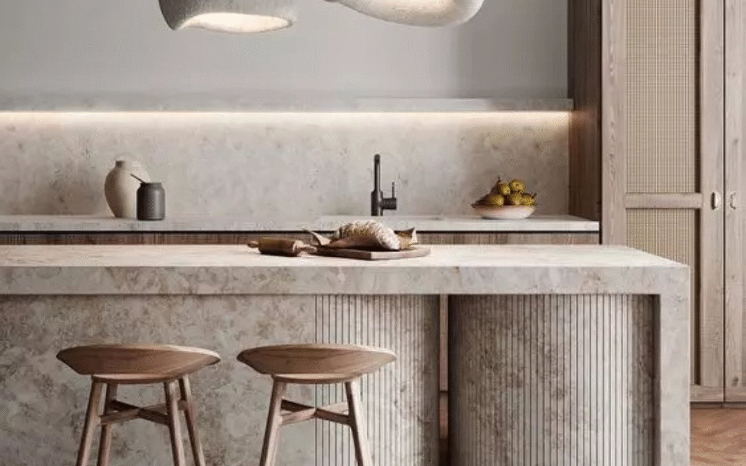
Tiles are a great way to embrace the Japandi aesthetic. Think large format stone-look tiles for floors, soft textured wall tiles or handmade ceramic splashbacks. Matte finishes work best to avoid too much shine. You want the space to feel natural and calm, not glossy and loud. Wood-look vinyl, laminate or engineered wood flooring also fits perfectly with the Japandi style, offering the warmth of timber with added durability and easy maintenance — ideal for creating that serene, minimalist feel.
Japandi isn’t just a trend — it’s a lifestyle shift. It’s about stripping back the noise and embracing simplicity, comfort and mindfulness in the way we live. Whether you’re redesigning a single room or your entire home, Japandi offers a timeless and peaceful solution.
Looking for tiles or design elements that suit the Japandi style? Bring your moodboard or Pinterest inspo to our showroom and we’ll help you choose pieces that bring your vision to life. Browse our collection of Japandi-inspired pieces below to get started.
Browse our collection of Japandi-inspired pieces

blog, interior design tips
Choosing the right colour palette can completely transform your home. Whether you’re updating a single room or planning a full renovation, your choice of colours will influence the mood, functionality and longevity of your space. If you’re looking to strike the perfect balance between modern style and timeless appeal, you’re in the right place. Let’s explore the best colour palettes that never go out of fashion.
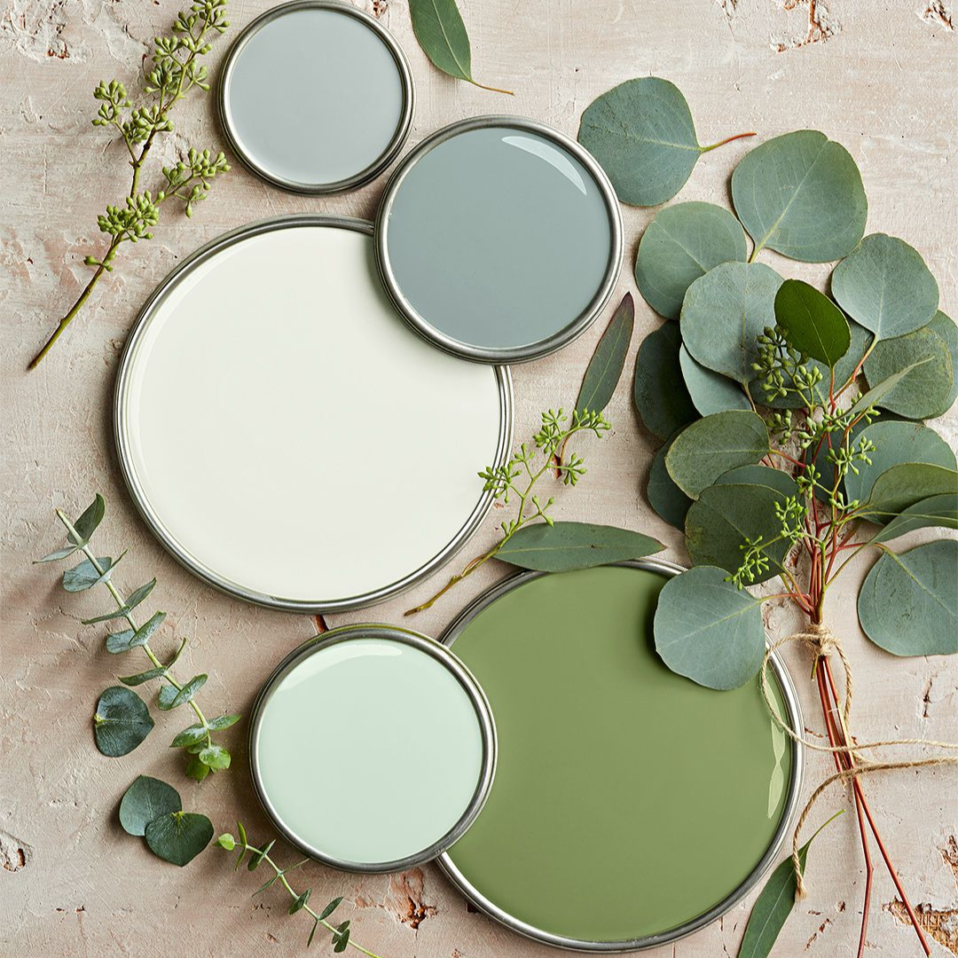
Table of Content:
Warm Neutrals
Monochrome Elegance
Soft Blues & Cool Greys
Earthy Greens & Olive Tones
Classic Greyscale
Muted Terracotta & Dusty Pink
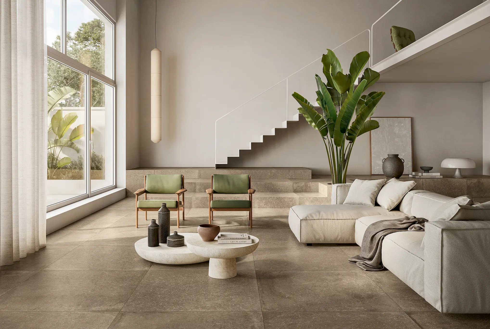
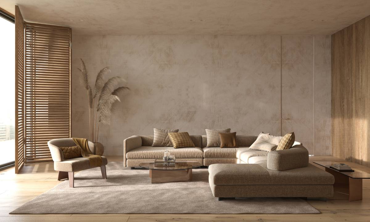
Warm Neutrals
Warm neutrals are a go-to for creating a cosy, inviting space. Think shades of beige, taupe, greige and warm whites. These tones work beautifully in living rooms, bedrooms and kitchens, especially when paired with natural materials like wood and stone. They create a soft, grounded feel that won’t feel outdated in a few years.
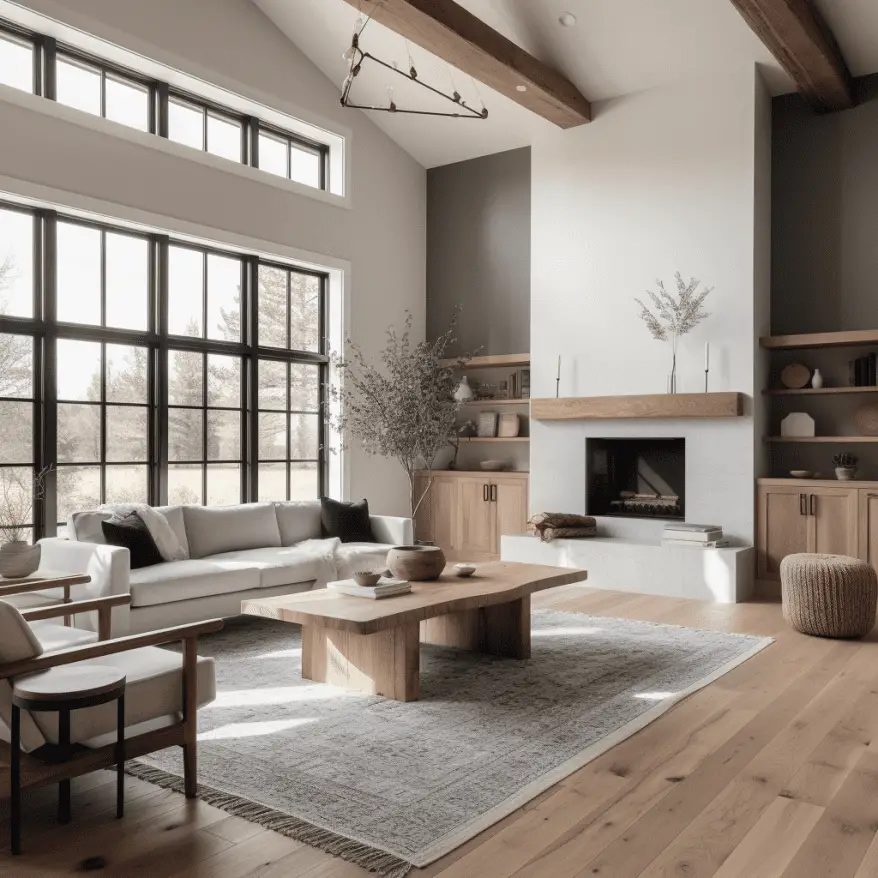
Image Credit: axxla.com
Best for: open-plan spaces, minimalist interiors and layering textures
Pair with: wood look flooring, ceramic tiles and soft furnishings in earthy hues
Monochrome Elegance
A black and white palette is the definition of timeless. It’s bold, clean and endlessly versatile. Monochrome doesn’t mean boring – you can add depth through different finishes, patterns and textures. Think matte black fixtures against crisp white tiles or a dramatic black feature wall in an all-white room.

Image Credit: cosentino.com
Best for: bathrooms, kitchens and modern industrial designs
Pair with: high-contrast tiles, glossy surfaces and simple geometric patterns
Soft Blues & Cool Greys
Looking for a calm and sophisticated vibe? Soft blues paired with cool greys bring serenity into any space. These tones are great for coastal-inspired interiors or minimalist homes with a Scandinavian twist. They also play nicely with natural light, making rooms feel airy and open.
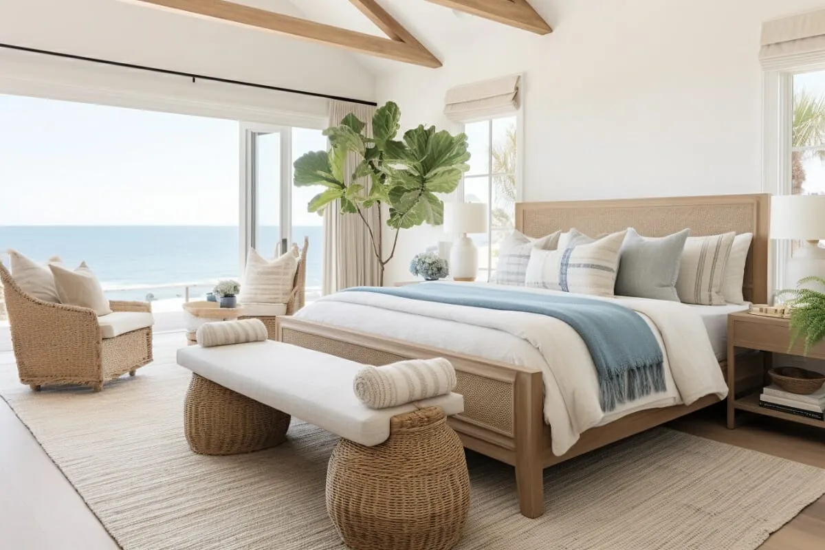
Image Credit: decorilla.com
Best for: bedrooms, bathrooms and small spaces
Pair with: light oak flooring, white accessories and subtle metallic finishes
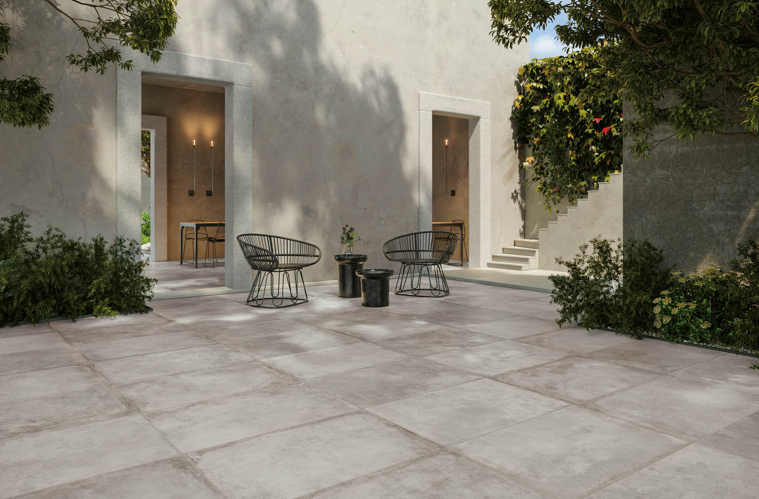
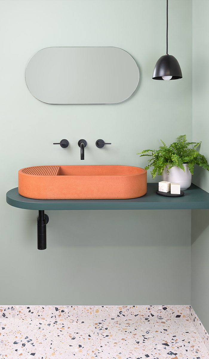
Earthy Greens & Olive Tones
Nature-inspired colours are huge right now and they’re not going anywhere. Olive green, sage and muted forest shades feel organic and grounding. These colours work especially well when combined with natural textures like stone, clay and rattan.
Best for: living areas, entryways and biophilic design schemes
Pair with: terracotta tiles, concrete finishes and indoor plants
Classic Greyscale
From pale dove grey to rich charcoal, greys remain a staple in modern home design. They provide a clean backdrop that lets other design elements shine. Use different tones of grey to create depth and interest without overwhelming the space.
Image Credit: cocolapinedesign.com
Best for: entire home colour schemes or feature walls
Pair with: marble-look tiles, chrome hardware and accent lighting
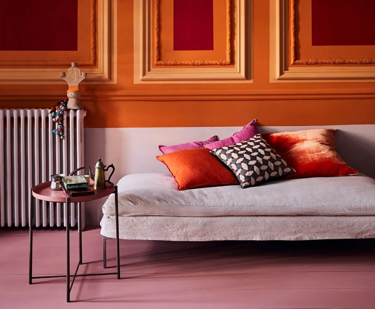
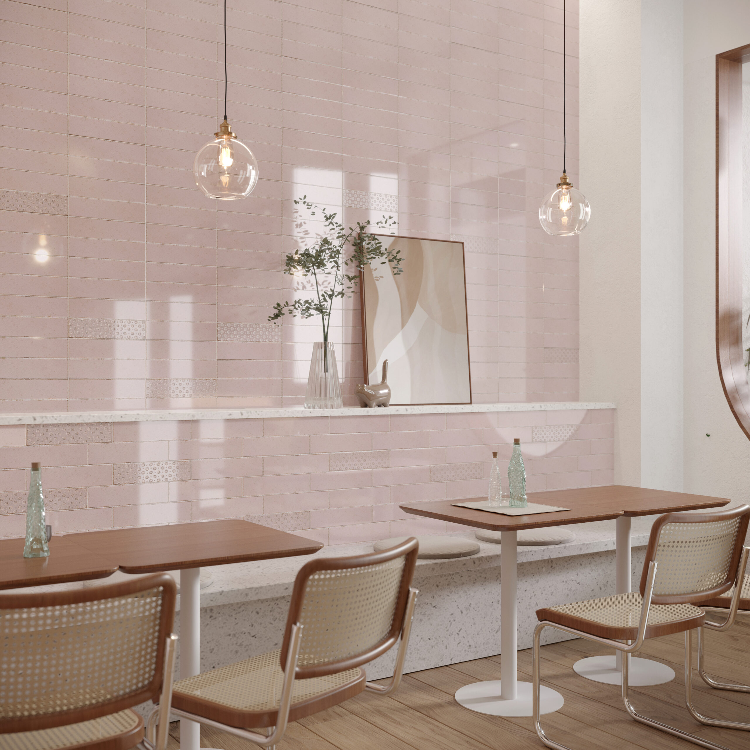
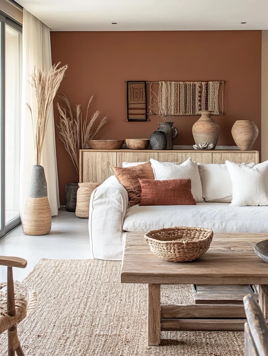
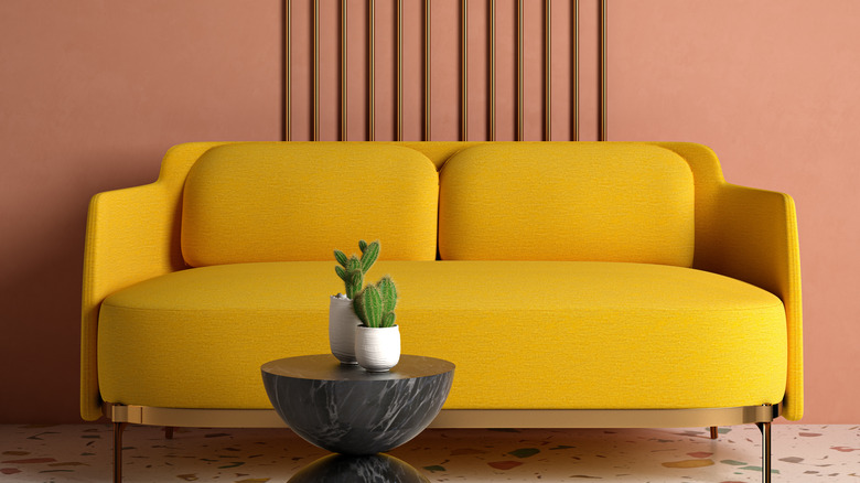
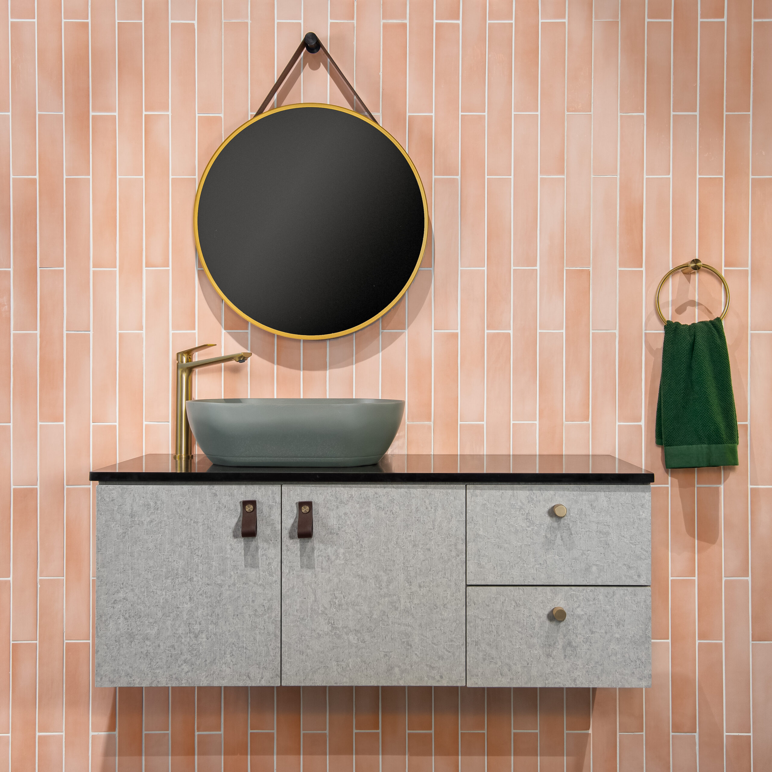
Muted Terracotta & Dusty Pink
Looking to warm things up without going too bold? Muted terracotta and soft pinks add a sense of comfort and charm. These colours bring in a subtle vibrancy while maintaining a sophisticated grown-up feel.
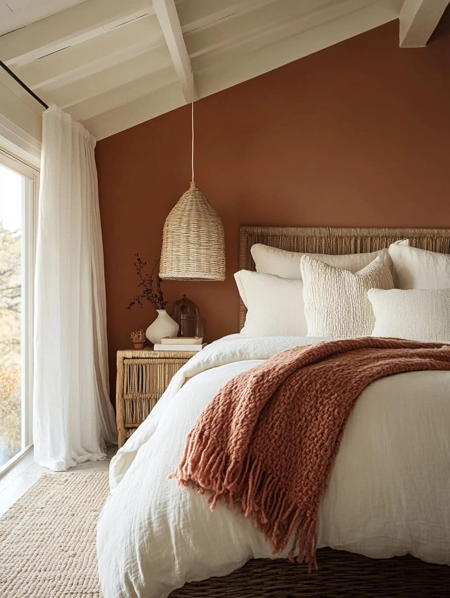
Image credit: Living Bright Interiors
Best for: bedrooms, reading nooks and creative studios
Pair with: warm wood tones, neutral tiles and textured fabrics
The best colour palette for your home should reflect your personal style while standing the test of time. Whether you’re drawn to clean monochromes, calming blues or warm neutrals, there’s a timeless palette that can suit your space. The key is to balance colour with texture, lighting and materials to create a cohesive look that feels modern and lived-in.
Need help choosing tiles or flooring to match your colour scheme? Explore our collections at Tiletoria for timeless finishes that elevate every room.
blog, commercial blog, how to articles, interior design tips, trends
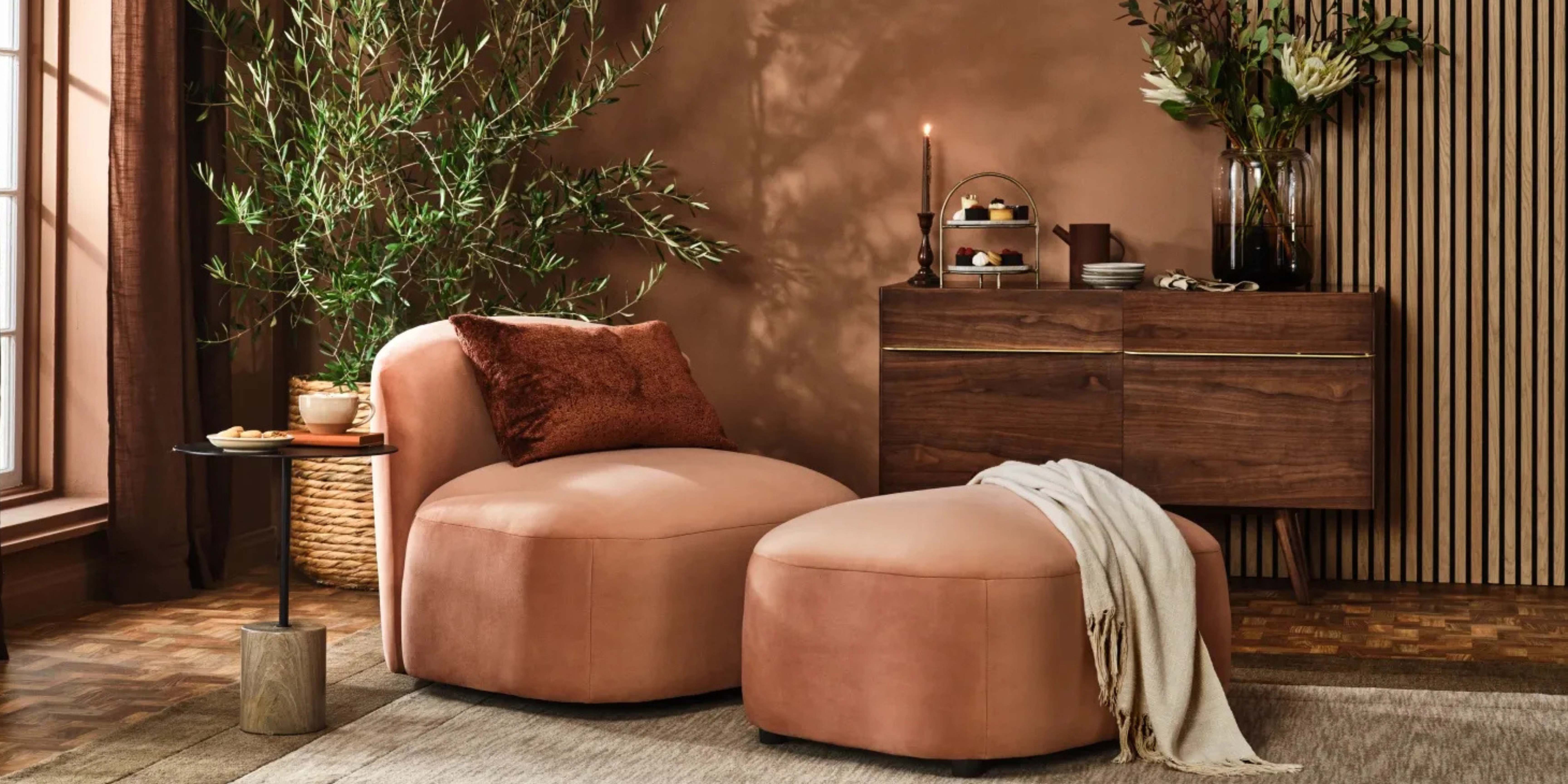
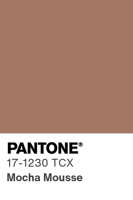
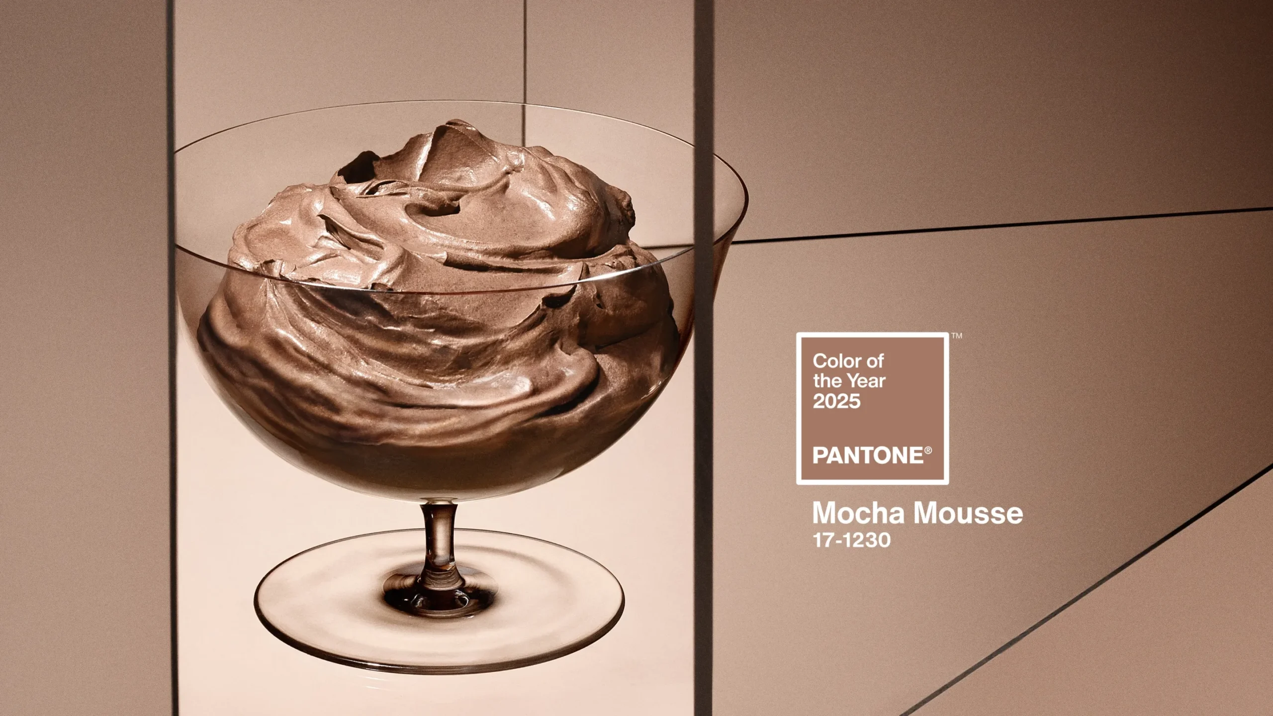
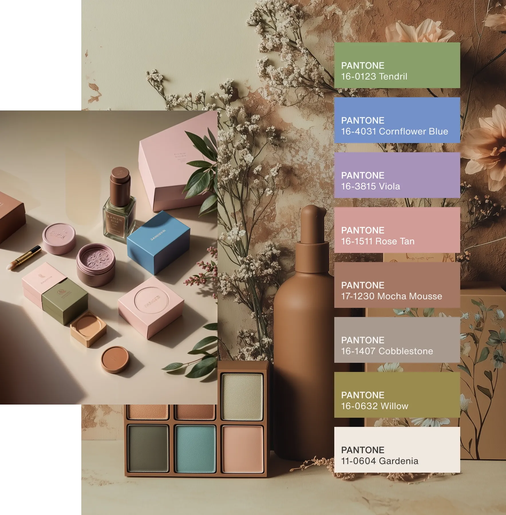
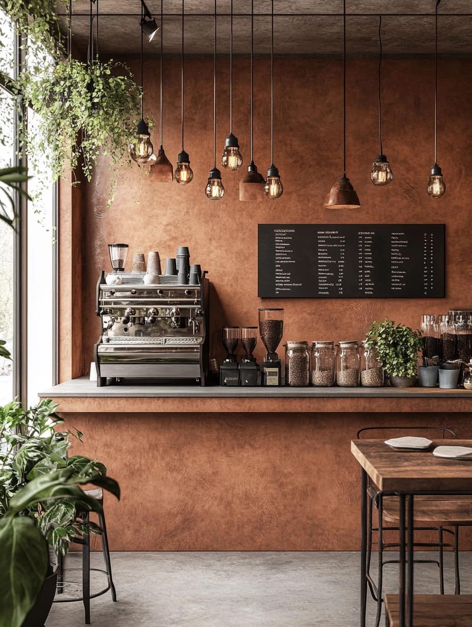
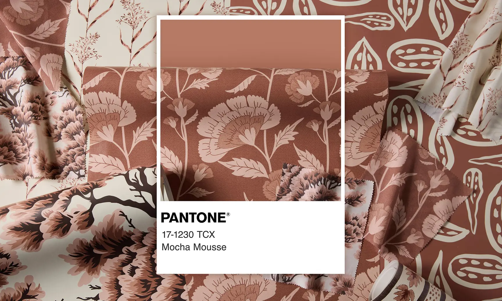
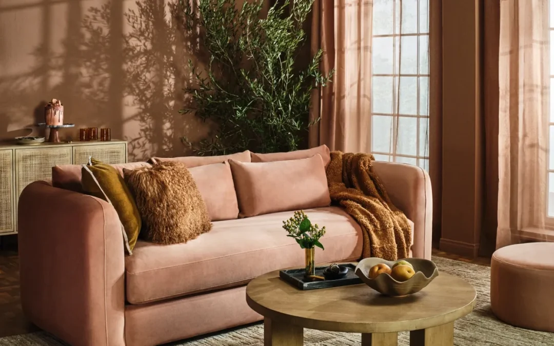
Pantone’s Colour of the Year for 2025 is finally here, and it’s a rich, warm brown named Mocha Mousse (Pantone 17-1230). If you’re drawn to earthy tones that radiate warmth and comfort, this is the perfect hue to introduce into your home. It strikes a luxurious balance between taupe and dark chocolate—soft, inviting, and ideal for creating a cocooning atmosphere that makes any space feel more relaxing and grounded.
This year’s selection reflects a global desire for stability, comfort, and a deeper connection to nature, making Mocha Mousse the perfect shade to incorporate into your home. Whether you’re looking for subtle accents or bold statements, this versatile colour can enhance your space in a way that feels both sophisticated and cosy.
Table of Content:
What is Pantone’s Colour of the Year?
The Meaning Behind Mocha Mousse
Pantone 17-1230 Mocha Mousse Color Palettes
Relaxed Elegance
Floral Pathways
How to Incorporate Mocha Mousse Into Your Interior Spaces
Living Room
Bedroom
Kitchen
Bathroom
Commercial Spaces
Art & Accessories
Embrace the Comfort of Mocha Mousse
Browse our range of Mocha Mousse inspired products
What is Pantone’s Colour of the Year?
Pantone’s Colour of the Year is far more than just a trend—it’s a reflection of broader cultural shifts, societal movements, and evolving design preferences. Each year, Pantone, a globally recognized authority on colour, selects a shade that encapsulates the mood and themes of the year to come. This decision is influenced by various factors, including art, fashion, politics and global events. The Colour of the Year sets the tone for design trends, offering a glimpse into the collective psyche and the state of the world.
The Meaning Behind Mocha Mousse
For 2025, Pantone has selected Mocha Mousse (Pantone 17-1230), a rich brown hue that exudes warmth, stability and simplicity. This colour evokes feelings of indulgence, drawing inspiration from comforting elements like coffee and chocolate, while simultaneously embracing earthy, grounded tones. Mocha Mousse reflects a move toward understated elegance, offering a sense of serenity and balance—qualities that are essential as we navigate uncertain times. It’s a colour that fosters connection and creates spaces that feel like home, perfectly suited for a year focused on comfort and emotional well-being.
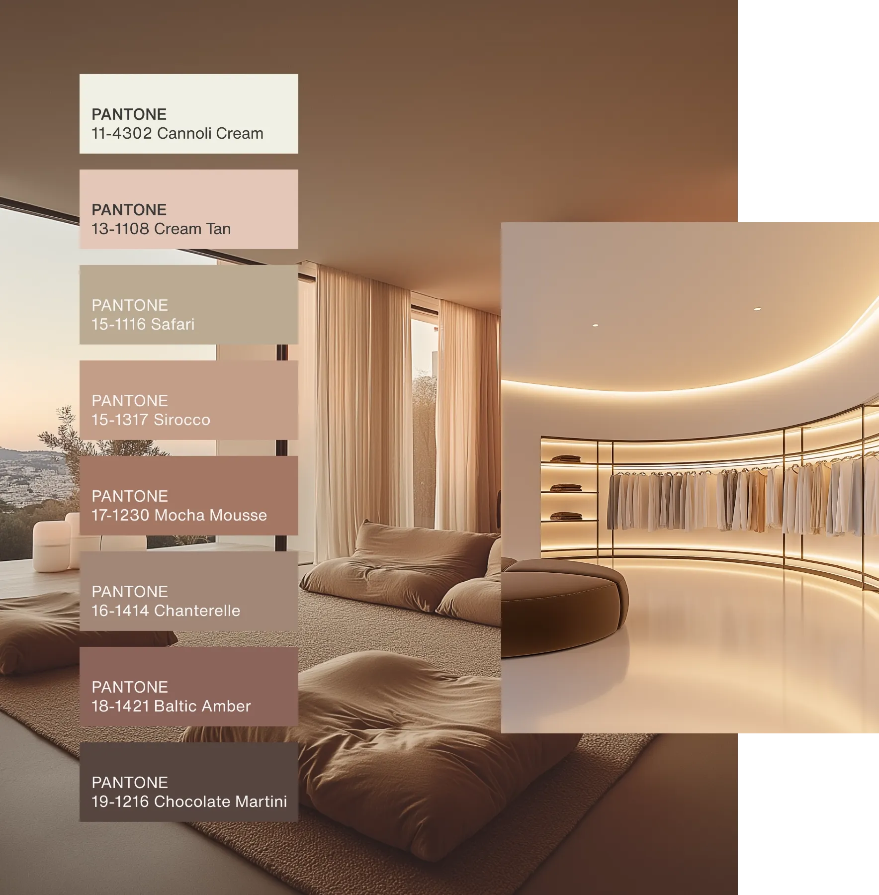
Pantone 17-1230 Mocha Mousse Color Palettes
Relaxed Elegance
Pantone has curated five distinct colour palettes featuring Mocha Mousse, each expressing a unique mood and atmosphere. Within each palette, you’ll find four harmonious shades that complement Mocha Mousse’s inviting warmth, creating the perfect setting for a variety of spaces and experiences.
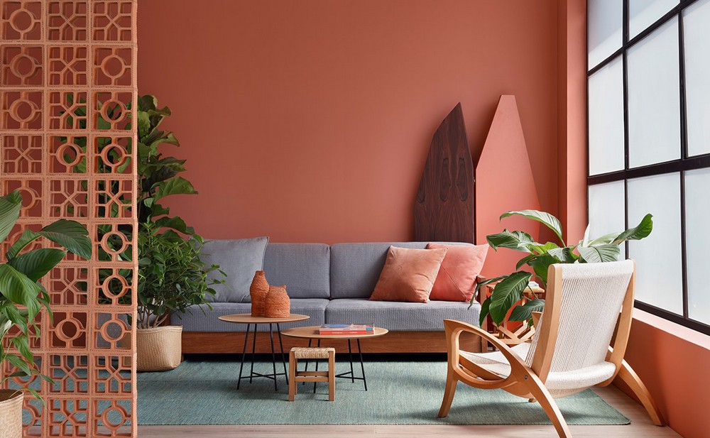
Floral Pathways
Floral Pathways blends Mocha Mousse with floral and soft green tones, evoking the beauty and scent of a serene garden. These combinations allow for an organic, grounding effect, encouraging you to bask in simple pleasures and embrace moments of calm. It’s an invitation to slow down and enjoy the richness of life—whether through a nature walk, a quiet evening or the joy of sharing sweet treats with loved ones.
How to Incorporate Mocha Mousse Into Your Interior Spaces
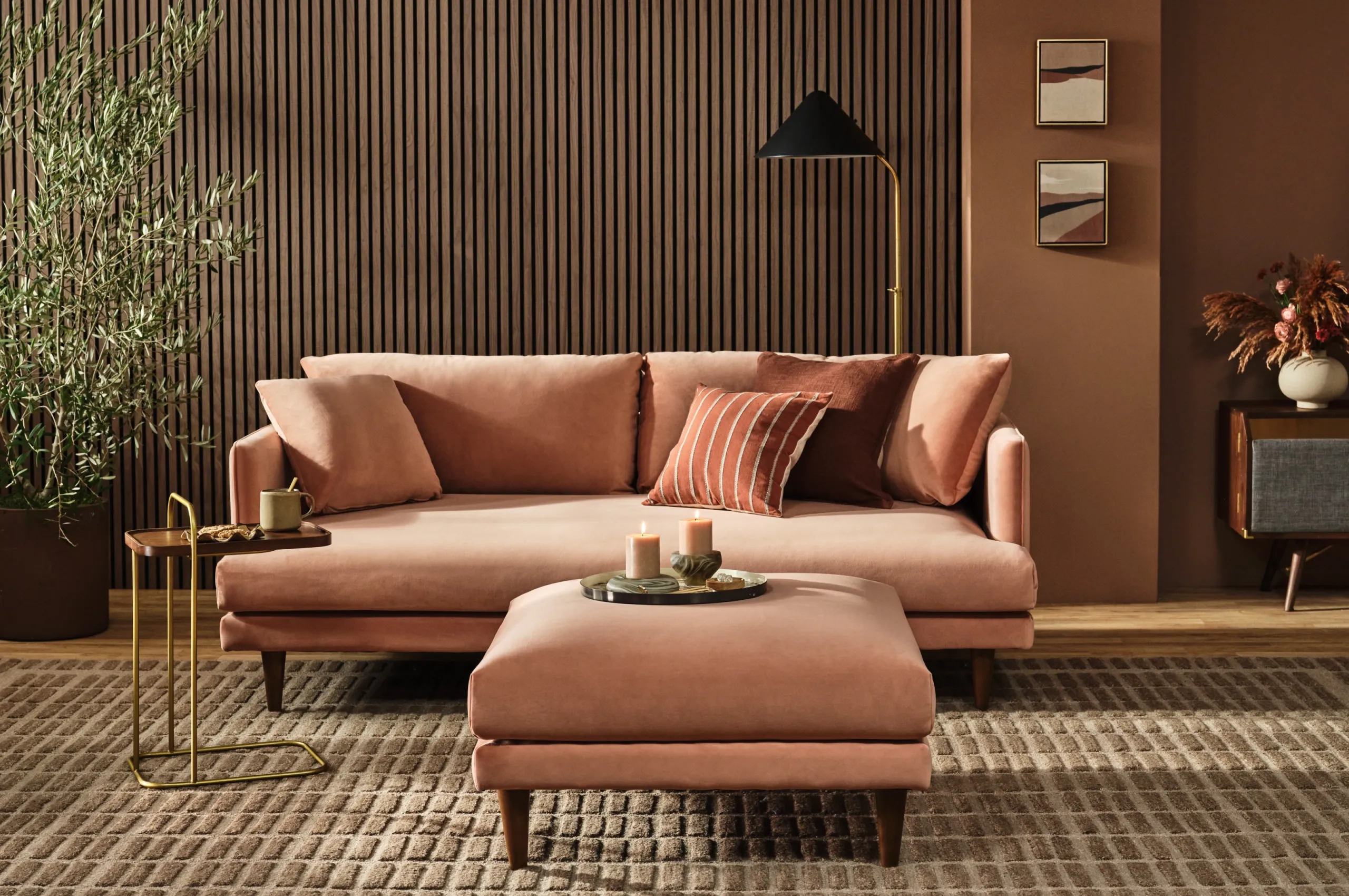
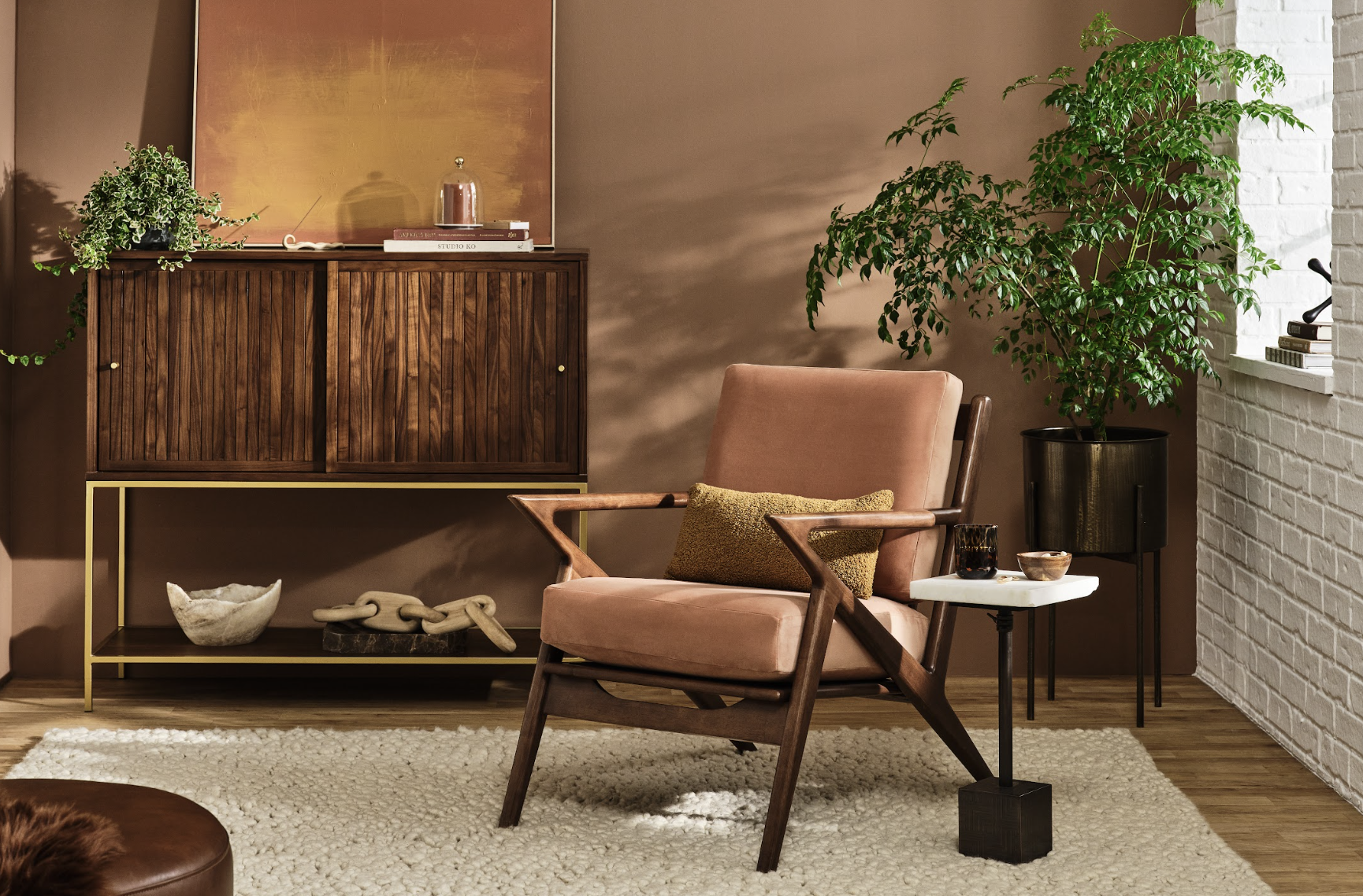
Revamp Your Living Room with Mocha Mousse Accents
Your living room is one of the most frequented areas in the home, and Mocha Mousse is the perfect choice for adding richness and warmth. Consider introducing this colour in furniture pieces such as a plush sofa, accent chairs or cushions. Mocha Mousse pairs beautifully with muted tones like sage green, dusky pink or even deeper earth tones, offering a grounding effect that enhances the entire space.
For a more subtle approach, you can bring the shade into the room with smaller items like vases, throws or wall art. The colour works wonderfully in both modern and traditional settings, making it versatile enough to match your existing decor.
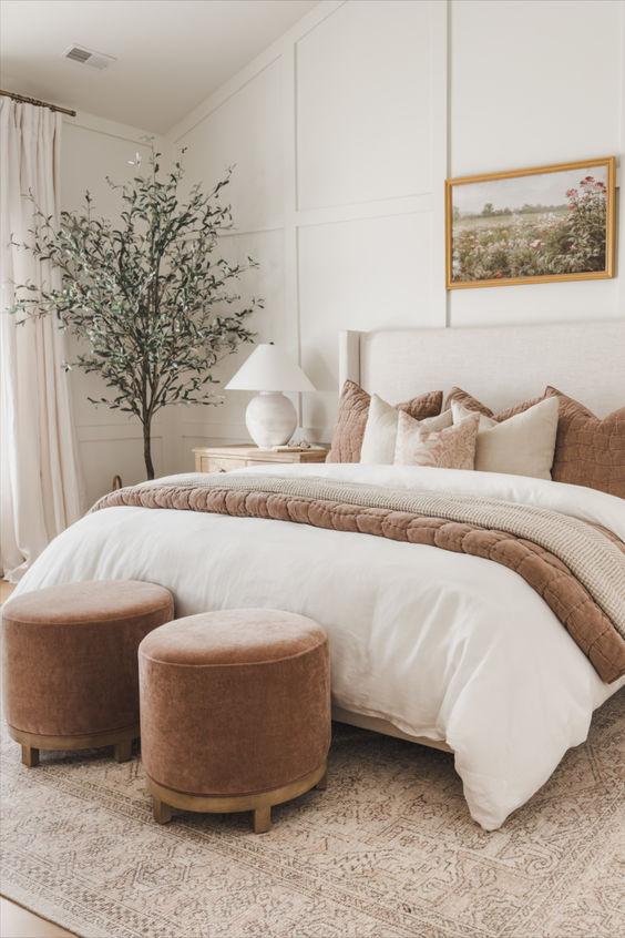
Create a Relaxing Bedroom Sanctuary
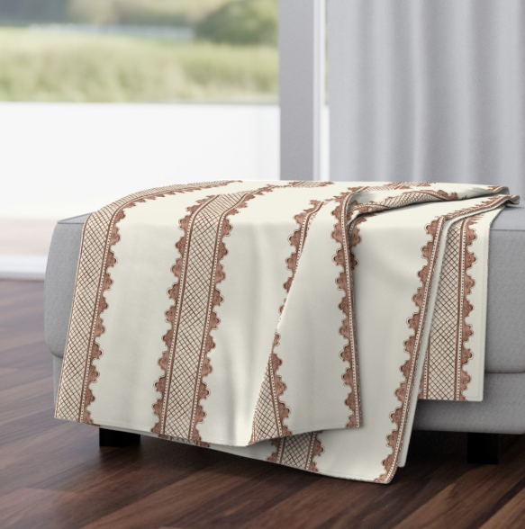
Transform your bedroom into a luxurious retreat by embracing Mocha Mousse as the dominant hue. This soft brown is ideal for creating a calming atmosphere that promotes relaxation and restful sleep. Start with bedding—opt for a Mocha Mousse duvet cover or throw pillows to create an inviting focal point.
If you’re feeling bolder, consider incorporating the colour into the walls or even the ceiling to fully envelop the space in comfort. Complement the brown tones with warm wood furniture, soft lighting and delicate textiles to further enhance the sanctuary vibe.
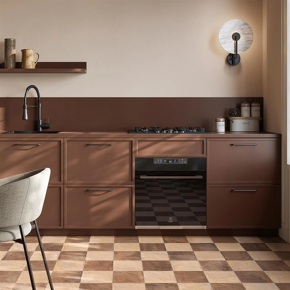
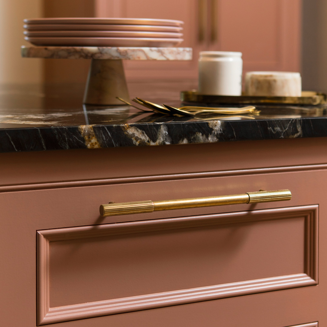
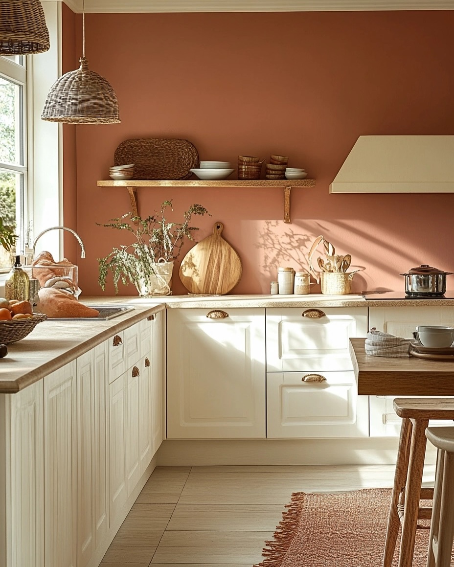
Warm Up Your Kitchen with Mocha Mousse
The kitchen is a space that often feels bright and airy, but adding Mocha Mousse can help ground it with a rich and indulgent touch. From cabinetry to counter tops, this earthy colour can be easily integrated into your kitchen design. Pair it with natural wood elements for a rustic yet refined look.
For an even more dynamic design, mix Mocha Mousse with lighter shades of cream, peach or terracotta. This creates a harmonious balance of warm tones that brings both vibrancy and tranquility into the heart of your home.
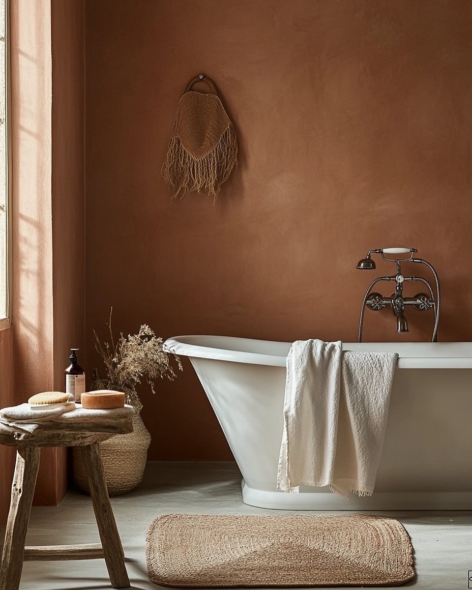
Introduce Mocha Mousse to Your Bathroom
If you’re looking to make a statement in your bathroom, Mocha Mousse is the perfect choice. Whether it’s through luxurious towels, bath mats or even a feature wall, this warm tone can transform your bathroom into a spa-like retreat. For a more subtle update, introduce the colour with accessories like soap dispensers, shower curtains or storage baskets.
If you’re planning a bathroom renovation, consider using Mocha Mousse tiles or a mocha-toned bathtub for a chic, soothing space that exudes calm.
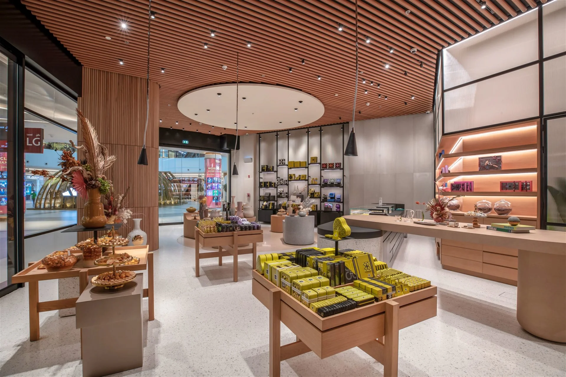
Add Texture and Warmth with Mocha Mousse in Commercial Spaces
Mocha Mousse isn’t just for homes—this warm, neutral tone works wonders in commercial interiors too. Whether it’s an office, retail store or healthcare setting, Mocha Mousse brings sophistication and tranquility to high-traffic areas. In open-plan offices, use it for modular furniture, desk partitions or acoustic panels to promote focus and productivity.
In retail spaces, Mocha Mousse enhances the shopping experience by creating a welcoming environment. Incorporate it into shelving units, display backdrops or fitting rooms to elevate the customer journey.
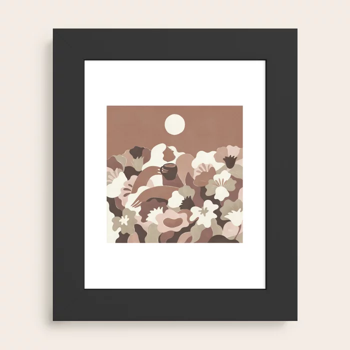
Art and Accessories: Small Touches, Big Impact
If you’re not ready to commit to major changes, you can still infuse Mocha Mousse into your space with smaller touches. Artwork is an excellent way to bring in this year’s colour—think large-scale pieces, framed prints, or even a decorative mirror. By introducing this deep, earthy shade through your accessories, you’ll create a cohesive and stylish vibe in any room without overwhelming the space.
Embrace the Comfort of Mocha Mousse
Pantone’s Colour of the Year for 2025 is a warm and inviting tone that speaks to our desire for comfort, stability and connection. Whether you’re redecorating your entire home or adding a few accents, Mocha Mousse offers endless possibilities to create a space that feels grounded, sophisticated and utterly comforting.
Are you ready to add this versatile shade to your interiors? From your kitchen to the bathroom, Mocha Mousse is a timeless colour that can work with a variety of design styles and will be a mainstay in interiors for years to come.
Browse our range of Mocha Mousse inspired tiles