blog, interior design tips, kitchen
Timeless kitchen colour palettes are the secret to creating a kitchen that still feels stylish years from now. While trends shift quickly, certain colour combinations remain popular because they feel calm, balanced and easy to live with. If you’re planning a renovation or building a new kitchen, choosing a timeless palette helps protect your investment and keeps your space looking relevant for longer.
Table of Content:
Timeless Kitchen Colour Palettes Create Long-Term Value
What Colours Are Considered Timeless in Kitchens?
Warmth Makes a Kitchen Feel Timeless
Kitchen Taps Should Match Your Colour Palette
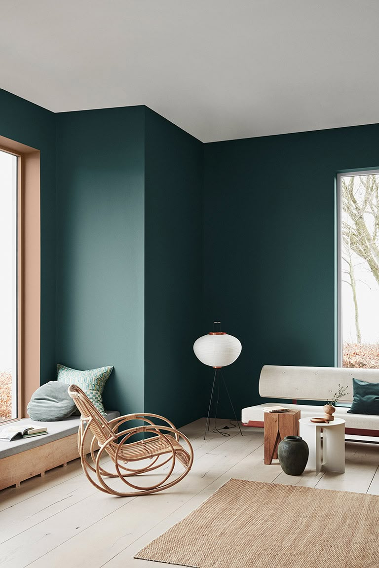
Dark Shades in Timeless Kitchen Colour Palettes
Tiles That Support Timeless Kitchen Colour Palettes
Balance Trends With Timeless Choices
Timeless Kitchen Colour Palettes Create Long-Term Value
A kitchen renovation is a big investment, so the colours you choose should last. Cabinets, tiles and countertops are not items you want to replace every few years. A timeless palette creates a strong foundation that won’t date quickly and allows you to refresh the look with smaller updates like accessories, décor or hardware.
Timeless colours also appeal to more people, which can be a bonus if you ever sell your home.
What Colours Are Considered Timeless in Kitchens?
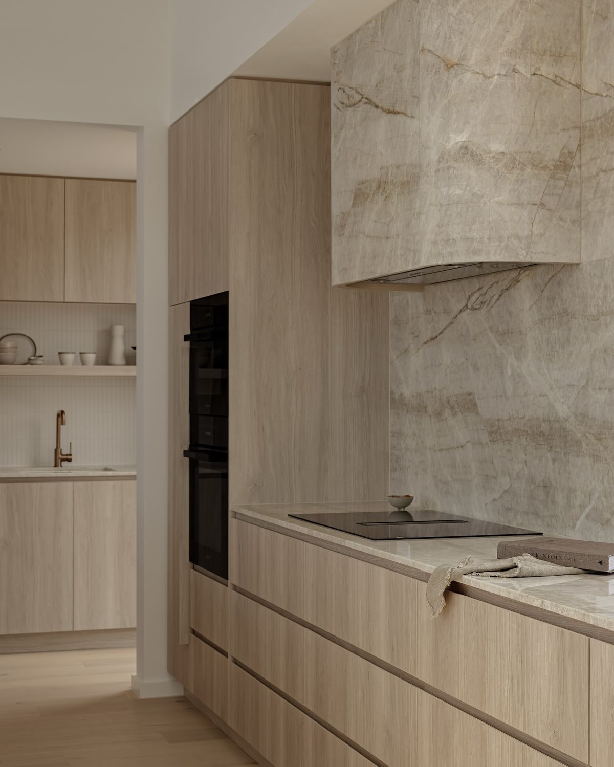
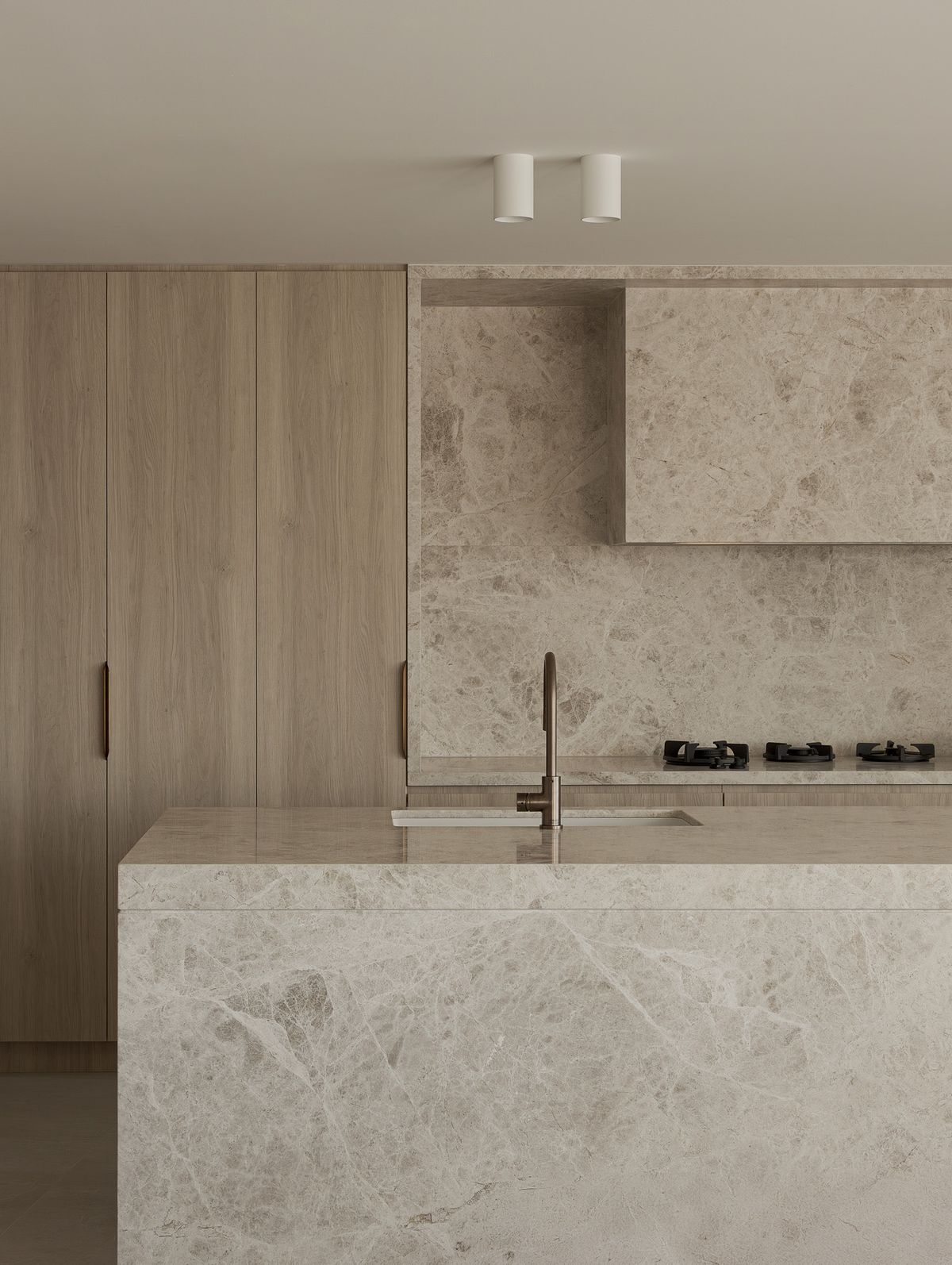
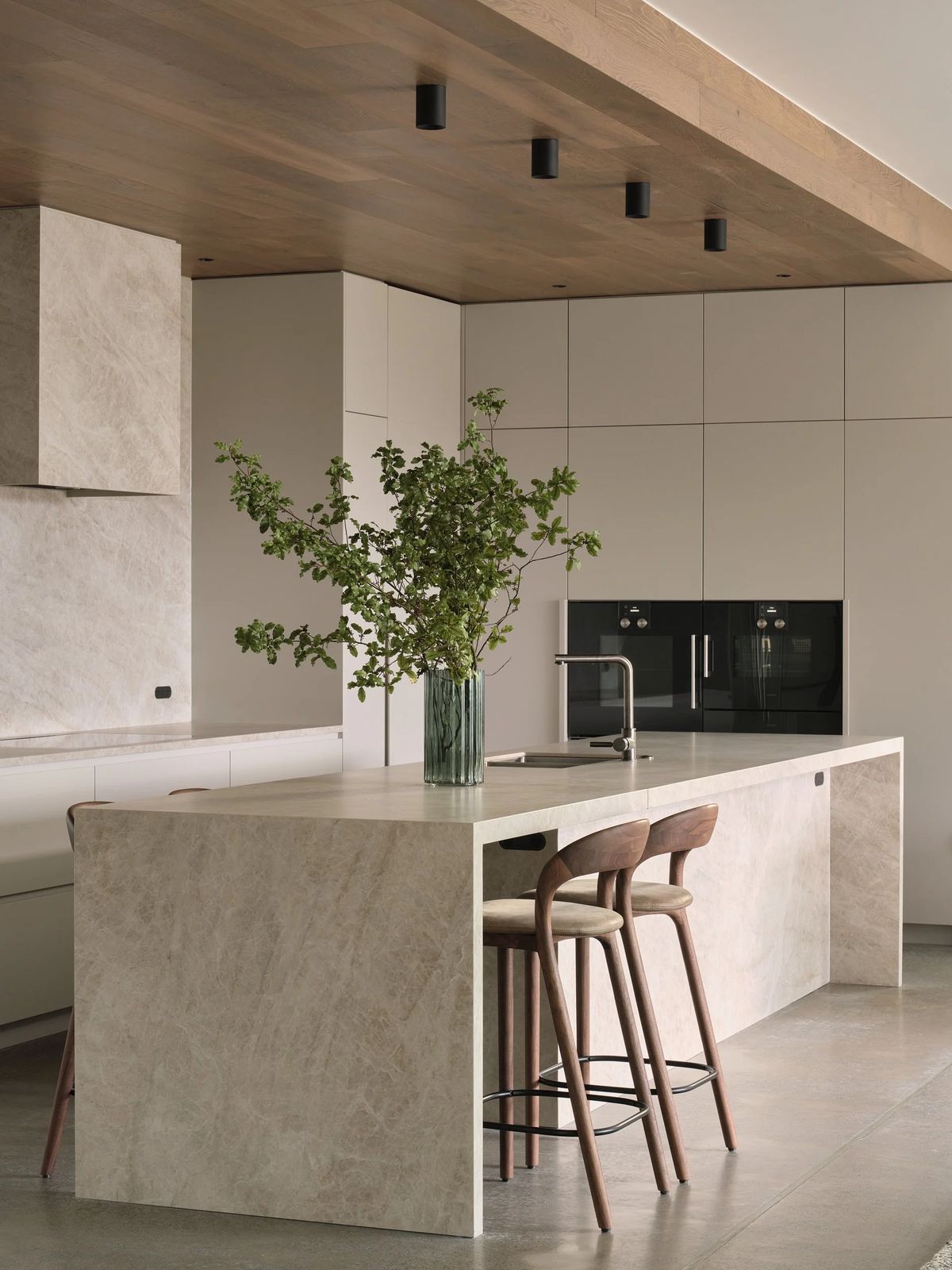
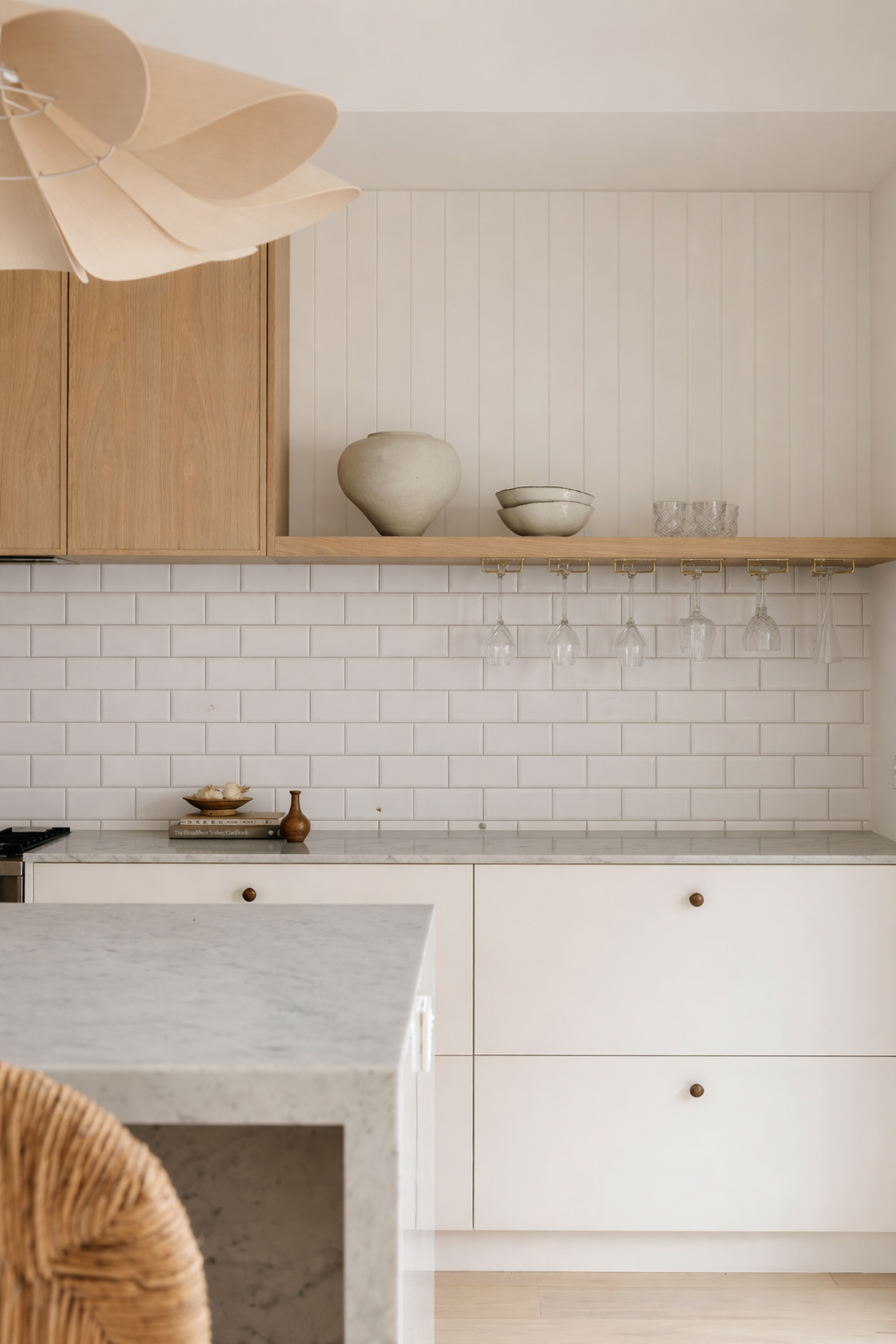
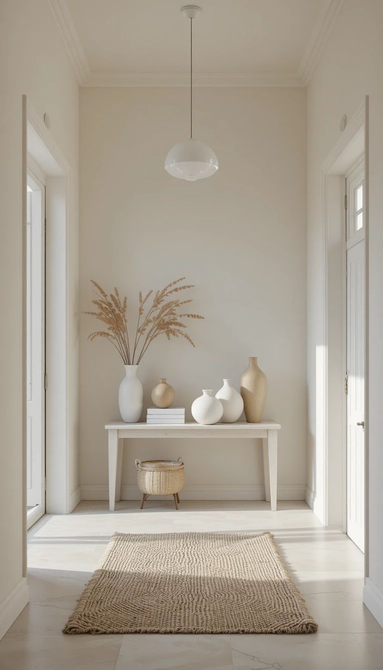
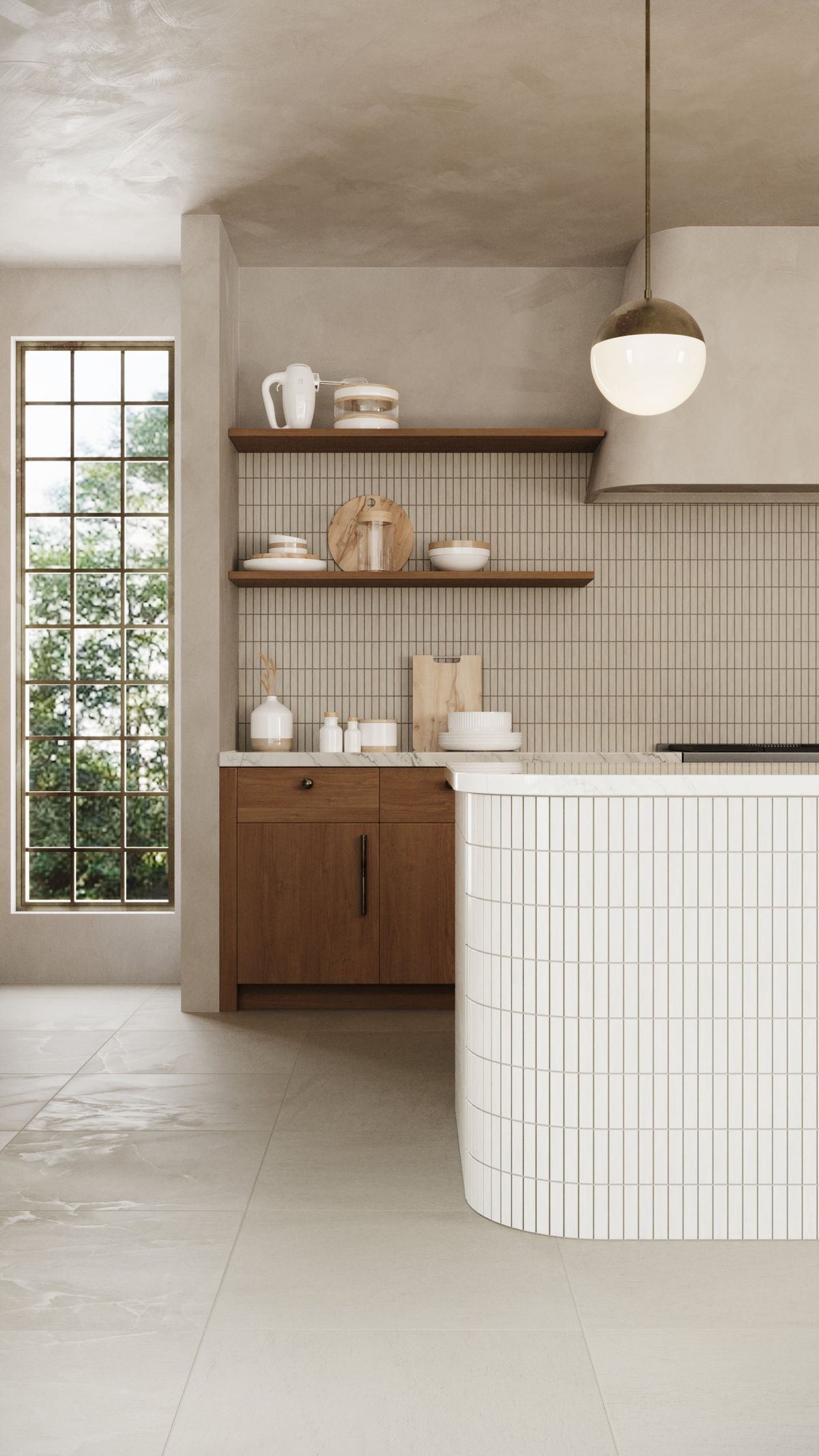
Timeless kitchen colours are usually neutral, earthy or softly contrasted. Shades like white, beige, warm grey, soft taupe and natural wood tones rarely go out of style. These colours reflect light well and make spaces feel calm and inviting.
They also pair beautifully with different materials like stone-look tiles, marble finishes or textured splashbacks.
Warmth Makes a Kitchen Feel Timeless
A timeless kitchen should feel inviting, not cold. Adding warmth through natural wood tones, stone-look tiles or warm-toned flooring helps balance lighter cabinets and walls.
Warmth prevents a kitchen from feeling lifeless and adds depth without relying on trends.
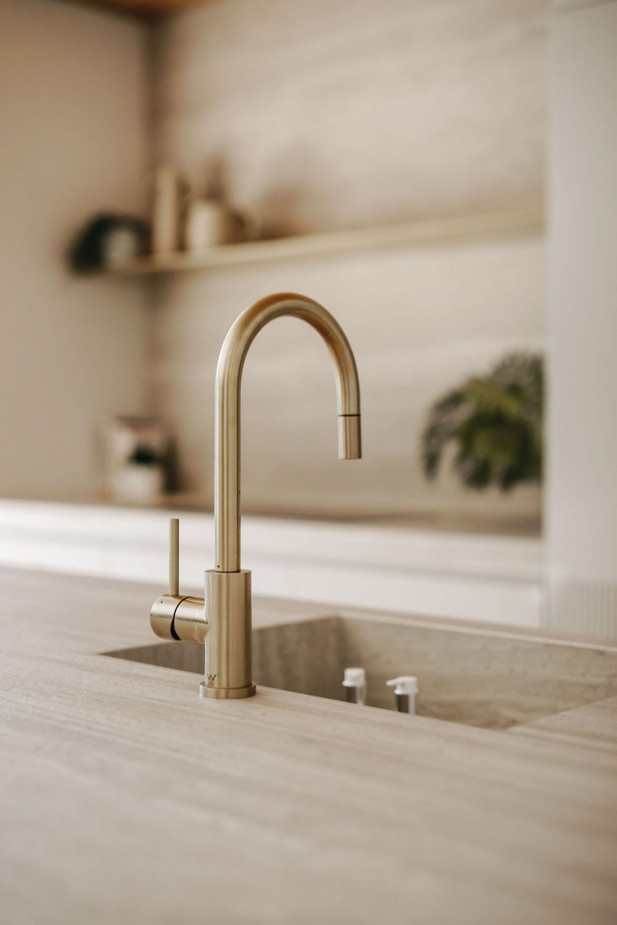
Kitchen Taps Should Match Your Colour Palette
Kitchen taps might seem like a small detail, but they play a big role in the overall look. A tap finish should complement your colour palette rather than compete with it.
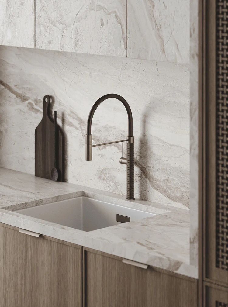
Classic finishes like chrome, brushed gold and soft brass tend to age well and suit timeless kitchens. Matte black taps can also feel timeless when paired with neutral palettes. Choosing a finish that works with your tiles and cabinetry helps create a cohesive look.
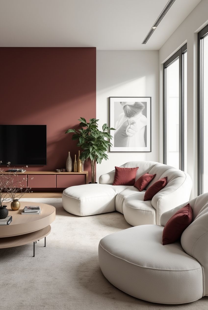
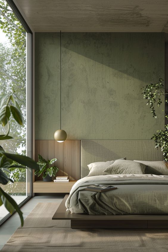
Dark Shades in Timeless Kitchen Colour Palettes
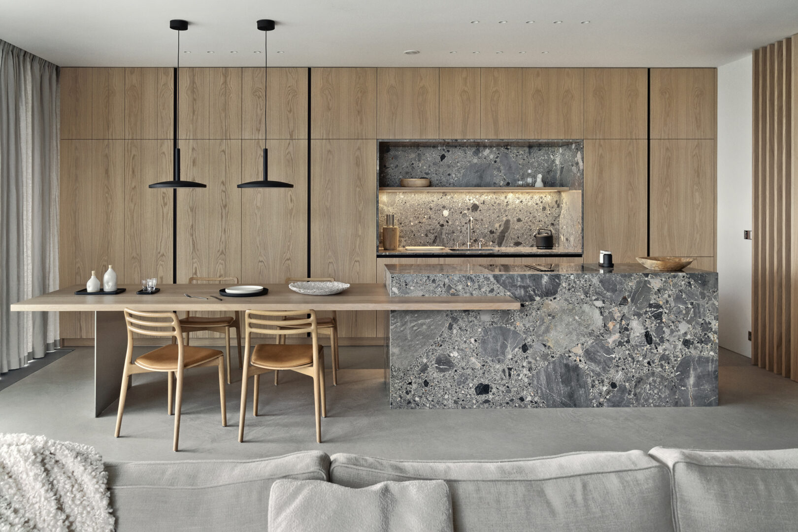
Timeless doesn’t always mean light. Deep navy, charcoal and rich brown tones can feel sophisticated and classic when used thoughtfully. These shades work best when balanced with lighter elements so the space doesn’t feel heavy.
Using darker tones on an island or lower cabinets keeps the look grounded while maintaining brightness.
Tiles That Support Timeless Kitchen Colour Palettes
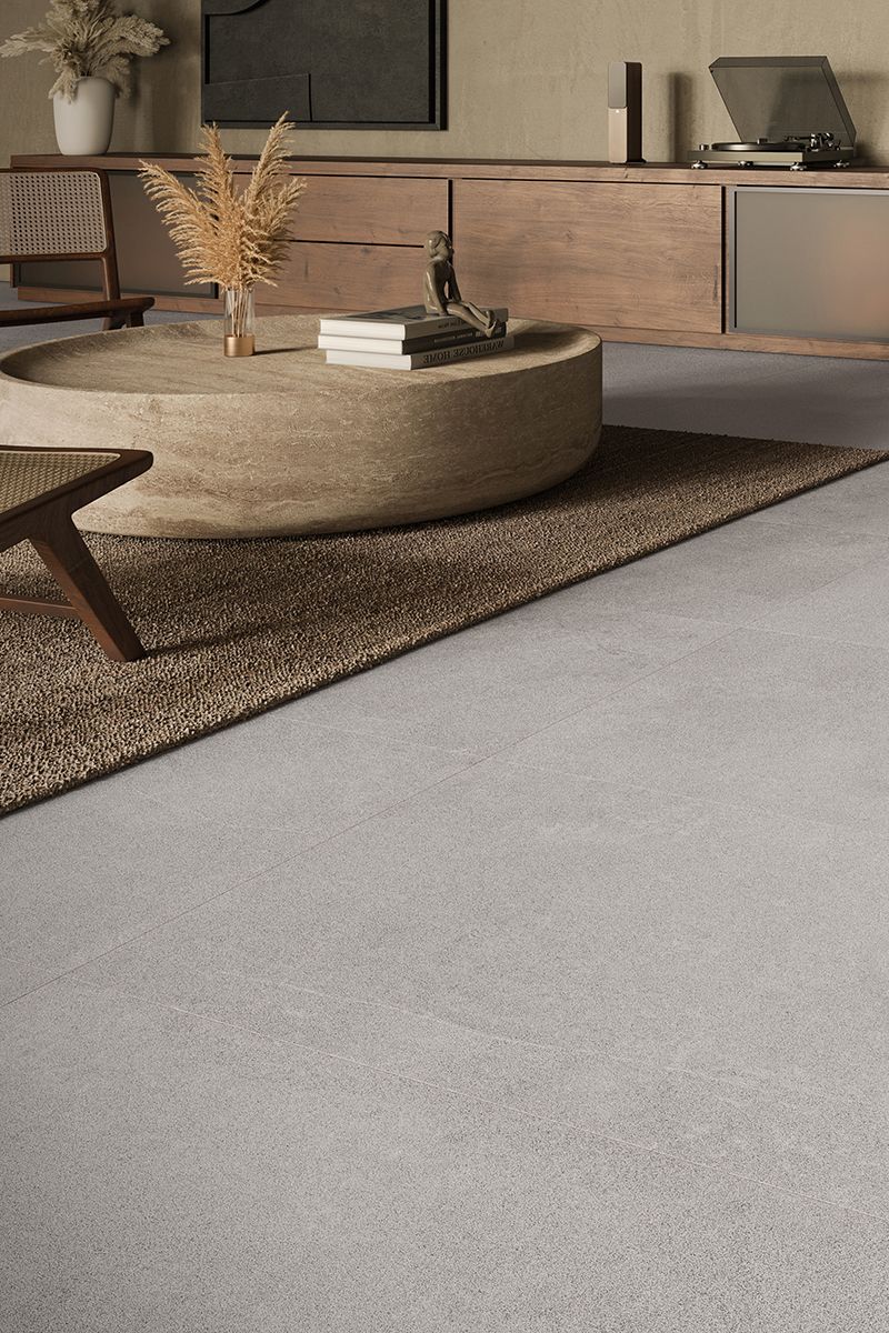
Tiles influence how a colour palette comes together. Large-format neutral kitchen floor tiles create a seamless base that won’t date. Classic subway tiles remain a safe splashback for kitchen walls because of their simplicity.
Stone-look and marble-look tiles are especially timeless since they mimic natural materials that stay in style year after year.
Balance Trends With Timeless Choices
It’s fine to enjoy trends, but they shouldn’t dominate your kitchen. Introduce trendy colours through items that are easy to change like bar stools, décor, accessories or paint.
Keeping major surfaces timeless gives you flexibility to update the space without a full renovation.
Timeless kitchen colour palettes focus on colours that feel natural and adaptable. Neutral bases, warm elements and balanced contrast help create a kitchen that looks good today and still works years down the line.
Timeless design isn’t boring. It’s a smart way to create a kitchen that grows with your lifestyle and stays visually appealing.
bathroom, blog, floors, interior design tips, kitchen, outdoor, walls
We’ve all had those moments where you look around your home and think: “Hmm, this isn’t quite working.” Maybe it’s a little too cluttered, or something just feels off. The truth is, even small missteps can make a space feel less than perfect. That’s why we’ve put together a guide of the most common interior design mistakes to avoid — so you can create a home that’s both beautiful and functional without the headaches.
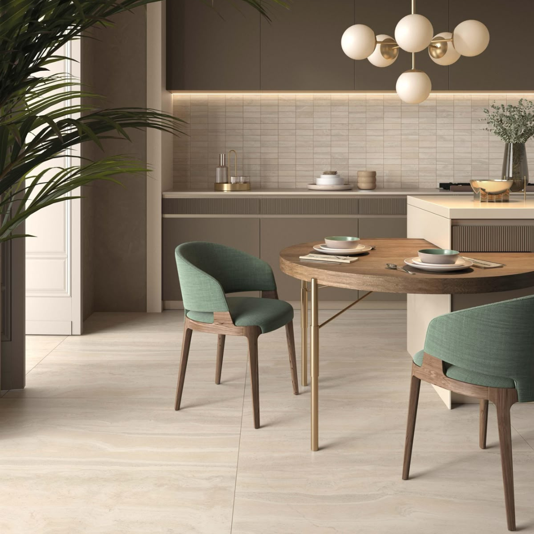
Table of Content:
Choosing the Wrong Finish
Using Wall Tiles on the Floor – A Flooring Interior Design Mistake
Forgetting About Outdoor Safety
Overlooking Lighting – Interior Design Mistakes That Dim Your Space
Skipping Accessories
Mixing Too Many Styles
Lack of Contrast
Following Every Fad – Trend-Related Interior Design Mistakes
Thinking Small Spaces Can’t Be Stylish
Choosing the Wrong Finish
Picking the wrong finish is an easy trap to fall into. Glossy tiles might look incredible in a showroom, but they can be slippery in kitchens and bathrooms. Matte finishes are often more forgiving — they hide scratches, resist smudges and make everyday life easier. Always think about how your choice will perform day-to-day, not just how it looks in pictures.
Using Wall Tiles on the Floor – A Flooring Interior Design Mistake
Not all tiles are created equal. Using wall tiles on the floor is a classic misstep. Wall tiles are thinner and less durable, which means they can crack or chip under heavy foot traffic. Always use tiles meant for flooring to ensure your surfaces last longer and stay looking great.
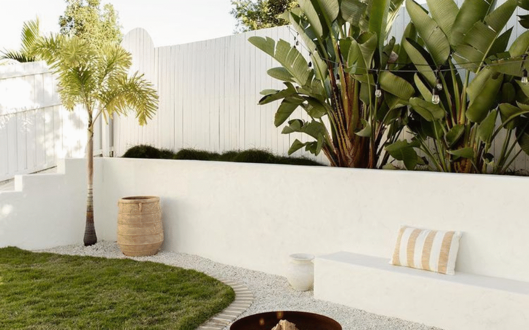
Forgetting About Outdoor Safety
Slip resistance is key for outdoor areas. Wet patios, pool decks or balcony tiles can quickly become hazardous if you overlook this detail. Opt for textured or slip-resistant tiles to keep your outdoor spaces safe, practical and stylish.
Overlooking Lighting – Interior Design Mistakes That Dim Your Space
Lighting can make or break a room. Skipping task or ambient lighting can leave spaces feeling dark or uninviting, even if everything else is perfect. Layer your lighting — think ceiling, wall and accent options — to bring warmth, depth and functionality to each room.
Skipping Accessories
A room without accessories can feel flat or unfinished. Rugs, cushions, artwork, plants and bathroom accessories like soap dishes, towel rails or decorative mirrors help bring personality and depth. Even small touches — a statement vase or a colourful throw — can completely transform the feel of a space and make it feel thoughtfully designed.
Mixing Too Many Styles
Trying to combine every design style you love can make a space feel messy and disjointed. When planning interiors, stick to a cohesive theme or mix two complementary styles for balance. Choosing the right tiles and coordinating them with bathroom accessories or furniture can help unify different elements and create a polished look.
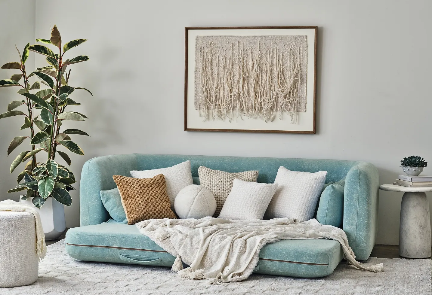
Lack of Contrast
A room without contrast can feel flat and uninspired. Use light and dark tones, mix textures or pair different materials to add dimension. This isn’t just about paint colours — consider the finish of your tiles, the sheen of your bathroom accessories and even the scale of furnishings. Smart choices can help create visually engaging spaces that feel intentional and stylish.
Following Every Fad – Trend-Related Interior Design Mistakes
Trends come and go, but your home style should last. Chasing every interior design fad can quickly date your space. Instead, pick trends that suit your style and combine them with timeless elements like durable tiles or classic bathroom accessories. Blend current trends with long-lasting pieces that will still look good years from now.
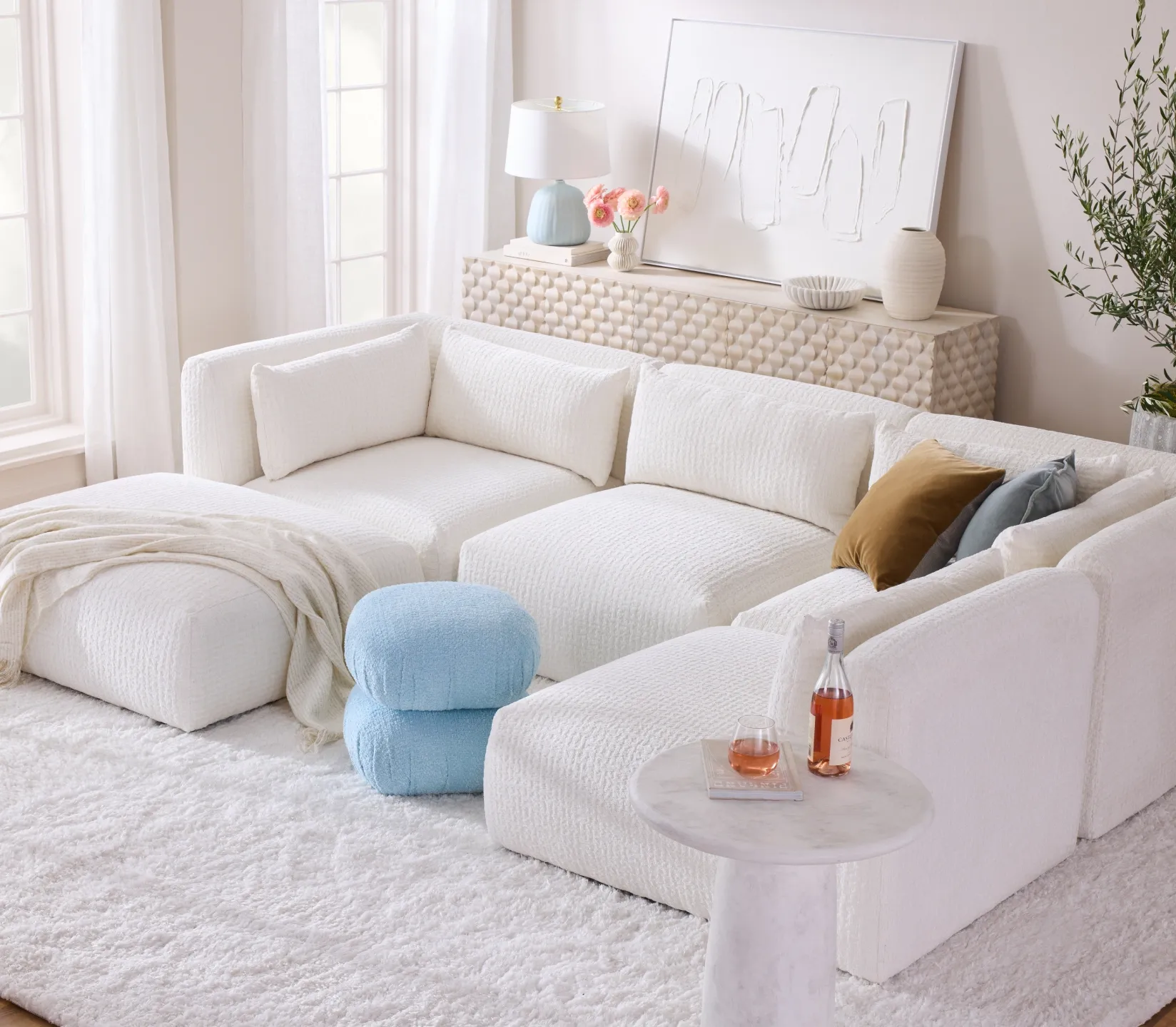
Thinking Small Spaces Can’t Be Stylish
Small rooms don’t have to feel cramped or overlooked. Clever design, smart storage and the right tile selection can make even tiny bathrooms or kitchens feel open and inviting. Bold colours, reflective surfaces, and multi-functional bathroom accessories help maximize style, personality and functionality. Small spaces can also pack a big design punch.
Avoiding these common interior design mistakes can save you time, money and stress while helping your home look its best. Small choices add up to big results.
Ready to refresh your space without the guesswork? Explore our range of tiles, flooring and design ideas at Tiletoria and see how simple changes can make a huge impact.
bathroom, blog, floors, how to articles, interior design tips, kitchen, trends, walls
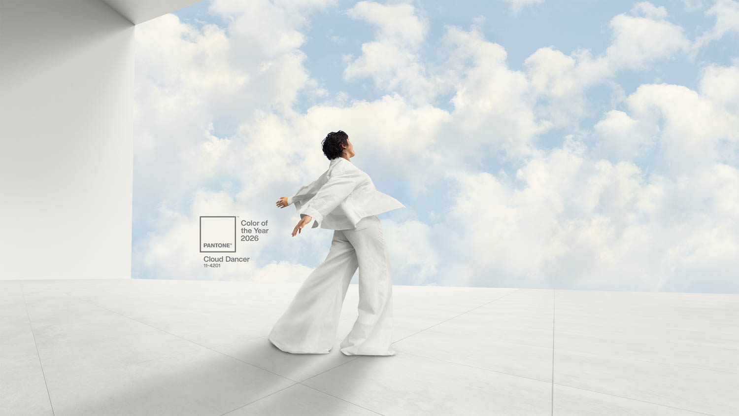
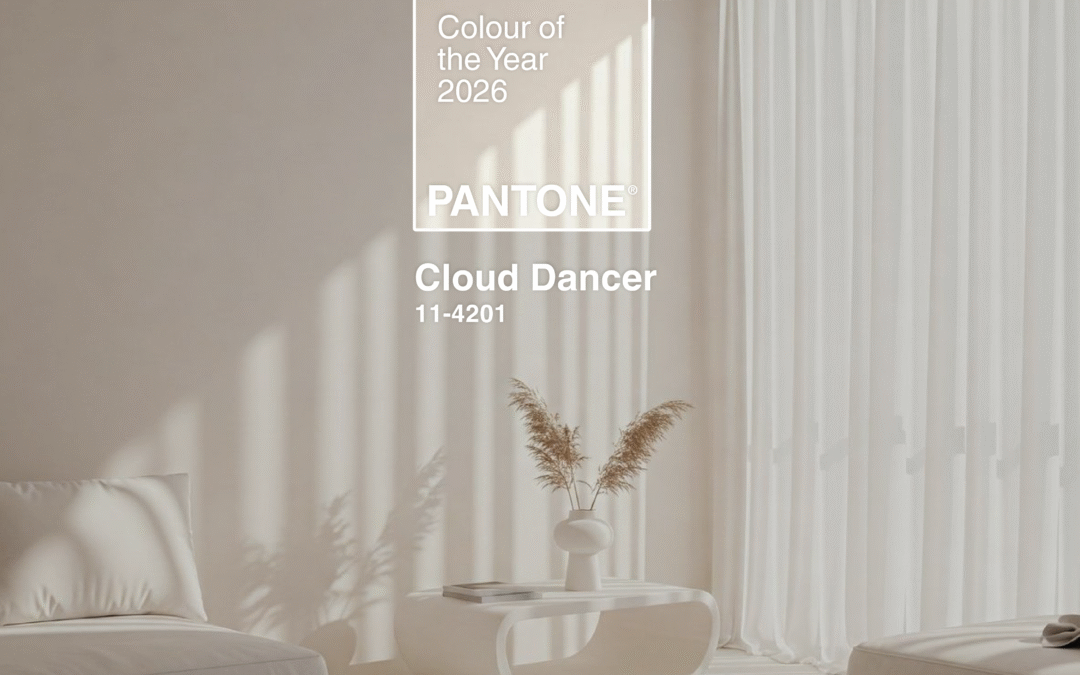
Pantone Colour of the Year 2026 Cloud Dancer is already making waves in the world of interior design for its soft, airy feel and effortless versatility. As homeowners and designers move toward calmer, more mindful spaces, Cloud Dancer stands out as the perfect shade to refresh interiors with clarity and warmth. This colour brings a unique blend of serenity and adaptability that fits beautifully into both homes and commercial projects, offering endless ways to elevate a space with a sense of calm and quiet sophistication.
(pantone.com)
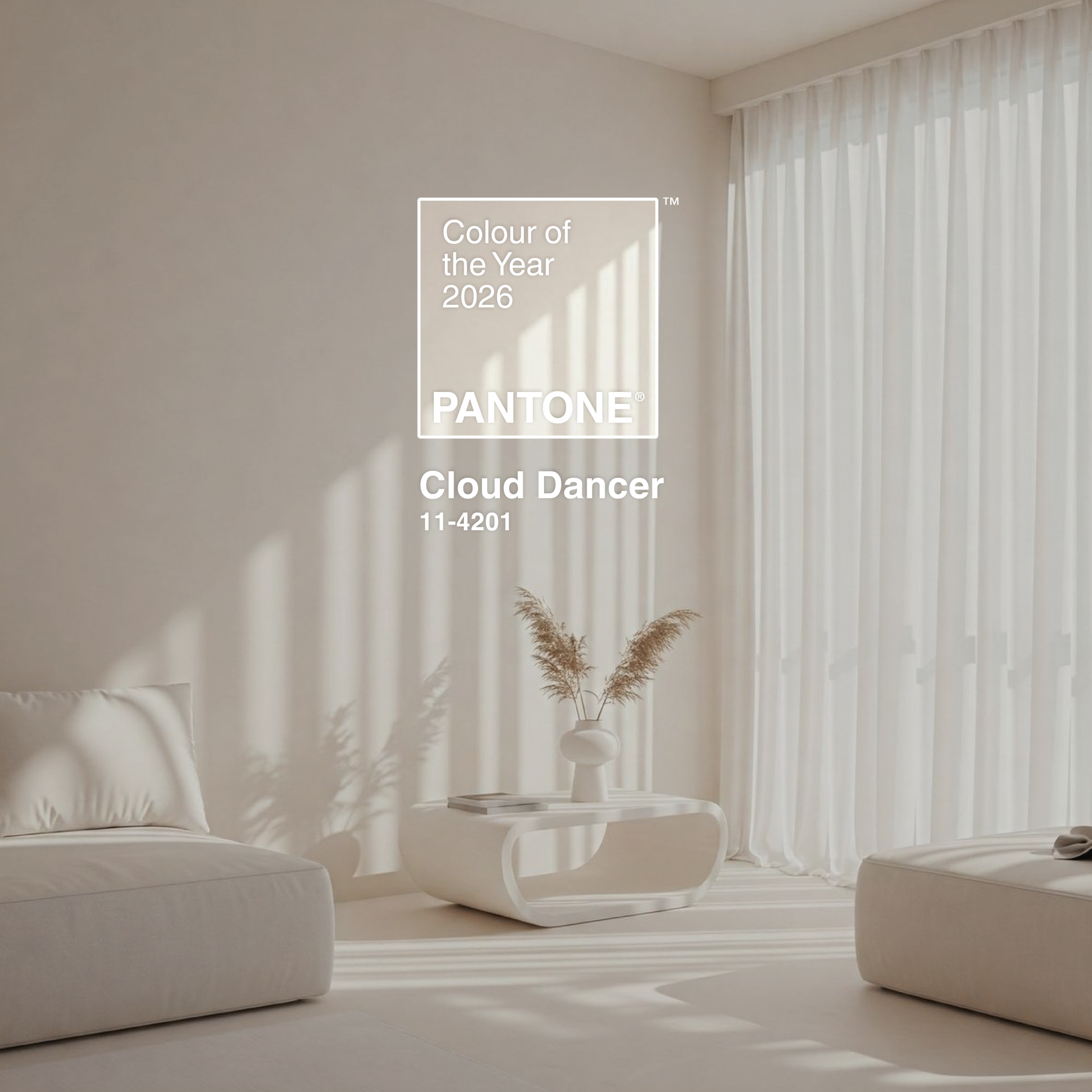
Table of Content:
The Meaning Behind Pantone Colour of the Year 2026 Cloud Dancer — A Whisper of Calm in a Busy World
Pantone Cloud Dancer Colour Palettes
How to Incorporate Pantone Colour of the Year 2026 Cloud Dancer Into Your Interior Design
Why Cloud Dancer Works So Well With Tiles
Pantone Colour of The Year 2026: A Colour for Every Style
The Meaning Behind Pantone Colour of the Year 2026 Cloud Dancer — A Whisper of Calm in a Busy World
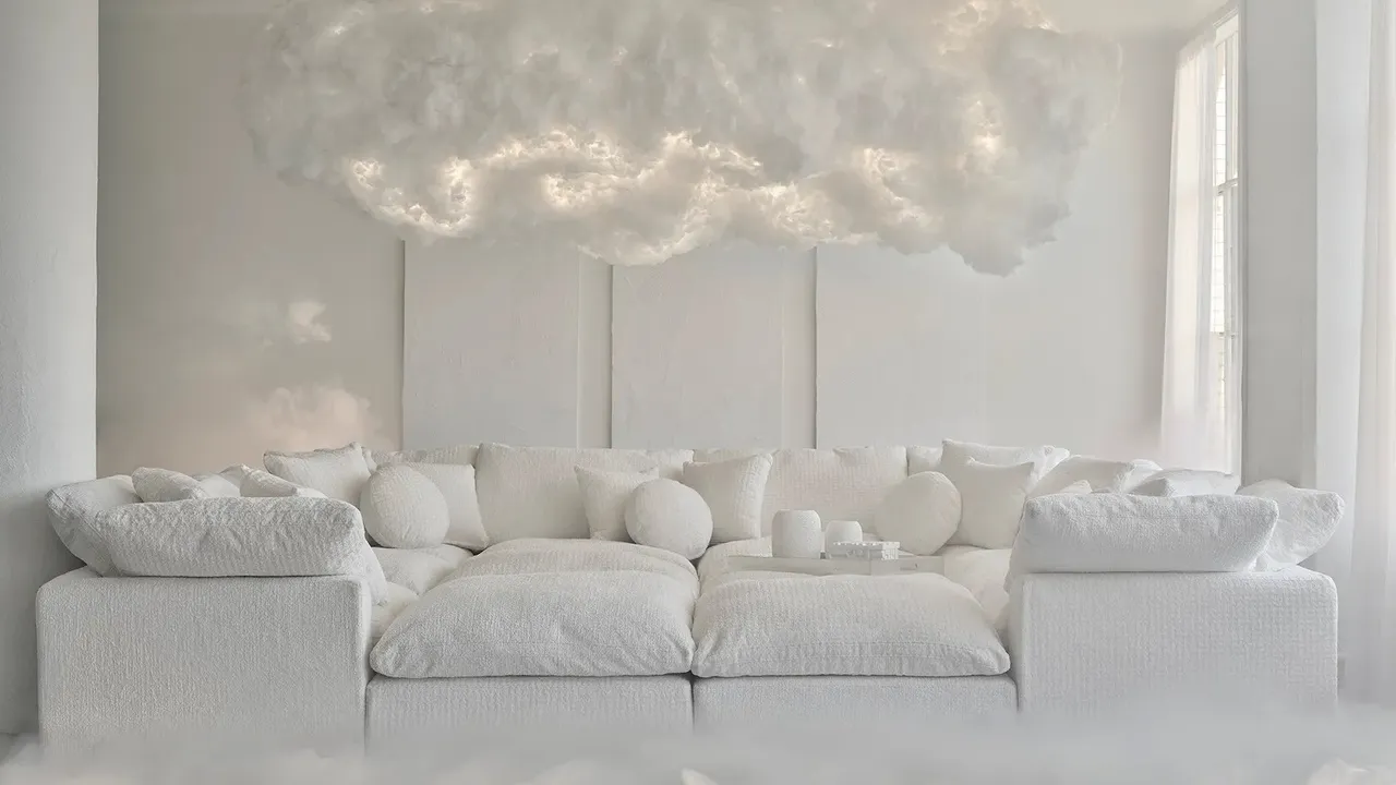
Pantone Colour of the Year 2026 Cloud Dancer brings a sense of stillness at a time when life feels fast and chaotic. This soft, airy white has a calming presence that helps you slow down, breathe and reconnect with your thoughts. It encourages true relaxation and gives your mind the space it needs for clarity and creativity.
Cloud Dancer naturally opens up a room, making it feel lighter, cleaner and more spacious. It has a gentle way of blending emotion with practicality, turning any interior into a peaceful retreat. Whether used across a whole room or as a supporting colour, it creates an uplifting environment that feels fresh and soothing.
(pantone.com)
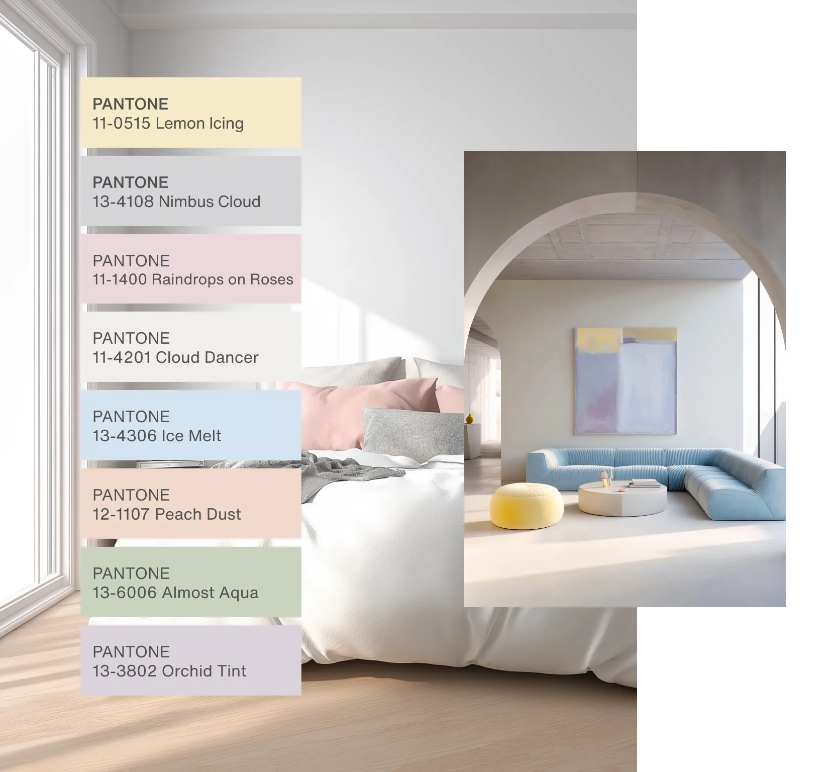
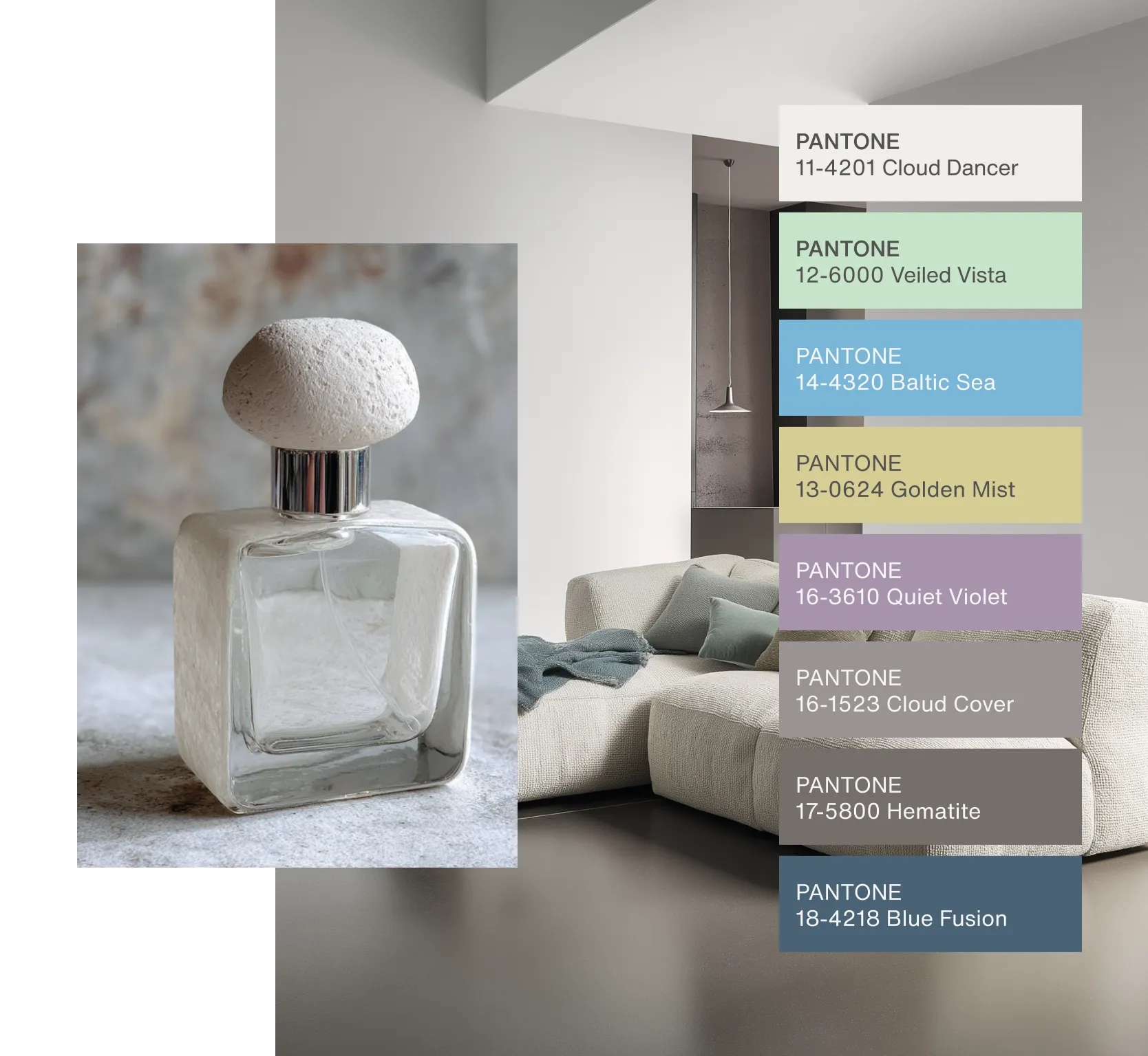
Pantone Cloud Dancer Colour Palettes
In a world where colour is deeply linked to self-expression Cloud Dancer earns its place as a versatile favourite. It adapts beautifully to different design styles, complements a range of palettes and can either stand alone or balance richer tones. Its soft brightness brings a sense of breathability to every room it touches.
Powdered Pastels
Cloud Dancer pairs effortlessly with light pastels and gentle neutrals. These combinations offer subtle shifts in tone that feel warm, refined and easy on the eye. If you want a calming look that still feels layered and interesting this palette is a great place to start.
Light & Shadow
For a more dramatic atmosphere Cloud Dancer works seamlessly with softened deep tones. When paired with charcoal, muted navy or earthy shadow shades the contrast feels harmonious rather than harsh. This light and dark balance adds depth without weighing a room down.
(pantone.com)
How to Incorporate Pantone Colour of the Year 2026 Cloud Dancer Into Your Interior Design
Cloud Dancer is as functional as it is beautiful, making it easy to introduce into your home whether you prefer minimalist style or warm, cosy design. Here are effortless ways to make it work in your space:
Cloud Dancer Walls for a Clean and Quiet Look
image credit: pantone.com
Painting walls in Cloud Dancer immediately brightens a room while keeping the atmosphere soft rather than stark. It creates a calm backdrop for furniture, décor and statement flooring, especially wood-look vinyl or natural stone tiles.
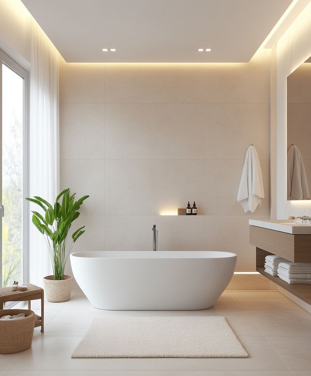
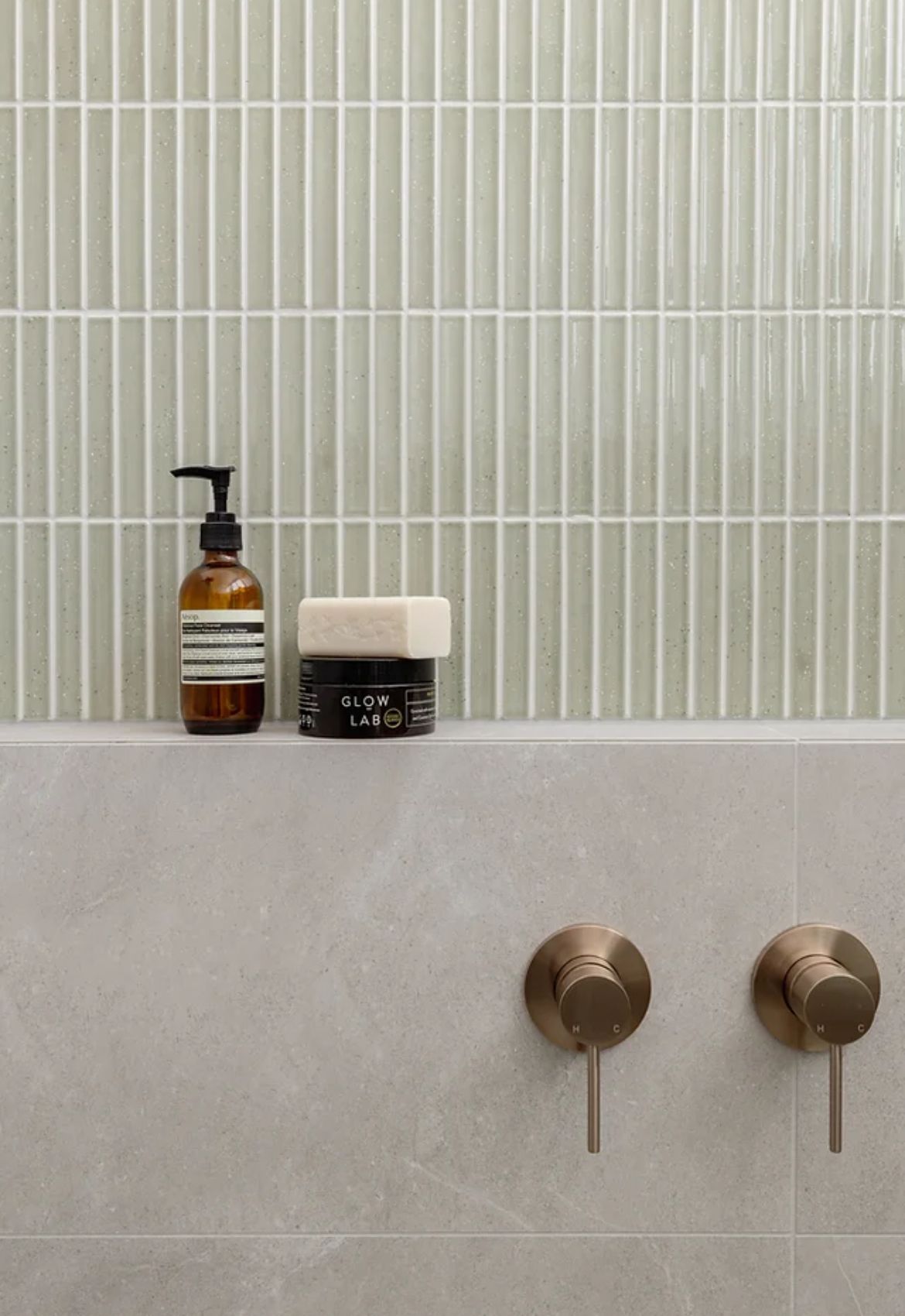
Use Cloud Dancer Tiles to Elevate Bathrooms and Kitchens
Soft white tiles are timeless and Cloud Dancer-inspired tones work especially well in bathrooms and kitchens where clean design matters most. Pair Cloud Dancer tiles with brushed brass taps, soft greys or pastel accents for a modern finish.
Pair With Warm Flooring for a Balanced Space
Because Cloud Dancer is airy and light it pairs beautifully with warm flooring such as oak-look laminate, textured vinyl or neutral large-format tiles. This combination creates warmth without losing brightness, making it ideal for living rooms and bedrooms.
Add Cloud Dancer Through Furniture and Soft Décor
If painting or tiling feels like too big a step try introducing the colour through fabrics, bedding, curtains, cabinetry or upholstered furniture. Its subtle warmth blends easily with any palette.
Contrast With Earthy, Bold or Moody Colours
To bring more personality into a room anchor Cloud Dancer with grounding tones like espresso, olive green, mauve or muted teal. These tones pair well with rich textured tiles and modern finishes.
Why Cloud Dancer Works So Well With Tiles
Tiletoria’s range of tiles makes it simple to enhance or contrast Cloud Dancer in any room.
Here’s why the pairing works:
Tiles add texture and depth to Cloud Dancer’s light and airy feel
Large-format tiles enhance Cloud Dancer’s spacious effect even further
Textured tiles create that sought-after soft shadowing that complements the colour palette
Natural stone looks pair beautifully with Cloud Dancer’s clean aesthetic
Whether you love subtle patterns or bold features, Cloud Dancer gives tiles the perfect calm backdrop to shine.
Pantone Colour of The Year 2026: A Colour for Every Style
Pantone Colour of the Year 2026 Cloud Dancer offers a rare blend of peace, versatility and sophistication. Whether you are refreshing a single room or planning a full renovation this gentle white will bring clarity and warmth into your space. Visit your nearest Tiletoria showroom to explore tiles, flooring and finishes that pair perfectly with Cloud Dancer and bring your vision to life.
bathroom, blog, floors, interior design tips, kitchen, outdoor, trends, walls
The top trend predictions for 2026 show a year of innovation, bold design choices and technology-driven functionality in interior design. From colours and textures to smart furnishings and eco-conscious choices, next year’s trends are all about balancing style, comfort and sustainability. Tiletoria’s wide range of tiles, flooring, kitchen and bathroom solutions makes it easy to bring these trends to life.
Table of Content:
AI Meets Sustainability for Smarter Spaces
Algorithmic Ergonomics for Healthier Furniture
Digital Art and Flexible Displays
AI-Powered Indoor Gardens
Fat Furniture: Comfort Becomes Statement
Modular and Hybrid Lighting Systems
Lived-In, Layered Interiors
Large-Format and Textured Tiles
Colour Forecasts: Warm, Bold and Unexpected
Let the Trends Inspire Your 2026 Projects
AI Meets Sustainability for Smarter Spaces
One of the most exciting trend predictions for 2026 is the union of AI and sustainability. Future homes will feature systems that adjust lighting, temperature, materials and décor in real time, creating spaces that feel emotionally satisfying, environmentally conscious and visually appealing.
decorilla.com
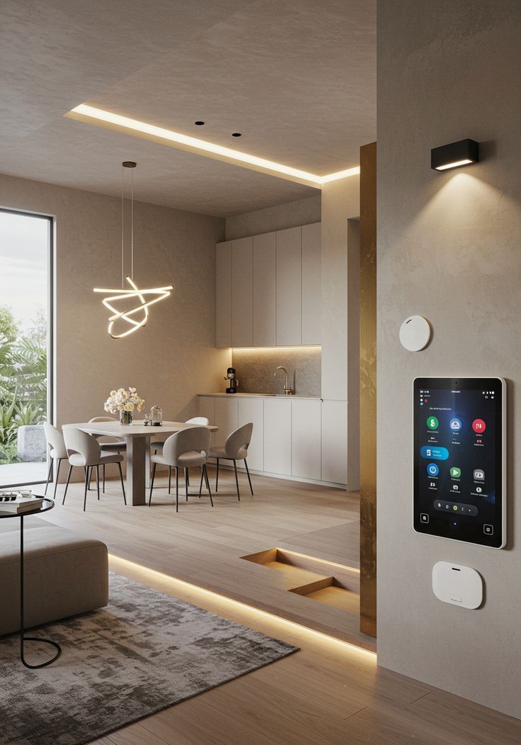
Using sustainable materials like porcelain and ceramic tiles, combined with energy-efficient flooring and eco-friendly wall coverings, helps reduce waste, optimise energy usage and enhance comfort — all while keeping interiors stylish.
Algorithmic Ergonomics for Healthier Furniture
Another standout trend predictions for 2026 is data-driven furniture design. Algorithmic ergonomics analyses body posture and pressure points to create chairs and sofas that support your spine and limbs naturally.
decorilla.com
In 2026, furniture complements flooring, wall tiles and cabinetry to create cohesive interiors. Think slip-resistant floor tiles paired with ergonomic seating in kitchens, living rooms or commercial spaces for the ultimate blend of comfort and functionality.
Digital Art and Flexible Displays
Dynamic, digital displays are replacing static artwork in 2026. Think paper-thin OLED panels featuring AI-generated visuals that shift throughout the day. From evolving murals to fully customizable displays, digital art brings motion, colour and creativity into your home, letting each space feel unique and interactive.
decorilla.com
These displays pair beautifully with statement wall tiles, whether it’s bold patterned backsplash tiles in the kitchen or textured feature walls in living areas. Digital art and modern tiles together allow you to customize each space with style and personality.
AI-Powered Indoor Gardens
Compact, tech-enabled indoor gardens are another one of our top trend predictions for 2026. Sleek wall panels or bookshelf-sized units with hydroponic systems and AI-timed LEDs let you grow herbs and microgreens even in small apartments.These gardens combine practicality, sustainability and beauty, making them perfect for modern interiors or rental spaces.
decorilla.com
Combine these indoor garden spaces with durable tiles or decor tiles to create functional, stylish and sustainable interiors. Minimalist and sculptural, these gardens fit perfectly alongside modern, low-maintenance tiles in both residential and rental properties.
Fat Furniture: Comfort Becomes Statement
Oversized seating and bold sofas will dominate 2026 interiors. These sculptural yet functional pieces serve as room focal points while providing ultimate comfort. Soft accessories and thoughtful placement allow “fat furniture” to anchor living spaces and create a cozy yet stylish atmosphere.
decorilla.com
Pair fat furniture with large-format floor tiles to make living rooms, dining areas or lounges feel open, inviting and practical. Add patterned tiles for walls or statement splashbacks in kitchens to tie the look together seamlessly.
Modular and Hybrid Lighting Systems
Lighting in 2026 is more versatile than ever. Modular fixtures let you configure combinations of glass, metal and fabric components to suit different moods. These systems can switch between task lighting, ambient diffusion or statement pieces, offering both practicality and visual interest.
decorilla.com
These systems highlight feature walls, backsplashes or textured tiles, allowing tiles to catch the light beautifully. Modular lighting works especially well in kitchens, bathrooms and workspaces where both aesthetics and functionality are essential.
Lived-In, Layered Interiors
Homes in 2026 will celebrate a “lived-in” aesthetic that feels cozy, personal and authentic. Imperfections, gentle clutter and layered décor pieces create interiors that tell a story and feel welcoming. This trend moves away from overly sterile spaces and embraces comfort, personality and warmth.
vogue.co.uk
Combine these interiors with textured tiles and warm laminate or vinyl flooring to balance practicality with style. Using durable tiles in high-traffic areas ensures longevity while keeping the space casual, collected and inviting.
Large-Format and Textured Tiles
Floor and wall tiles remain a major player in home design. Large-format tiles expand spaces visually, while textured and patterned options add depth and tactile interest.
Expect a mix of bold colours, natural finishes and geometric layouts to define kitchens, bathrooms and living areas. Layer in geometric patterns, statement splashbacks or Zellige-style tiles to stay on-trend in 2026.
Colour Forecasts: Warm, Bold and Unexpected
housebeautiful.com
Olive Green
Olive green is set to be a dominant colour in 2026. This earthy shade adds a calming and natural feel to interiors, working perfectly on walls, cabinetry and accent tiles. It pairs beautifully with both warm neutrals and bold contrasts. Pair olive green with neutral tiles or wood-look flooring to create a balanced, modern and inviting space.
Espresso Brown
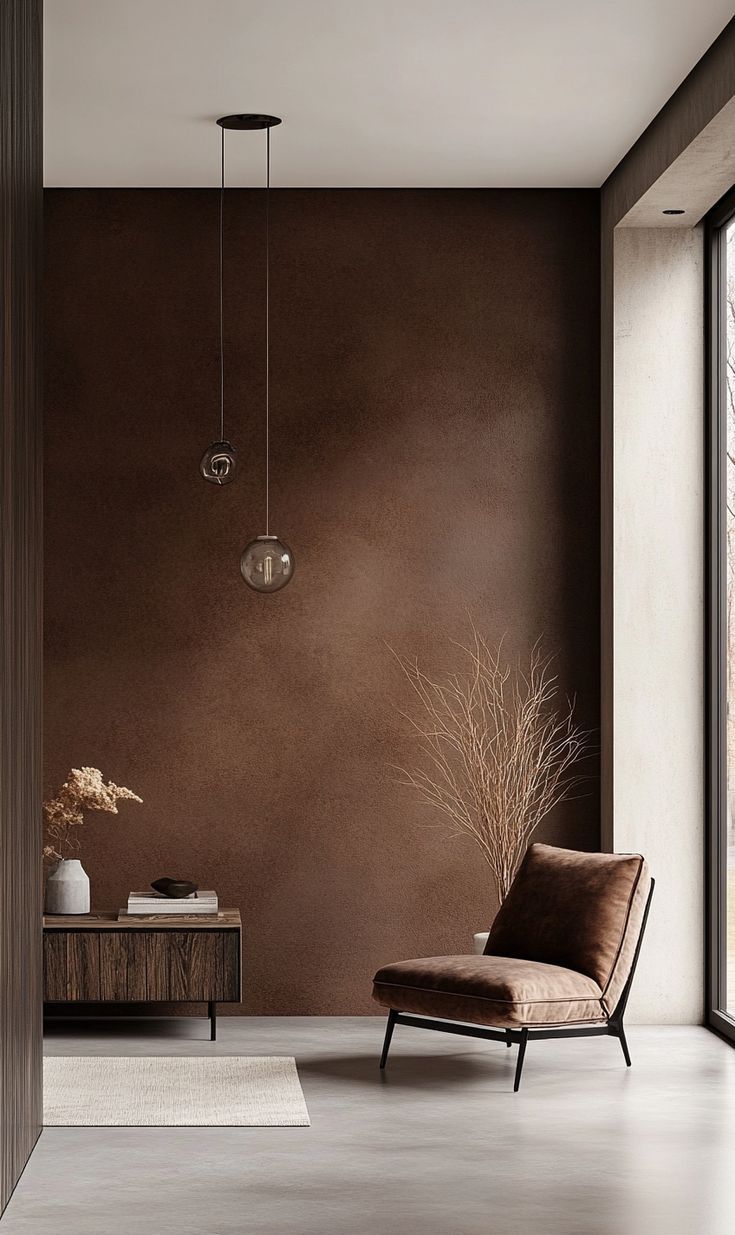
Espresso brown brings depth and sophistication to any space. Ideal for flooring, furniture or feature walls, this rich tone adds a grounded and timeless touch while complementing lighter shades.
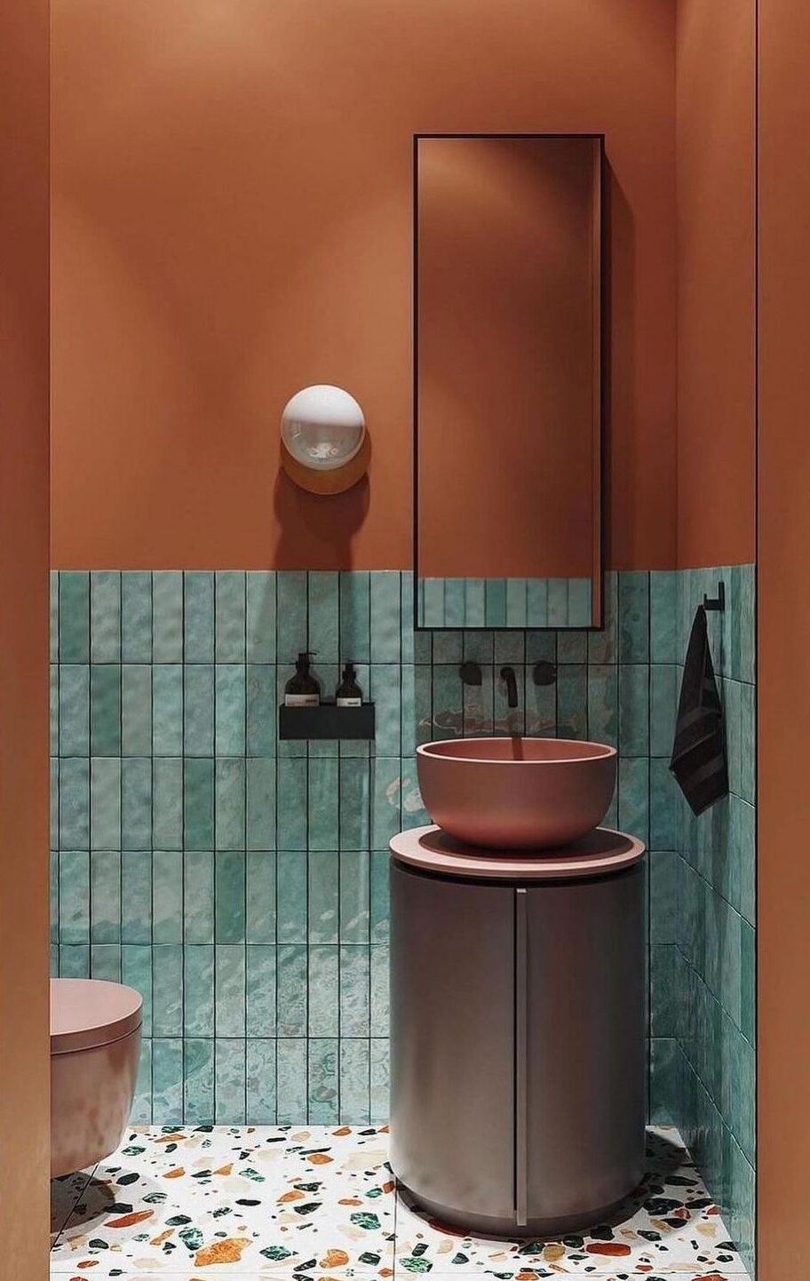
Aubergine
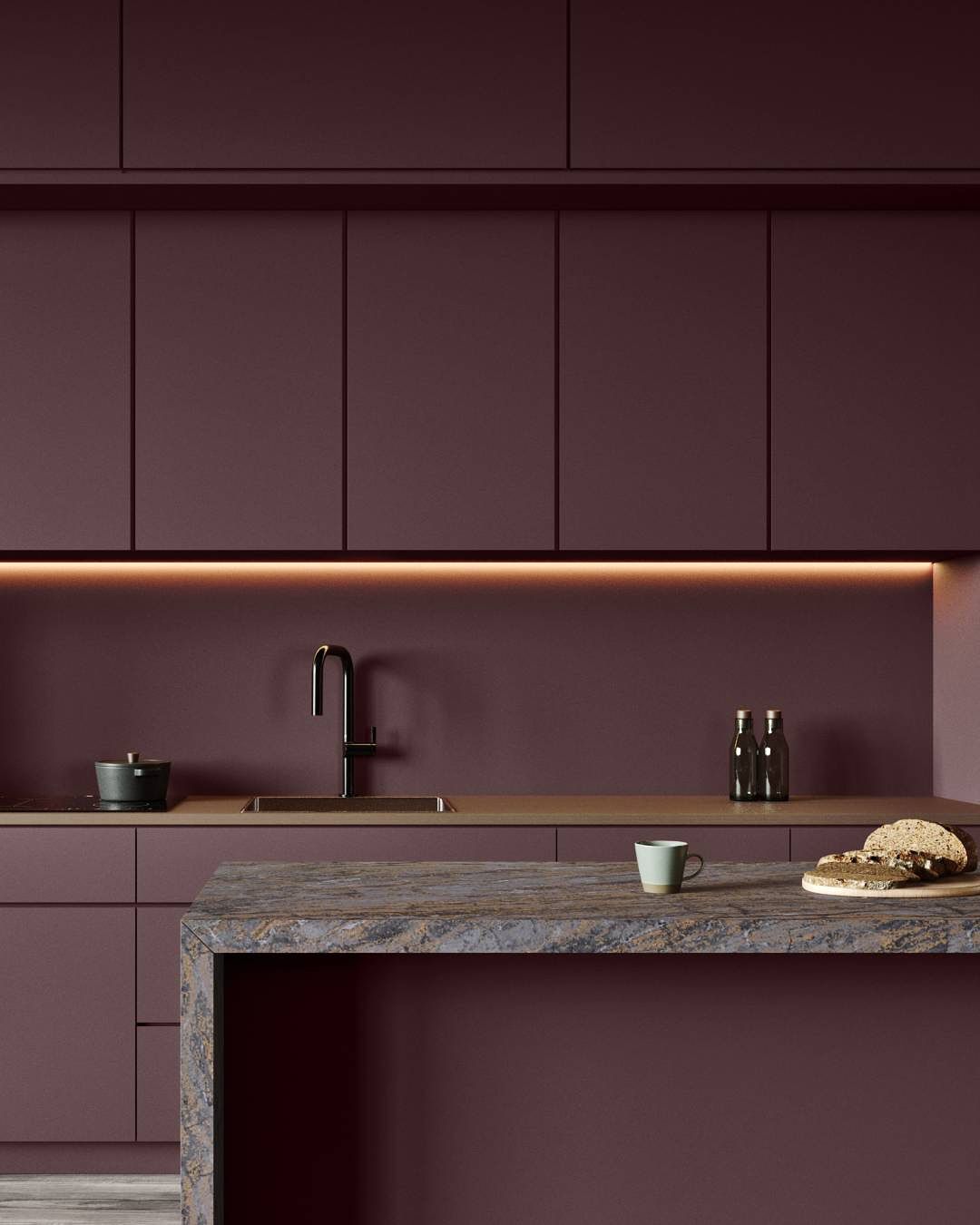
Aubergine is a bold choice that creates drama and elegance. Perfect for statement walls, tiles or décor pieces, this deep purple hue adds personality without overwhelming the room.
Pink-Toned Neutrals
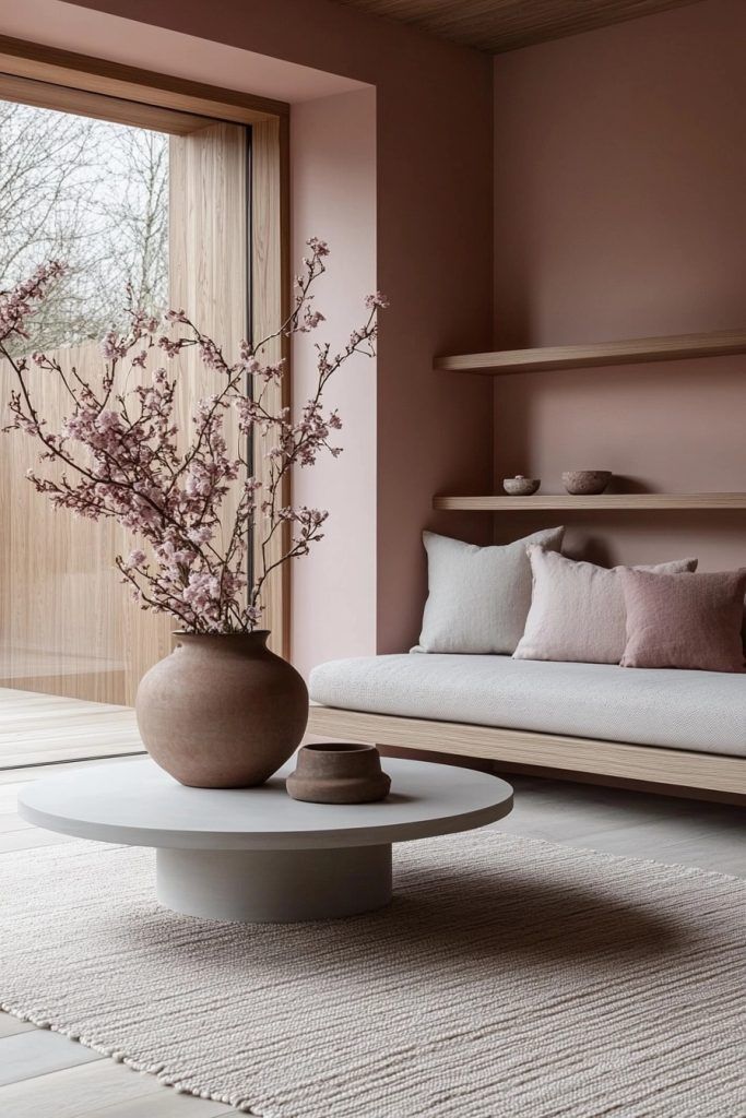
Soft pink-toned neutrals are gaining popularity for their ability to create warmth and subtle sophistication. Use these shades on walls, textiles or cabinetry to add a gentle, inviting glow to interiors.
Green-Blue Shades
Green-blue tones bring a fresh, modern energy to 2026 interiors. These shades are ideal for tiles, decorative accents or statement furniture, adding a vibrant yet calming vibe to living spaces.
Let the Top Trend Predictions For 2026 Inspire Your Next Project
The top trend predictions for 2026 combine bold aesthetics, smart technology, comfort and sustainability. From algorithmic furniture to AI-powered gardens and statement colours, there’s something to inspire every project. Which trend will you incorporate in your home or commercial space this year? Visit your nearest Tiletoria showroom to explore tiles, finishes and design inspiration that will bring these 2026 trends to life.
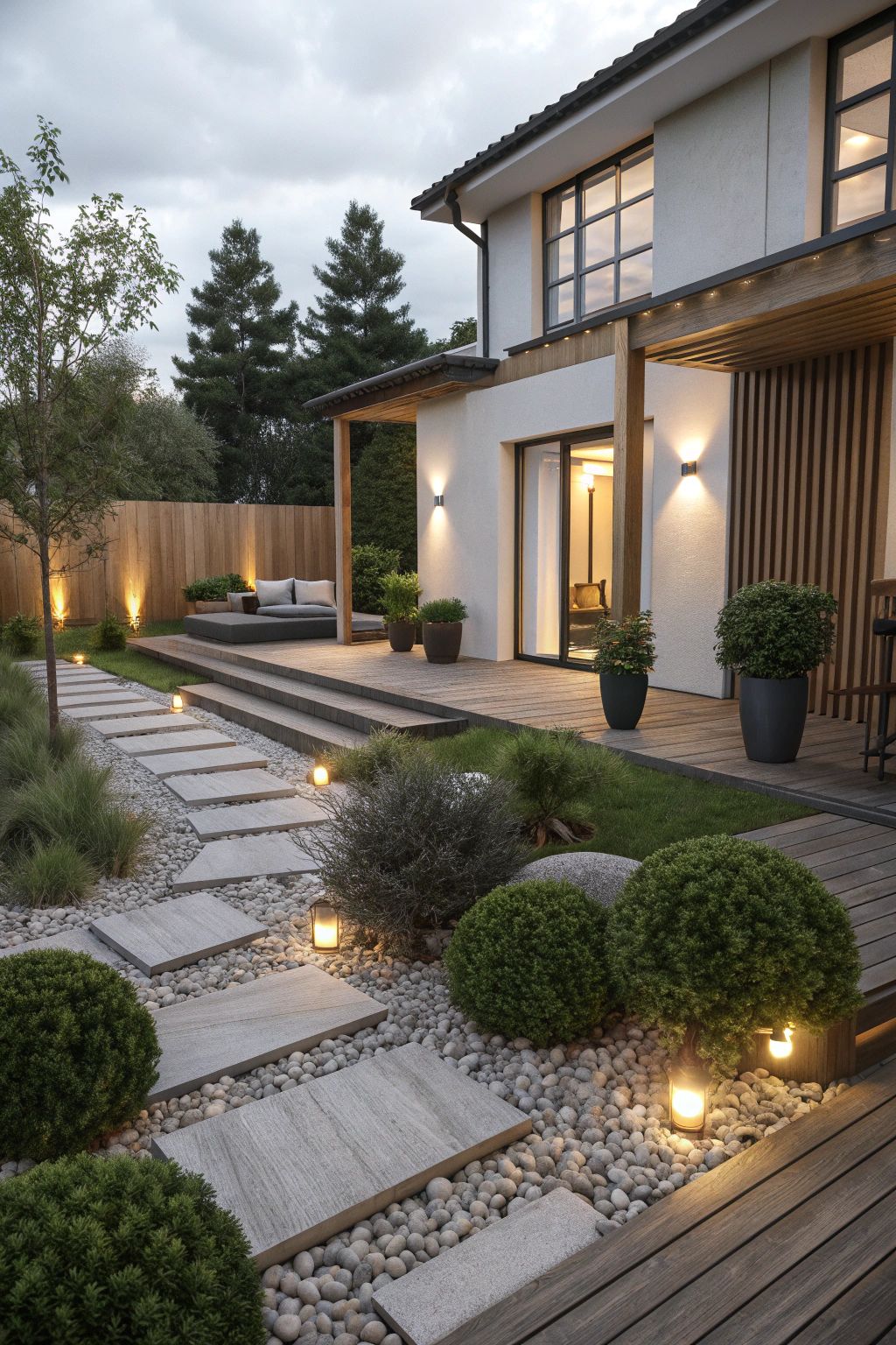
bathroom, blog, floors, interior design tips, kitchen, outdoor, renovation tips, walls
Summer renovation ideas are the perfect place to start if you want to refresh your home this holiday season. With longer days and warmer weather, it becomes easier to tackle projects that brighten indoor and outdoor spaces. From upgrading your garden and pool area to refreshing kitchens and bathrooms, these ideas can elevate your home and make it feel ready for summer hosting.
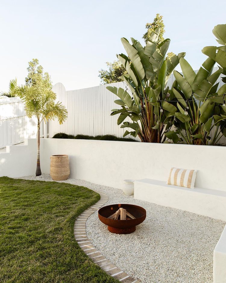
Table of Content:
Summer Renovation Ideas for Outdoor Spaces
Pool Renovations for the Summer Holidays
Creating Indoor-Outdoor Flow
Kitchen Updates Inspired by Summer Renovation Ideas
Brighten Your Bathroom for a Fresh Summer Feel
Summer Renovation Ideas: Flooring Upgrades
Summer Renovation Ideas for Outdoor Spaces
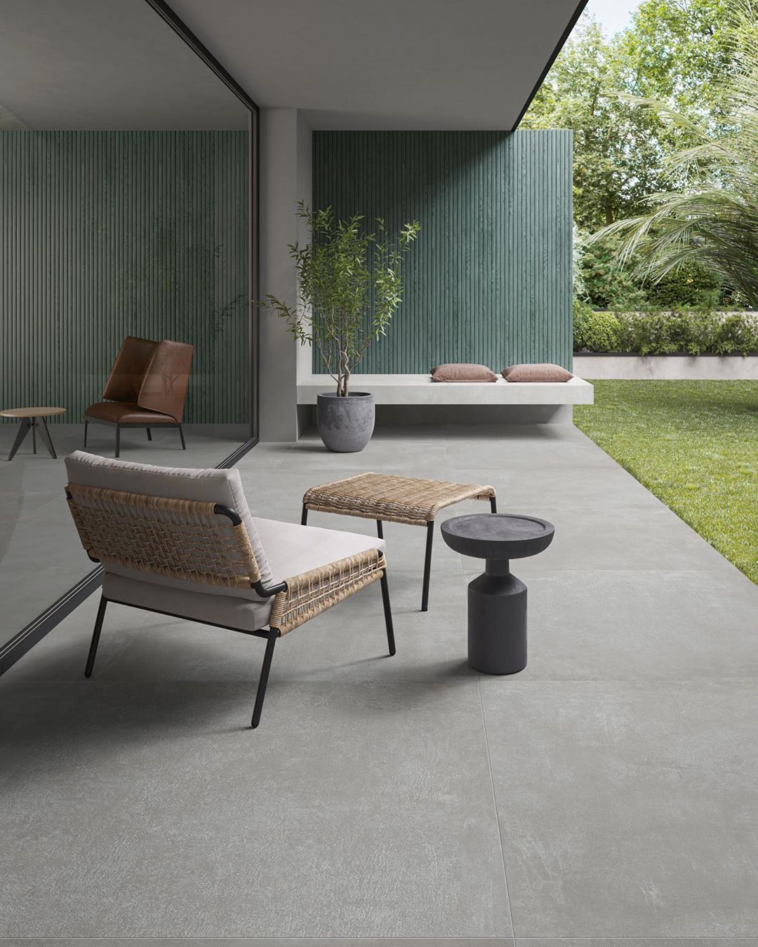
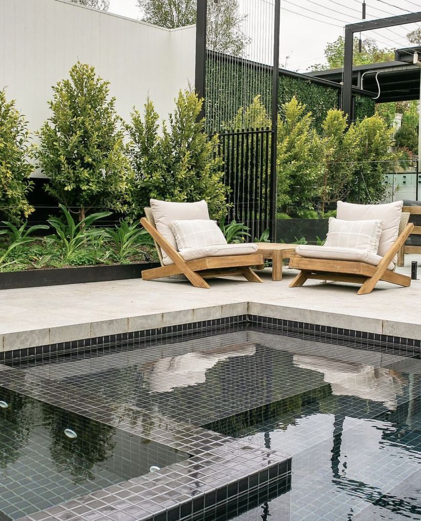
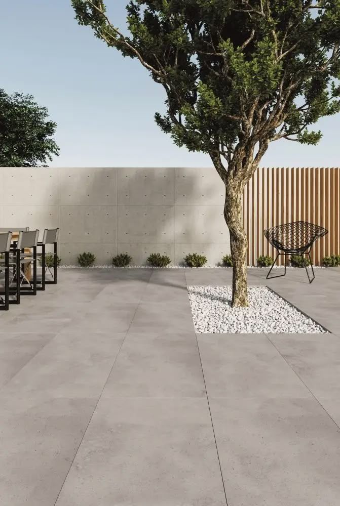
Outdoor spaces are often the heart of summer living, so giving them a seasonal upgrade can completely transform your home. Start by looking at your flooring. Large-format outdoor tiles create a clean, modern look that instantly expands your patio or entertainment area. These tiles have fewer grout lines, which means easier maintenance and a seamless visual flow. For added safety during the summer months, slip resistant tiles for outdoor use are a smart choice, especially around braai areas and walkways where the ground often gets wet.
You can also update outdoor seating areas with weather-friendly furniture, soft lighting or a fresh coat of paint on exterior walls. Adding greenery like potted plants or a herb garden brings life and texture to your space without overwhelming it.
Pool Renovations for the Summer Holidays
A sparkling pool is a must-have during the festive season, and mosaic swimming pool tiles can make a huge difference in the overall look. These tiles are durable, easy to clean and reflect light beautifully, giving your pool water that bright summer sparkle.
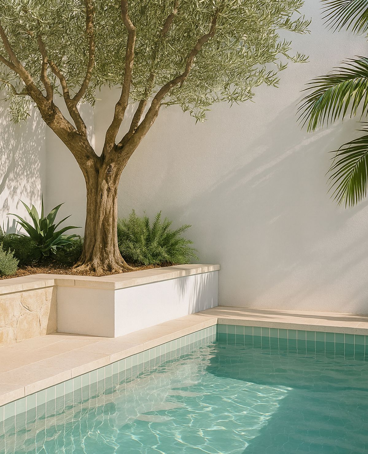
Choose shades of aqua, navy or turquoise for a fresh coastal feel. If you prefer something more modern, darker tones like charcoal blue create the illusion of depth and sophistication. Pair your pool tiles with slip-resistant outdoor tiles around the pool deck for safety and style.
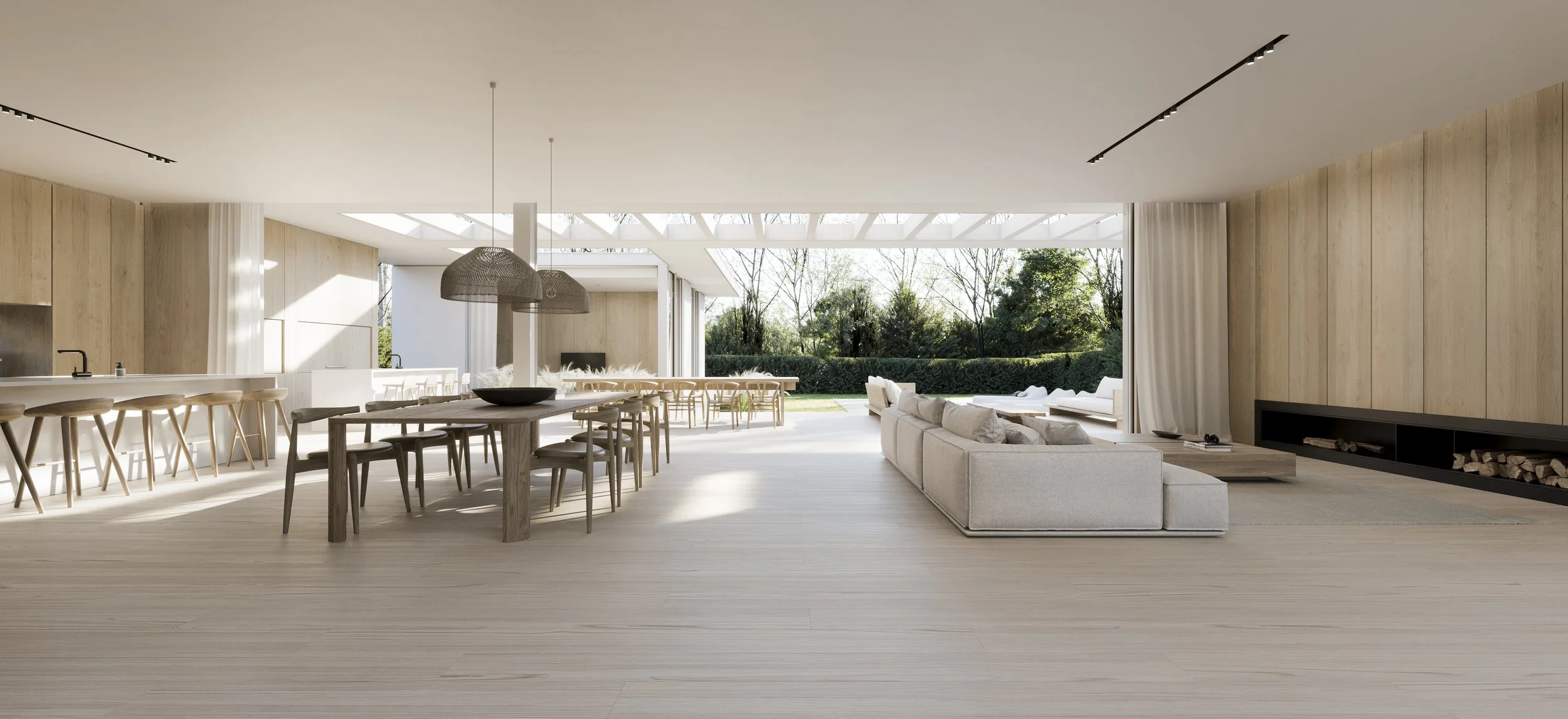
Creating Indoor-Outdoor Flow
Improving the connection between your indoor and outdoor spaces is one of the most effective summer renovation ideas. You can achieve this by choosing similar colours or finishes for both areas. For example, using stone-look tiles inside and outside creates a smooth transition that feels airy and cohesive.
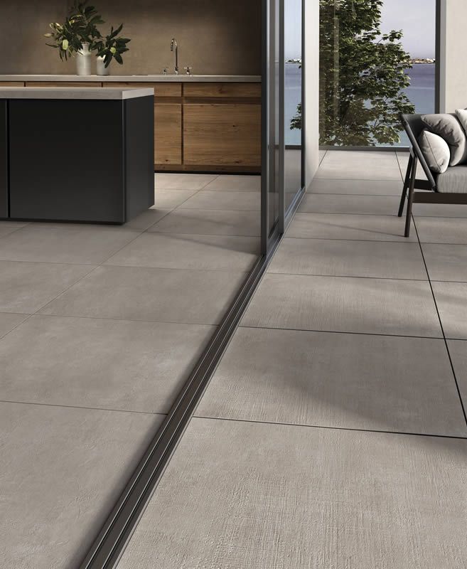
Open up living areas with stack doors or wide windows to let in natural light. Lighter wall colours, textured rugs and neutral furniture also help create a breezy summer atmosphere indoors.
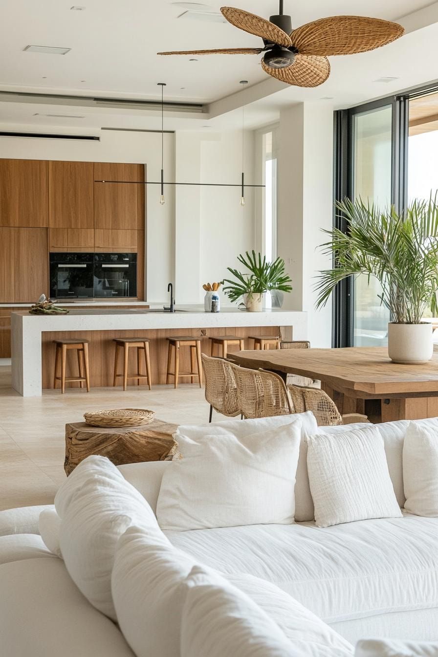
Kitchen Updates Inspired by Summer Renovation Ideas
The kitchen is often a busy space during the festive season. A few simple upgrades can make it more inviting for cooking and hosting. Consider replacing old splashbacks with fresh subway tiles or textured décor tiles for a modern touch that is easy to clean.
Natural materials like wood, stone or warm neutrals help create a relaxed summer feeling. If you want to go a step further, install new kitchen taps or add open shelving to display glassware or festive décor.
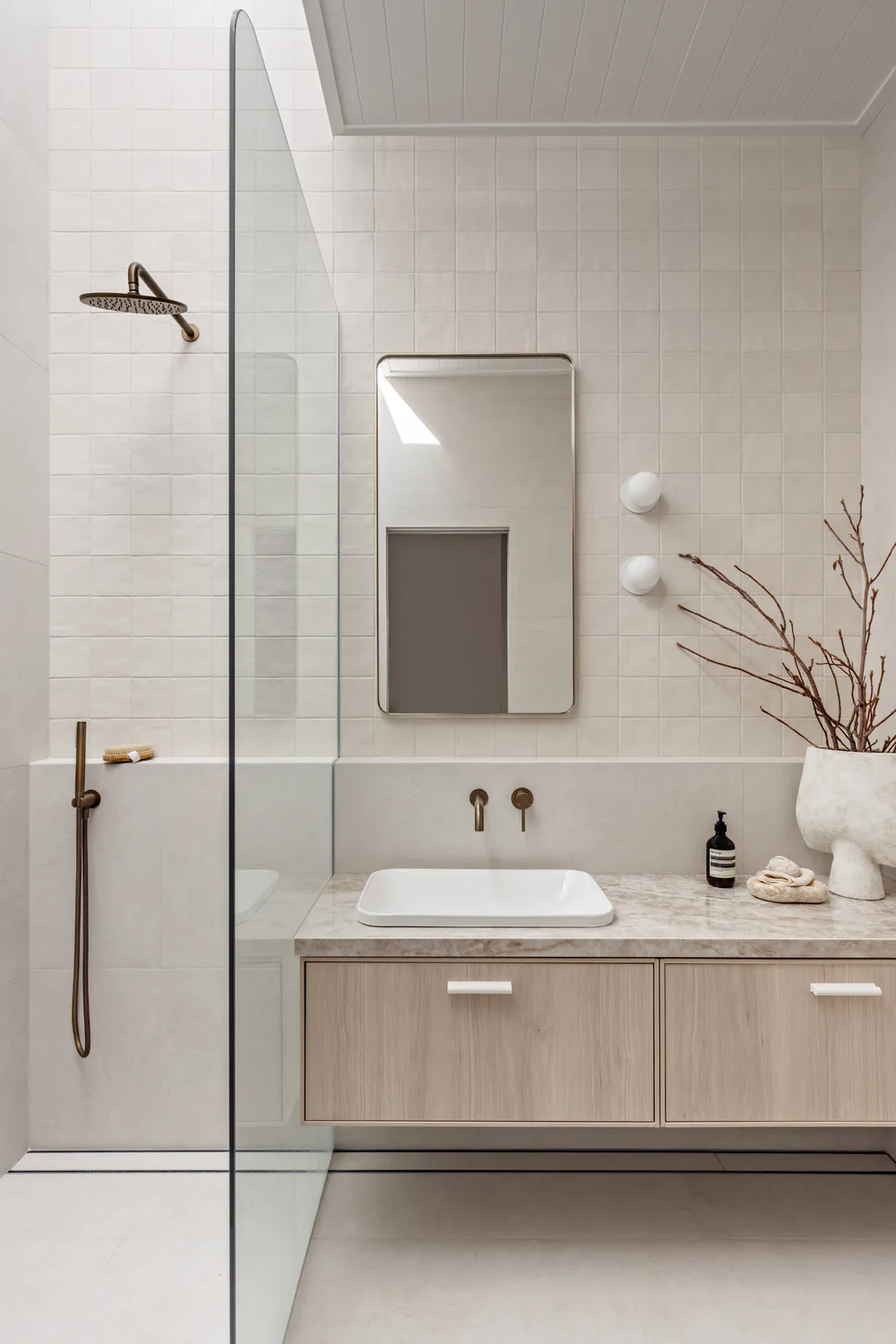
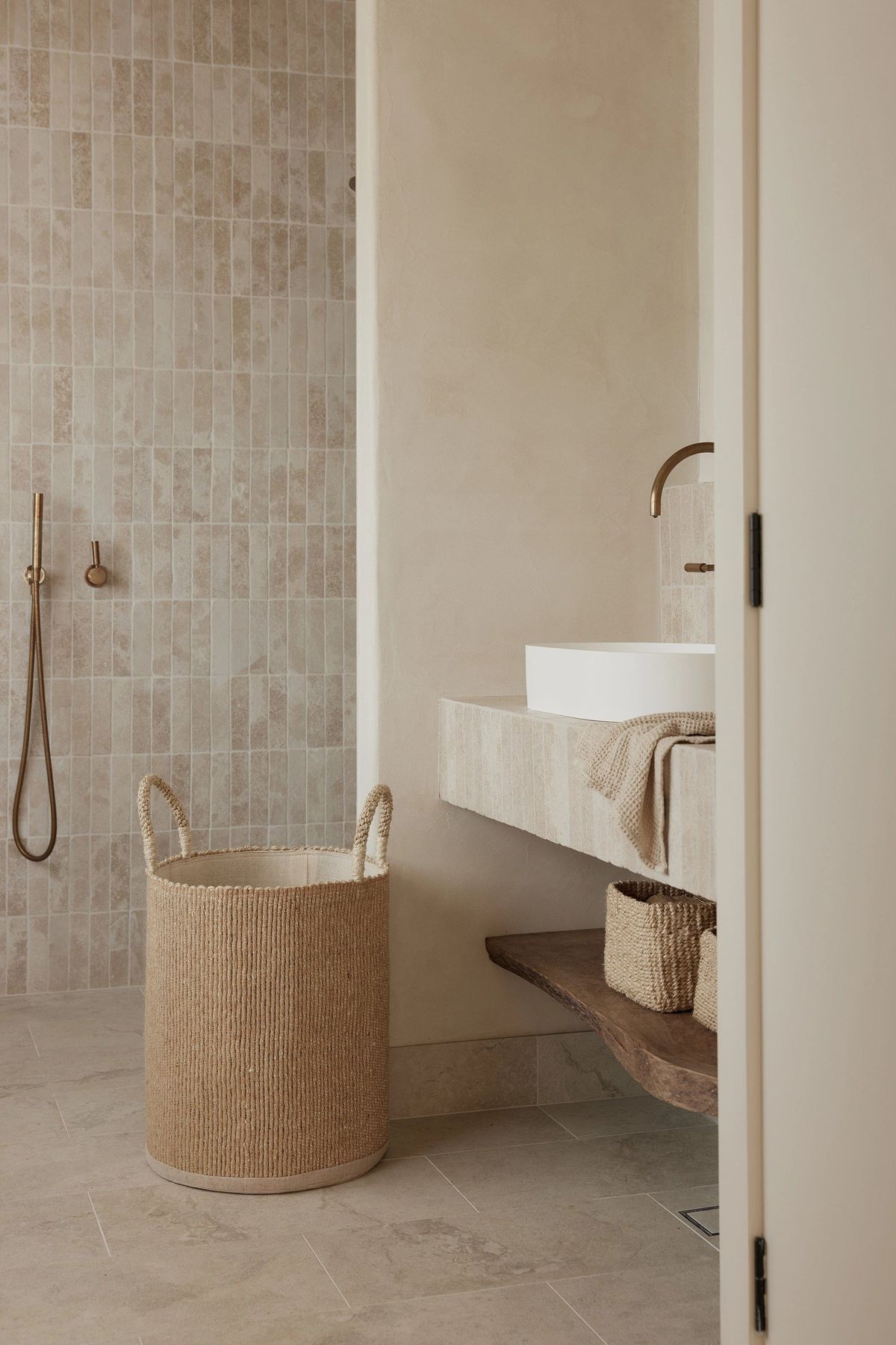
Brighten Your Bathroom for a Fresh Summer Feel
Bathrooms can feel much lighter with just a few seasonal changes. Fresh tiles in soft neutrals or subtle patterns can open up the space and make it feel more summery. Marble-look wall tiles create brightness and elegance while still being practical.
A new vanity, updated tapware or simple accessories like woven baskets or greenery can give your bathroom a homey feel. These small touches make a big impact when guests visit during the holidays.
Summer Renovation Ideas: Flooring Upgrades
Flooring upgrades are another great way to give your home a fresh start. Large-format floor tiles, vinyl flooring or laminate flooring can transform a room quickly and with minimal disruption. Lighter shades help keep spaces cool and bright, which is ideal for summer.
These options are durable, easy to maintain and perfect for high-traffic areas like living rooms or entrance halls during the holiday season.
Making changes during the warmer months can completely elevate your home and set the perfect tone for hosting family and friends. Whether you focus on outdoor tiles, pool mosaics or simple indoor upgrades, these summer renovation ideas can help create a home that feels fresh, welcoming and ready for festive living.
bathroom, blog, floors, interior design tips, kitchen, walls
Holiday home inspiration is all about turning your home into a warm, welcoming space for Christmas without feeling cluttered or overdone. By focusing on thoughtful colour choices, natural elements and room-specific décor, you can create a festive atmosphere that feels cohesive and stylish from the kitchen to the living room.
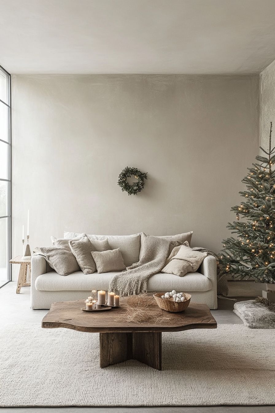
Table of Content:
Creating a Cohesive Look with a Unified Colour Palette
Incorporating Nature and Natural Elements
Holiday Decorating Ideas for the Kitchen
Dining Room Holiday Inspiration
Living Room Holiday Décor Ideas
Adding Festive Touches to the Bathroom
Creating a Cohesive Look with a Unified Colour Palette
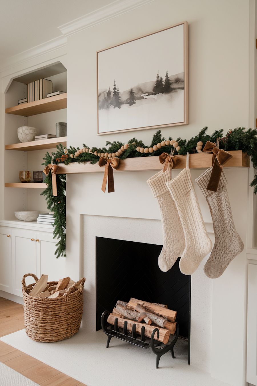
A unified colour palette is key to achieving holiday home inspiration that feels intentional. Choose two or three primary colours and use them consistently across rooms.
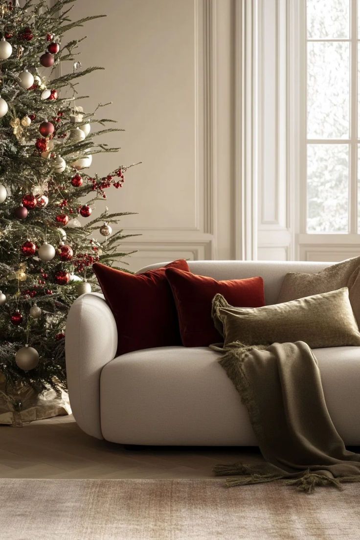
Classic Christmas tones like deep greens, rich reds and soft golds work beautifully, but muted shades like sage, cream and warm neutrals can create a modern and serene festive vibe.
Layer in accents like cushions, throws or table runners in coordinating shades to tie the whole look together.
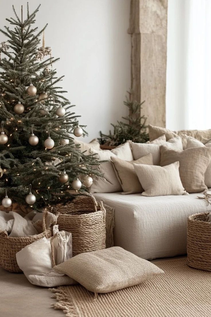
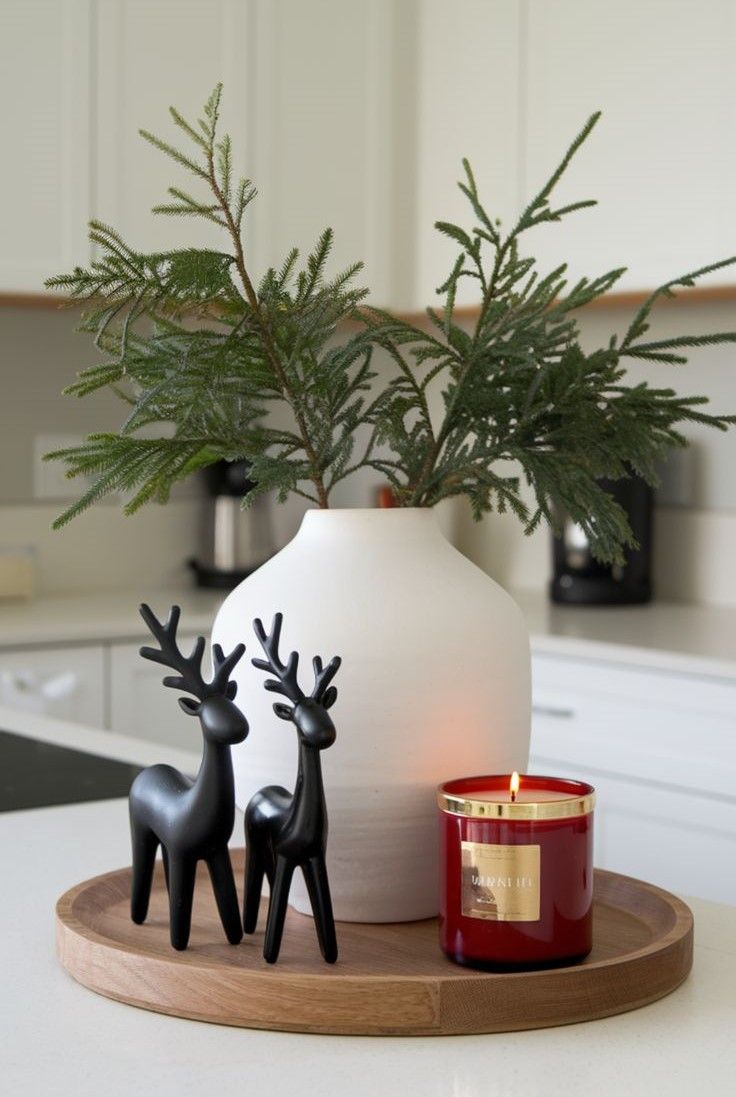
Incorporating Nature and Natural Elements
Natural elements bring warmth and texture to your holiday home. Think fresh pine garlands, eucalyptus branches, or dried orange slices for subtle decoration.
Wooden accents, wicker baskets and stone-look tiles can add depth and interest while keeping the overall style grounded.
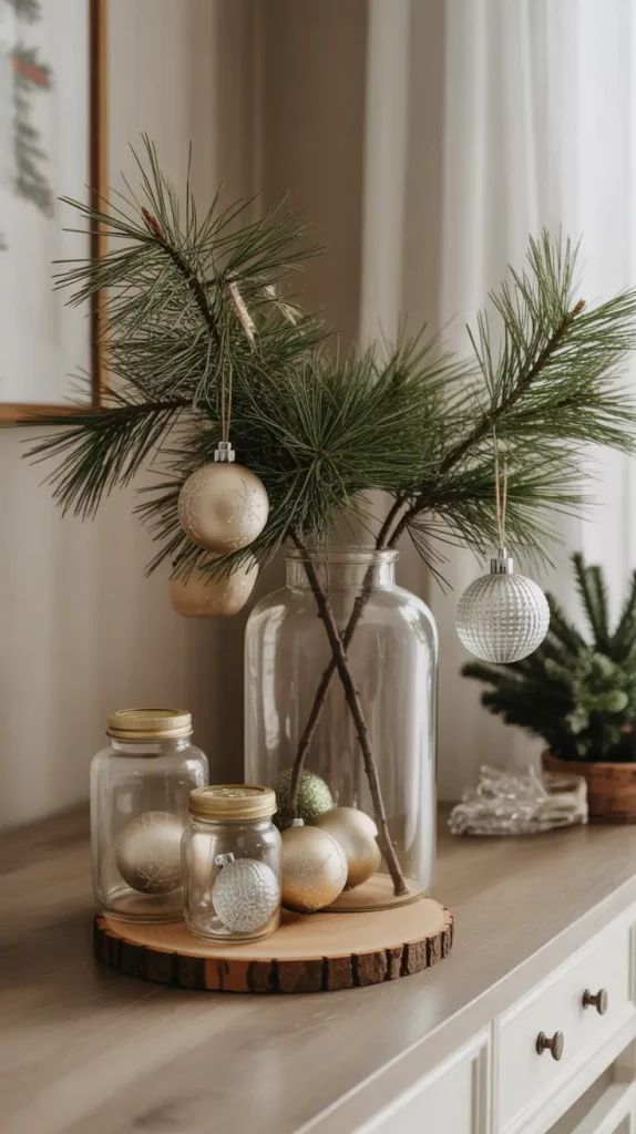
Nature-inspired décor not only enhances your festive look but also makes your home feel inviting and relaxed.
Holiday Decorating Ideas for the Kitchen
The kitchen is often the heart of holiday gatherings, so it’s a perfect place to focus your festive energy.
Add a small garland along the countertop or hang wreaths on cabinet doors.
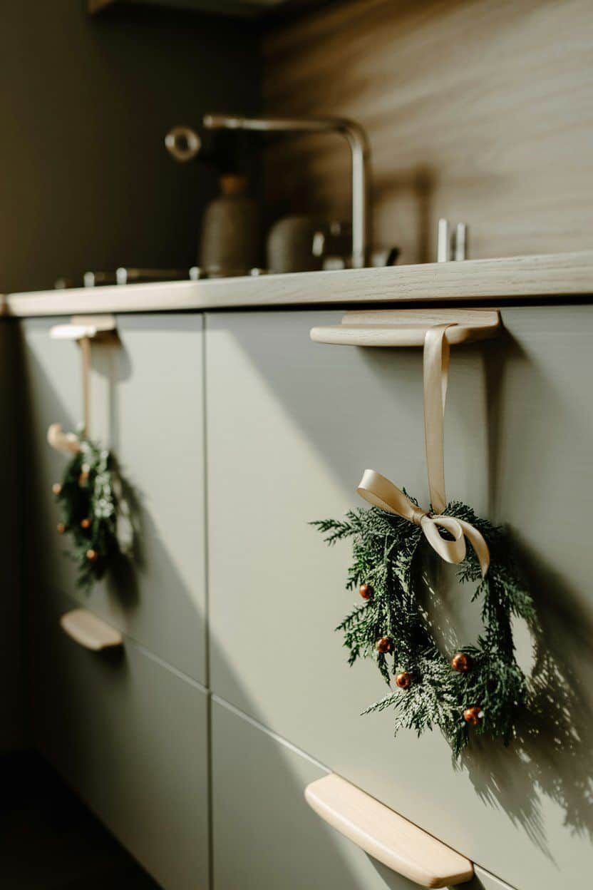
Incorporate natural elements like pinecones or small potted herbs for a seasonal touch.
Even your tableware can reflect your colour palette with festive placemats, napkins or mugs to create a cohesive and cheerful space.
Dining Room Holiday Inspiration
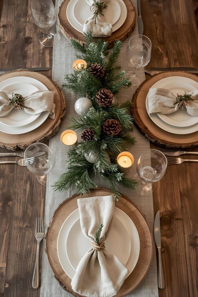
The dining room is where friends and family come together, so make it festive yet functional. Use your colour palette for table runners, candles and centrepieces. A mix of textures, such as linen napkins, wooden serving boards and metallic accents, can elevate the space. Don’t forget to incorporate nature with greenery or a small festive tree to add life and warmth to the room.
Living Room Holiday Décor Ideas
The living room is often the showpiece for your holiday home inspiration.
Focus on layers and textures with throws, cushions and rugs that match your chosen palette.
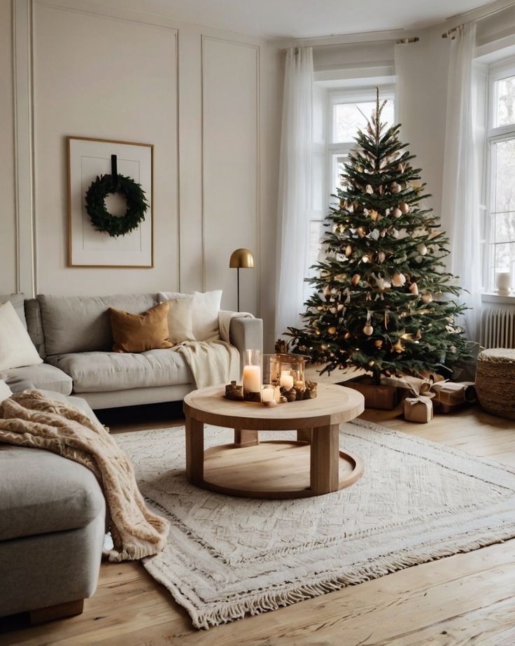
Add seasonal decorations like a statement Christmas tree, fairy lights or a fireplace display.
Try to balance festive elements with everyday décor so your living room feels cozy but not overcrowded.
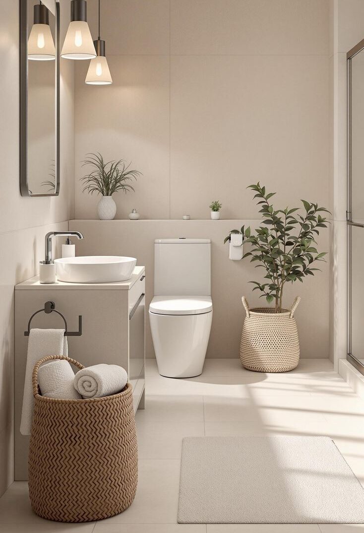
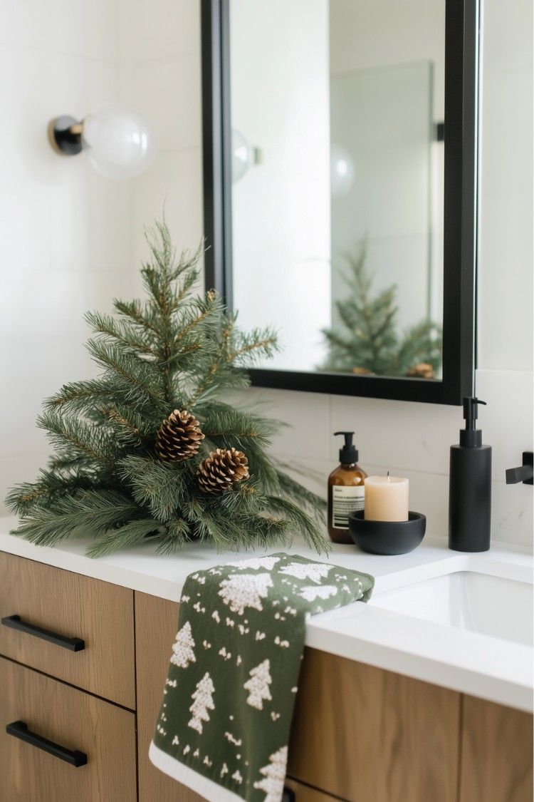
Adding Festive Touches to the Bathroom
Even bathrooms can carry holiday cheer without being over the top.
Swap out hand towels for festive versions, add a small vase of greenery or pinecones, and consider subtle scented candles to evoke the season.
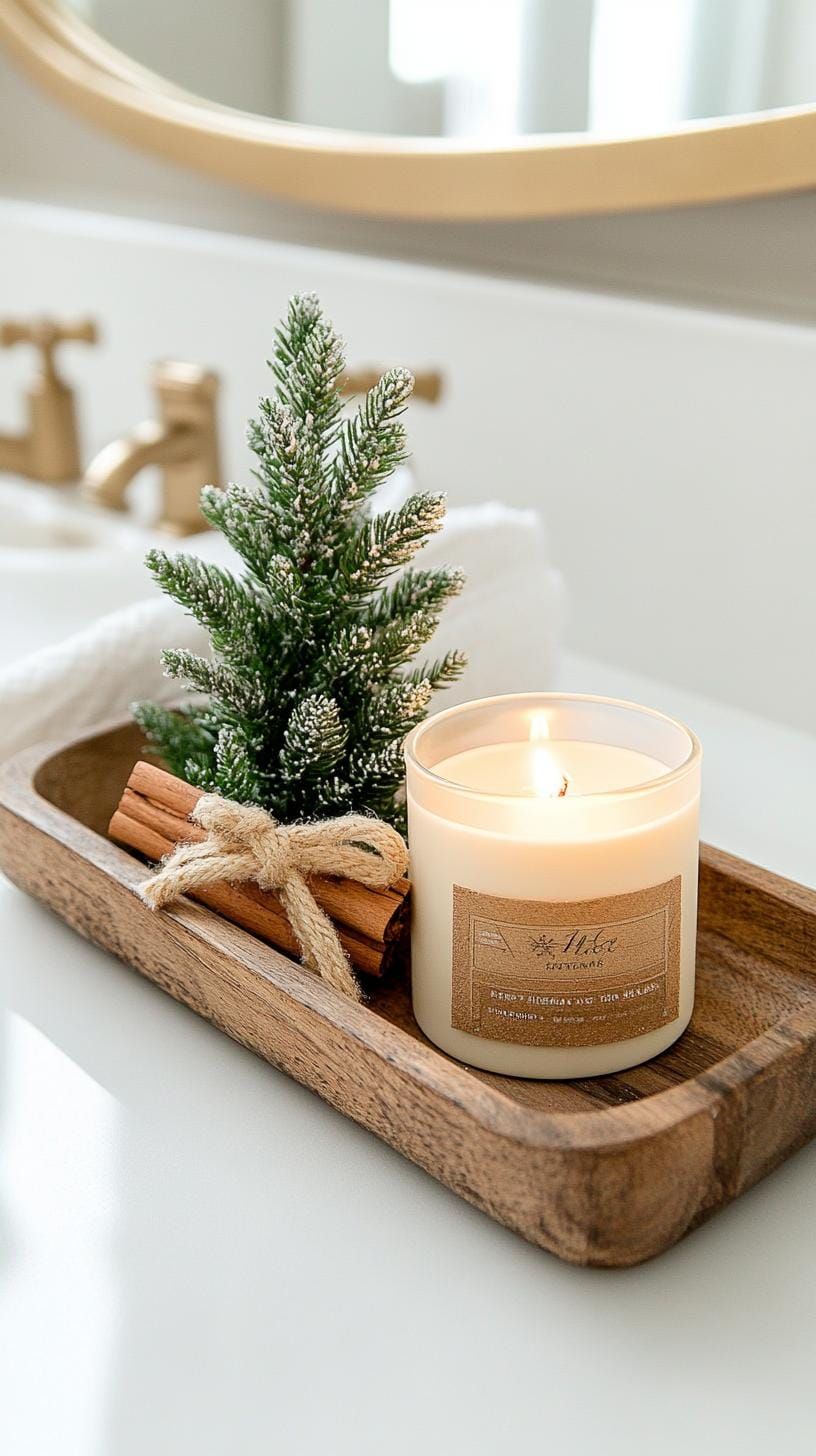
Small touches like soap dispensers or ornaments in your palette can tie the bathroom into the rest of your home’s holiday look.
Creating holiday home inspiration is all about thoughtful design and cohesive styling. By sticking to a unified colour palette, incorporating natural elements and tailoring decorations to each room, you can make your home feel festive, welcoming and stylish this Christmas. Small touches can go a long way, helping you celebrate the season in comfort and style.