bathroom, blog, floors, kitchen, outdoor, renovation tips, walls
Design details that instantly reveal a bad renovation are often the small things people overlook. At first glance a space may look modern or newly finished, but closer inspection usually tells a different story. Misaligned tiles, rushed layouts or mismatched finishes can quickly undermine the overall result. Paying attention to these details is what separates a renovation that looks polished from one that feels unfinished.
Table of Content:
Design Details That Instantly Reveal a Bad Renovation: Edges and Corners
Poor Transitions Between Flooring Materials
Fixtures Installed Without Considering Tile Placement: Another Design Detail That Instantly Reveals a Bad Renovation
Inconsistent Grout Colour Across Surfaces
Skipping Proper Surface Preparation
Design Details That Instantly Reveal a Bad Renovation: Ignoring Visual Alignment Across the Room
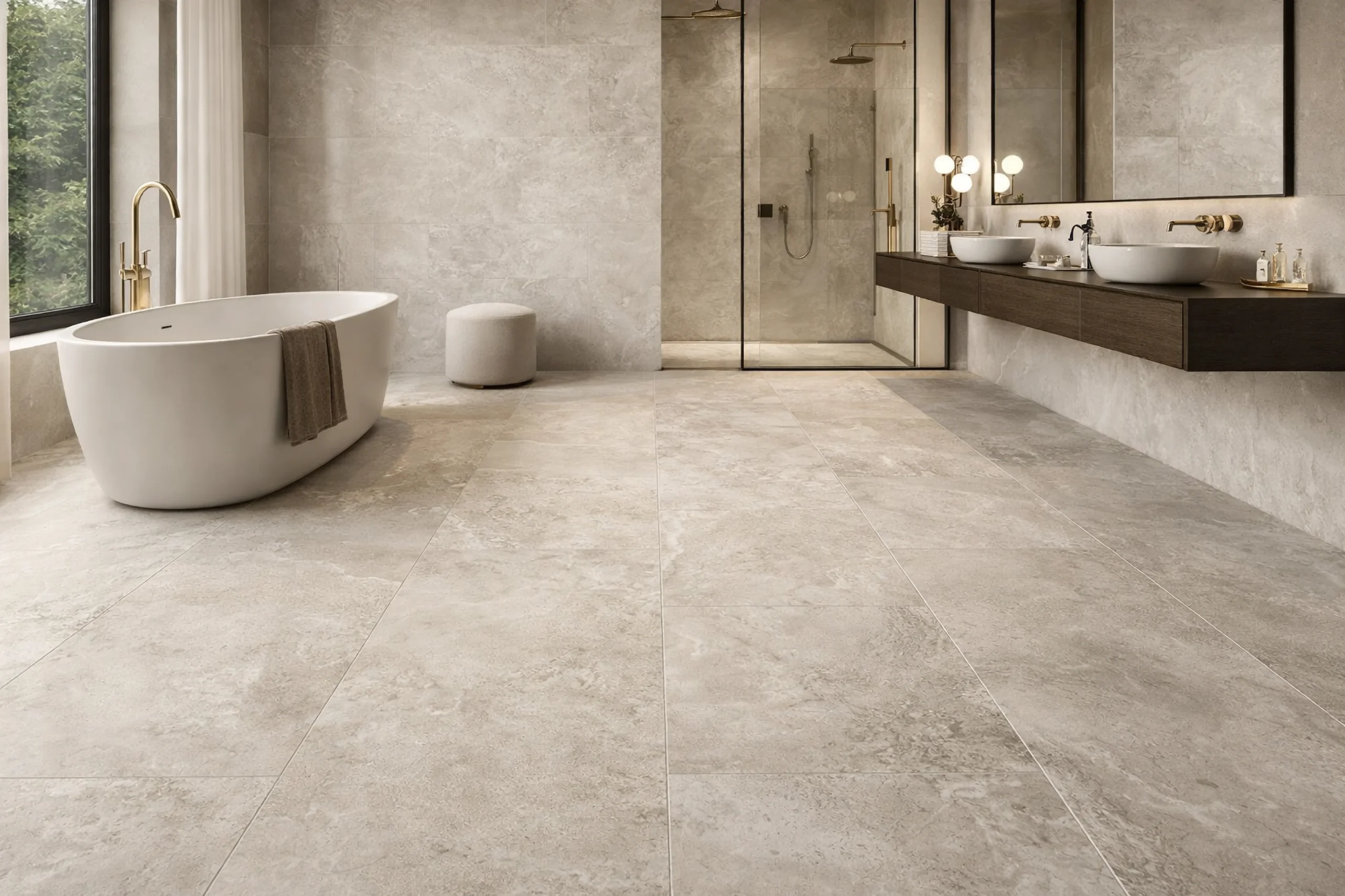
Design Details That Instantly Reveal a Bad Renovation: Edges and Corners
One of the first things professionals notice is how tiles finish at edges and corners. Exposed tile edges, uneven trims or poorly cut corners instantly reveal rushed workmanship.
Well-finished spaces usually include proper edging, trims or carefully mitred corners that create a clean transition between surfaces. These small finishing details make the difference between a renovation that looks professional and one that feels unfinished.
Poor Transitions Between Flooring Materials
Transitions between rooms are another detail that can reveal a rushed renovation. When tile flooring suddenly meets wood flooring, laminate or vinyl without a clear transition strip or level alignment, the space feels disjointed.
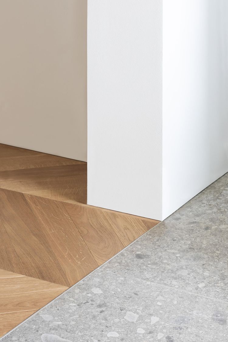
Good renovations consider how materials flow from one room to another. Smooth transitions create visual continuity and prevent the floor from feeling like separate pieces rather than one cohesive design.
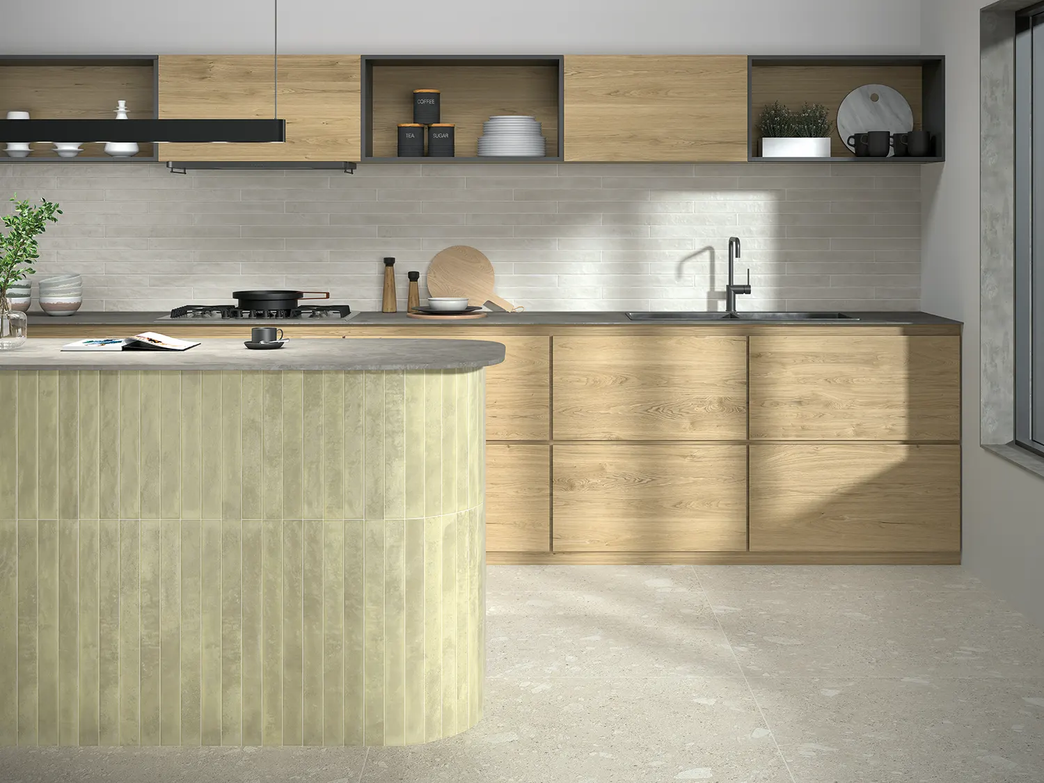
Fixtures Installed Without Considering Tile Placement: Another Design Detail That Instantly Reveals a Bad Renovation
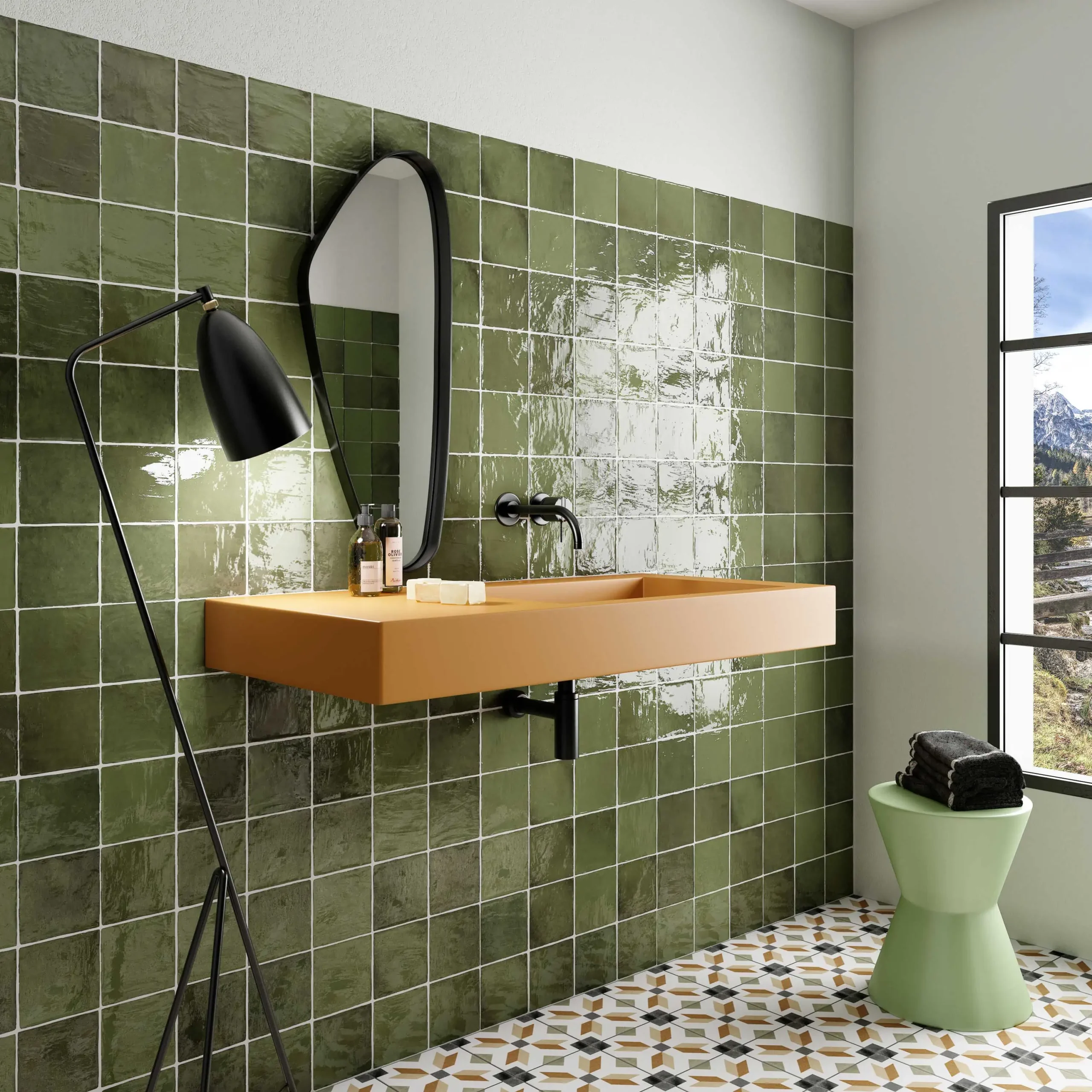
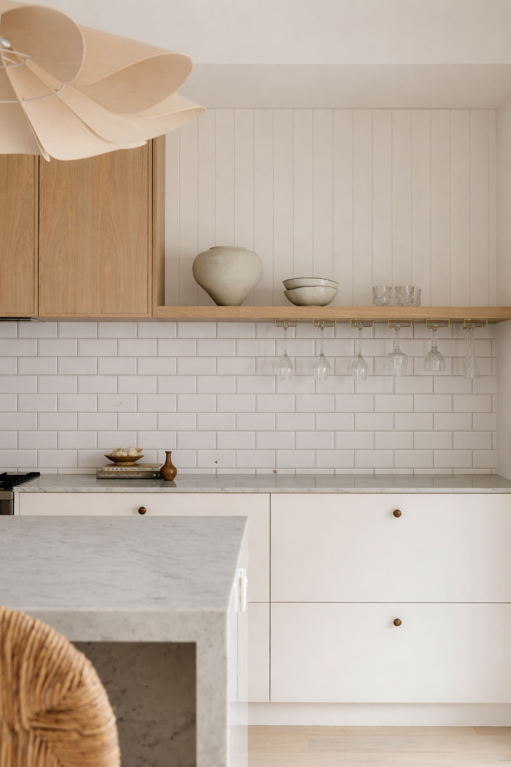
Another mistake designers notice immediately is when fixtures appear randomly positioned within tiled areas. For example, taps, shower fittings or basins may land awkwardly across grout lines or off-centre within a tile.
Thoughtful planning ensures fixtures align with tile placement and appear visually balanced. When fittings feel centred and intentional, the entire room looks more refined.
Inconsistent Grout Colour Across Surfaces
Grout colour consistency is often overlooked during renovations. If the grout shade changes slightly between areas or surfaces, the difference can be surprisingly noticeable once everything is installed.
Using consistent grout tones helps surfaces feel unified rather than fragmented. Designers often choose grout colours carefully so the tiles feel integrated with the rest of the design.
Skipping Proper Surface Preparation
Even the best tiles can look poorly installed if the surface beneath them was not properly prepared. Uneven walls, poorly levelled floors or inadequate waterproofing often reveal themselves through subtle imperfections once tiles are installed.
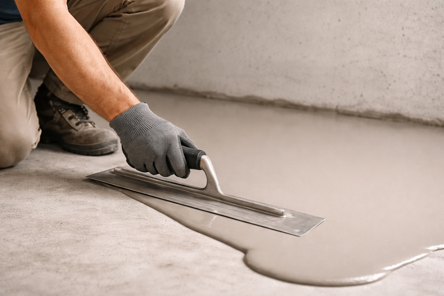
Professionals know that good preparation is what allows finishes to look clean and precise. When the foundation is correct, the final installation appears smooth and intentional.
Design Details That Instantly Reveal a Bad Renovation: Ignoring Visual Alignment Across the Room
Designers also pay attention to how elements align across a space. For example, a vanity might sit slightly too close to a door frame, or a mirror may not align with the basin below it. When key elements feel visually unbalanced, the entire room can appear poorly planned.
Carefully aligning surfaces with surrounding architectural features helps create a sense of order. This subtle coordination is one of the things that makes well-designed renovations stand out.
Understanding subtle but impactful design details that instantly reveal a bad renovation can help homeowners avoid costly mistakes before construction even begins. Paying attention to installation quality, transitions and alignment ensures that materials work together rather than against each other.
When these details are handled carefully, a renovation feels polished, intentional and built to last.
bathroom, blog, floors, kitchen, outdoor, walls
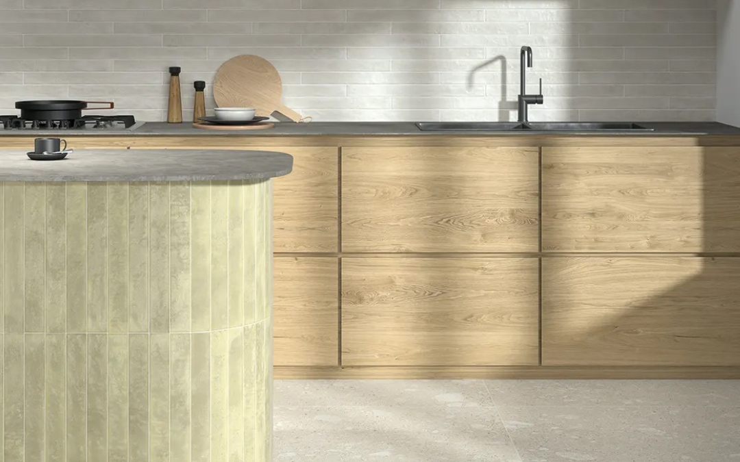
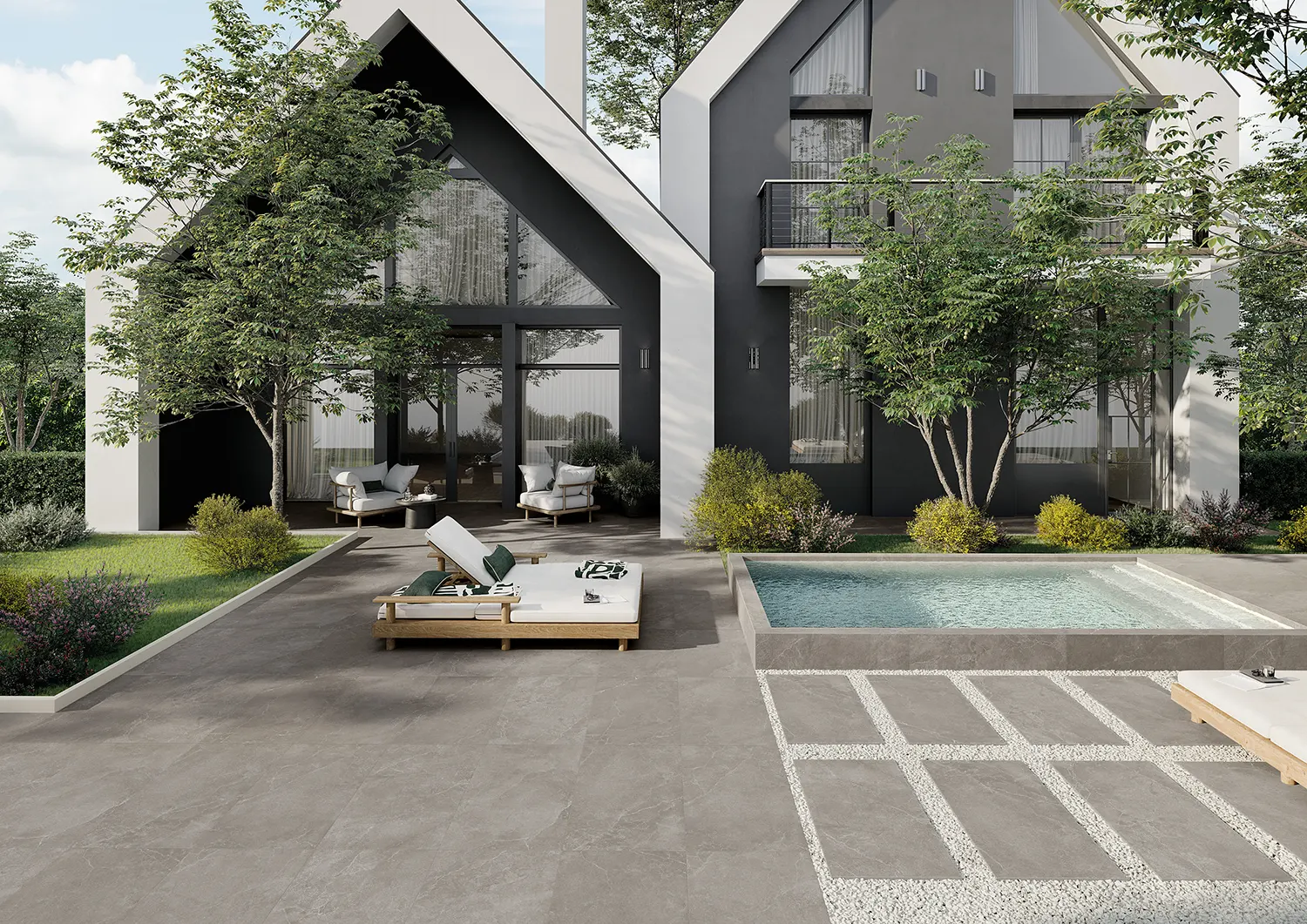
How tiles can make a space look more expensive is something many people underestimate. The size of the tile, the layout, the grout colour and the finish all influence how luxurious a space feels. When these elements are chosen carefully, tiles can elevate an interior and create the impression of a high-end design without dramatically increasing the renovation budget.
Table of Content:
How Tiles Can Make a Space Look More Expensive Through Scale
Consistency Creates a Luxurious Feel
How Tiles Can Make a Space Look More Expensive With Thoughtful Layouts
The Right Finish Can Elevate the Entire Room
Colour Palettes Matter More Than You Think
How Tiles Can Make a Space Look More Expensive Through Material Inspiration
How Tiles Can Make a Space Look More Expensive Through Scale
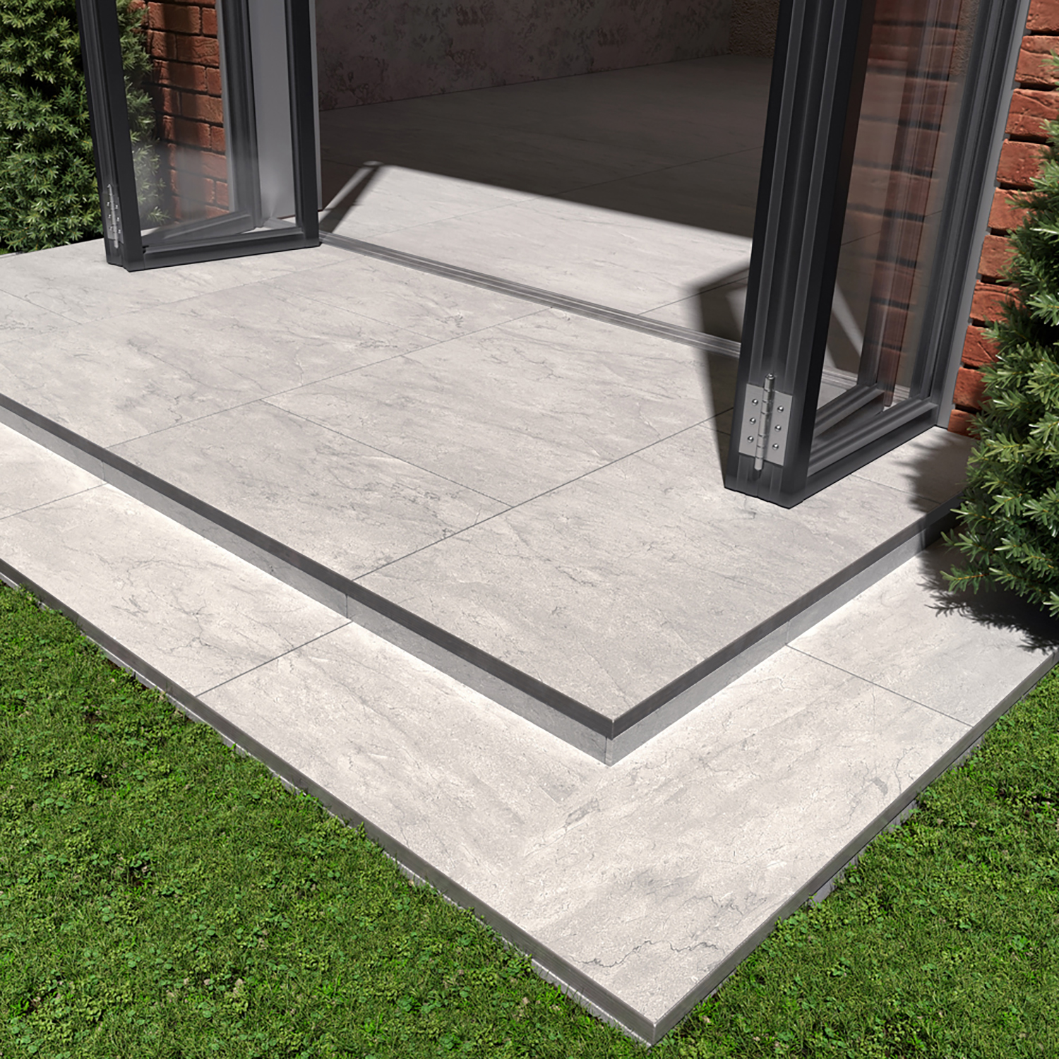
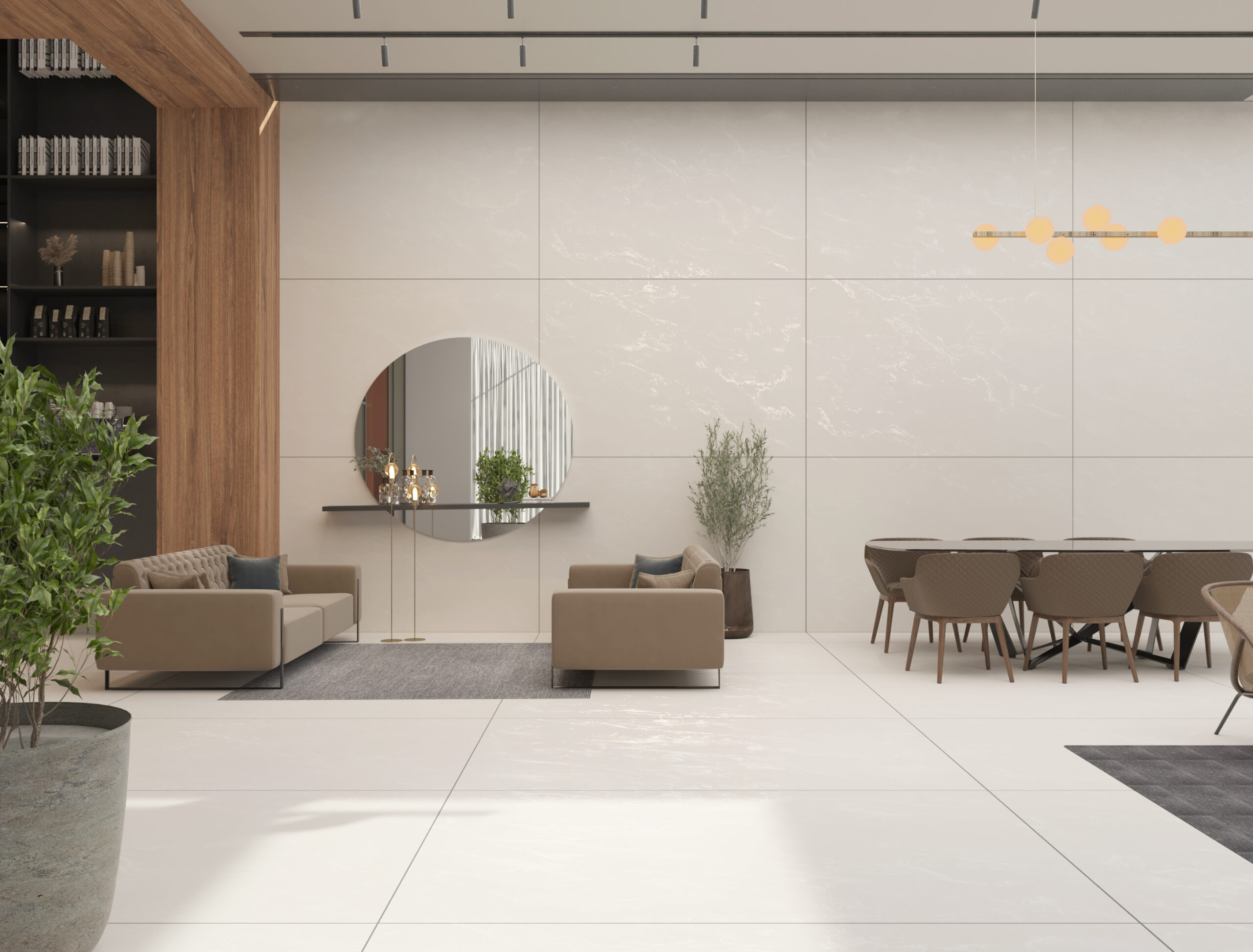
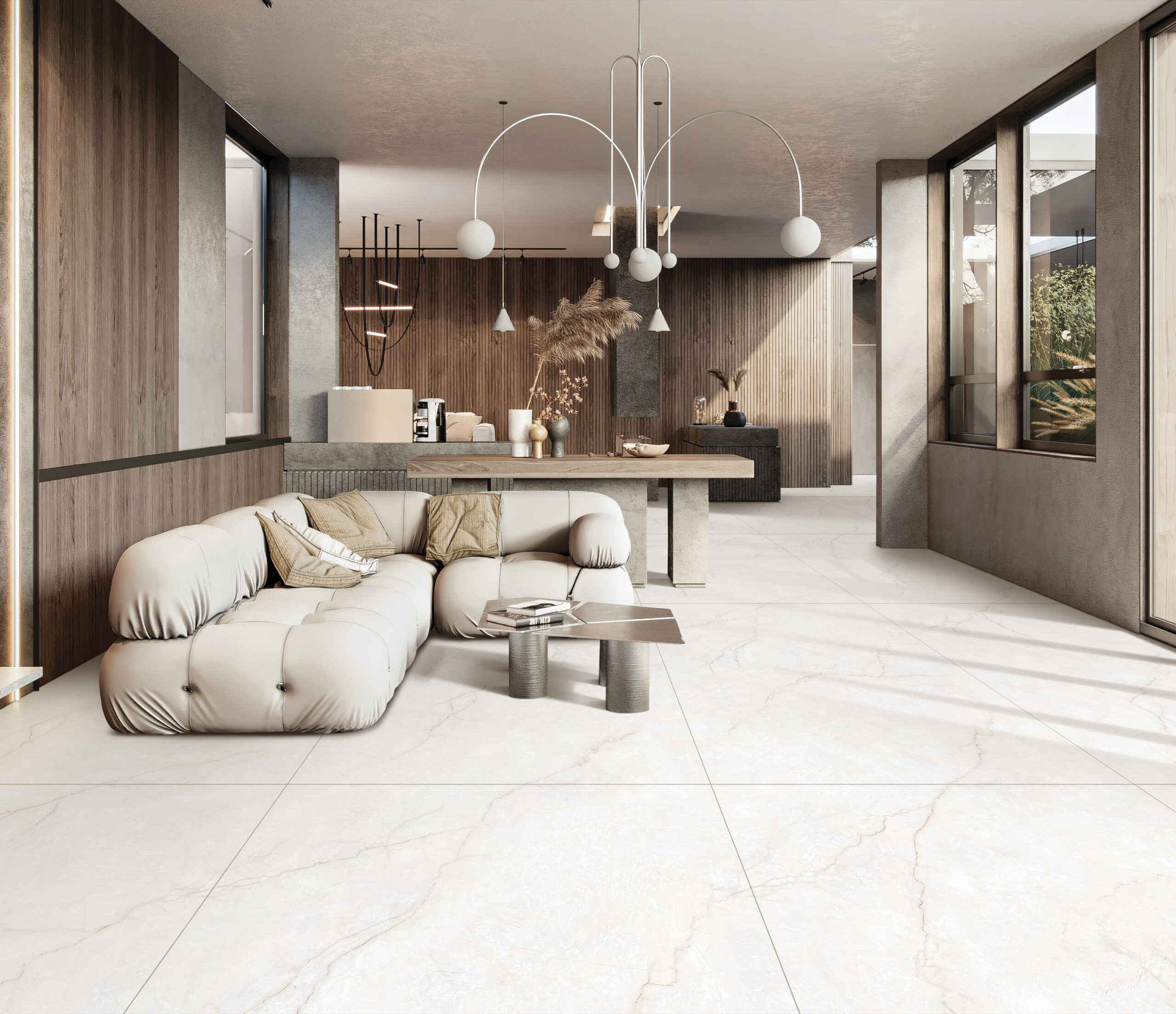
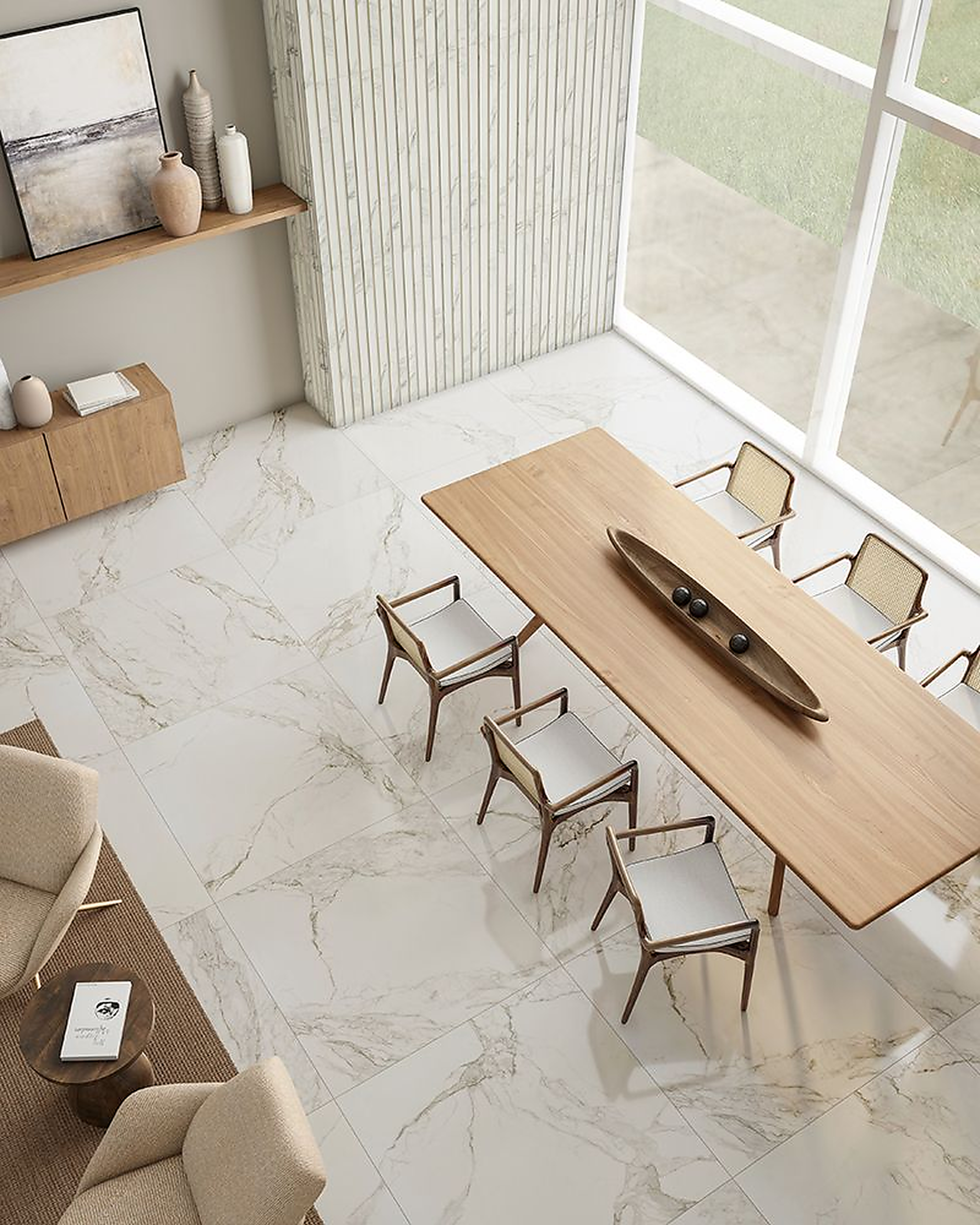
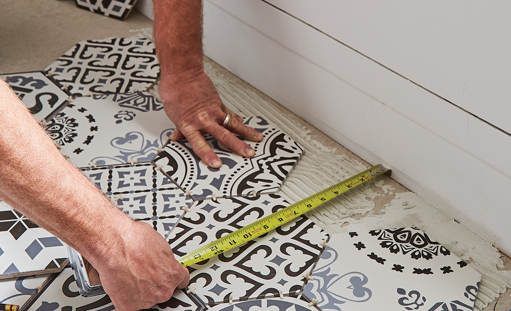
One of the easiest ways tiles can elevate a space is through scale. Larger tiles create fewer grout lines, which makes surfaces look more seamless and visually calm. This uninterrupted look is often associated with high-end interiors because it feels intentional and well designed.
Large-format tiles also help rooms feel more open. With fewer lines breaking up the surface, floors and walls appear more expansive, which contributes to a more sophisticated overall look.
Consistency Creates a Luxurious Feel
Luxury spaces often share one common trait: consistency. When colours, materials and finishes flow naturally from one surface to another, the result feels cohesive and considered.
Using the same tile across larger areas or carrying similar tones between floors and walls helps create this effect. Instead of feeling busy or fragmented, the space feels balanced and calm.
Consistency does not mean everything has to match perfectly. It simply means the design choices feel connected rather than random.
How Tiles Can Make a Space Look More Expensive With Thoughtful Layouts
The way tiles are installed plays a significant role in how expensive a space looks. Carefully planned layouts with aligned grout lines create a sense of precision and craftsmanship.
Symmetry and clean alignment make tiles feel deliberate rather than rushed. When patterns are centred correctly and cuts are minimised, the entire room feels more refined.
Simple layouts often work best when the goal is to create a polished and expensive-looking interior.
The Right Finish Can Elevate the Entire Room
Tile finishes influence how light moves through a space. Polished surfaces reflect light and create brightness, while matt finishes offer a softer and more contemporary feel.
Both finishes can contribute to a high-end look when used in the right setting. The key is choosing a finish that complements the surrounding materials and lighting conditions.
For example, a softly textured matt tile paired with warm lighting can create a refined atmosphere that feels both modern and welcoming.
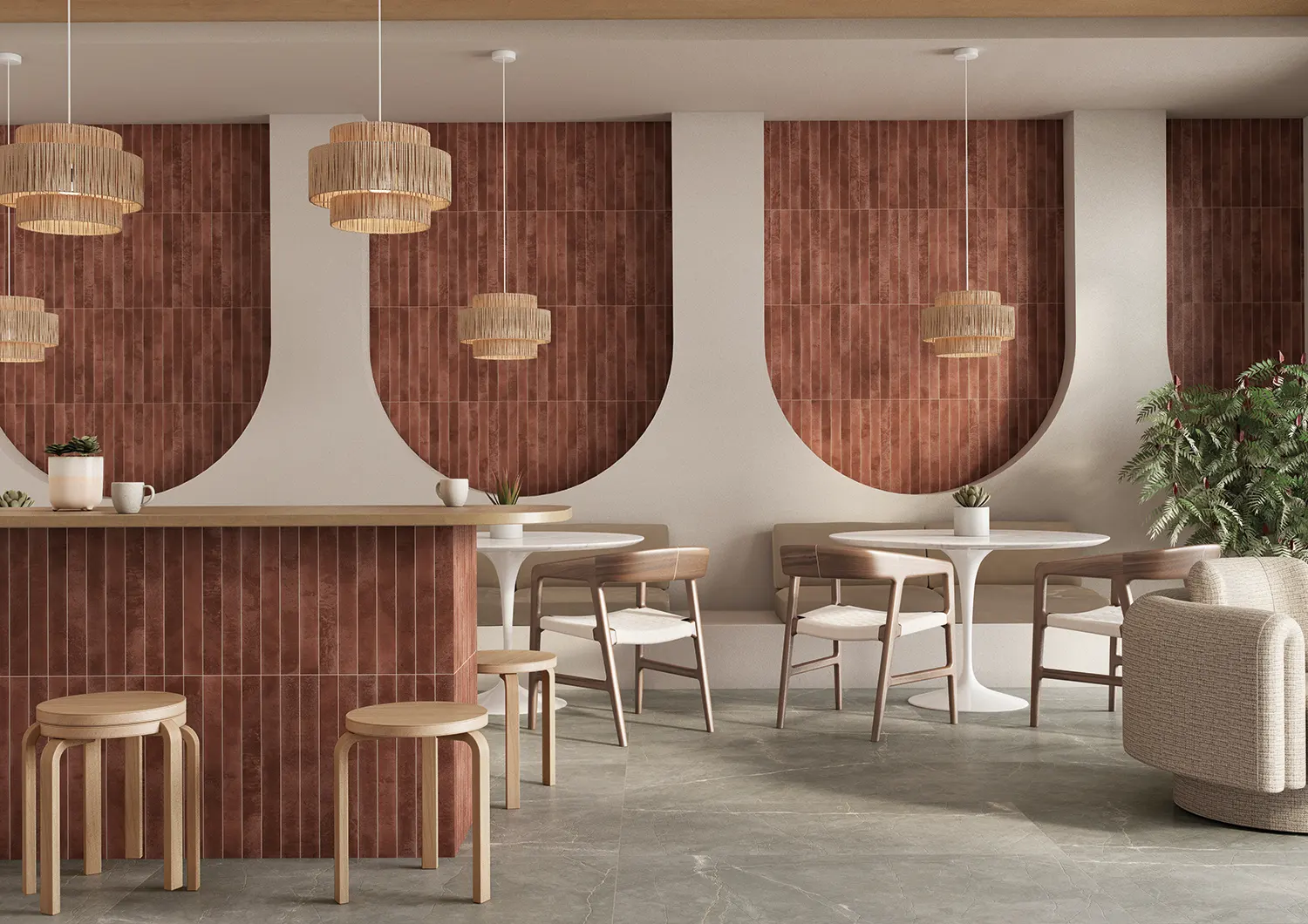
Colour Palettes Matter More Than You Think
Colour plays a major role in how luxurious a space feels. Soft neutral palettes tend to create a calm and timeless foundation that many high-end interiors share.
Shades like warm white, taupe, soft grey and natural stone tones allow materials and textures to stand out without overwhelming the room.
When colours feel balanced and intentional, the overall design appears more sophisticated and visually relaxing.
How Tiles Can Make a Space Look More Expensive Through Material Inspiration
Many modern tiles replicate natural materials like marble, stone or travertine. These surfaces carry a sense of luxury because they reference materials traditionally associated with premium interiors.
Marble-look and stone-look tiles allow homeowners to achieve this aesthetic while maintaining durability and practicality. The result is a space that feels elegant but still works for everyday life.
Understanding how tiles can make a space look more expensive is less about choosing the most expensive product and more about thoughtful design decisions. Tile size, layout, colour and finish all influence how refined a space feels.
When these elements work together, tiles become more than just a surface. They become a design feature that shapes how a space looks, feels and functions.
Careful planning and intentional choices can transform even simple materials into something that feels elevated and timeless.
bathroom, blog, floors, kitchen, outdoor, walls
Tile design personality might not be something you’ve thought about before, but the tiles you’re naturally drawn to often say a lot about how you approach design. Some people gravitate toward calm, minimal spaces while others are drawn to colour, texture or statement features.
The finishes, patterns and materials you prefer often reflect the way you like your spaces to feel and function.
Table of Content:
The Tile Design Personality Quiz
The Five Tile Design Personalities
Why Your Tile Personality Matters
The Tile Design Personality Quiz
To help you uncover what your tile choices say about your design personality, try our quick quiz below. Follow the answers that feel most like you and see which tile design personality you land on.
The Five Tile Design Personalities
Now that you’ve discovered your tile design personality, here’s what it says about the way you design and choose materials for your space.
The Minimalist
Minimalists are drawn to simplicity, balance and visual calm. Their spaces feel uncluttered and intentional, with every element chosen carefully.
Tiles that suit this personality usually include large-format tiles, soft neutral tones and minimal grout lines. Colours like warm white, soft grey and taupe create the calm foundation minimalists love.
These tiles work beautifully in modern kitchens, open-plan living spaces and spa-like bathrooms.
The Minimalist Collection
The Bold Creator
Bold Creators see tiles as an opportunity to make a statement. They enjoy spaces that feel expressive and memorable.
Patterned tiles, textured surfaces and strong colour contrasts often appeal to this personality. Think feature splashbacks, geometric tiles, mosaics or unexpected colour combinations.
Used thoughtfully, statement tiles can turn kitchens, bathrooms or entryways into design focal points.
The Bold Creator Collection
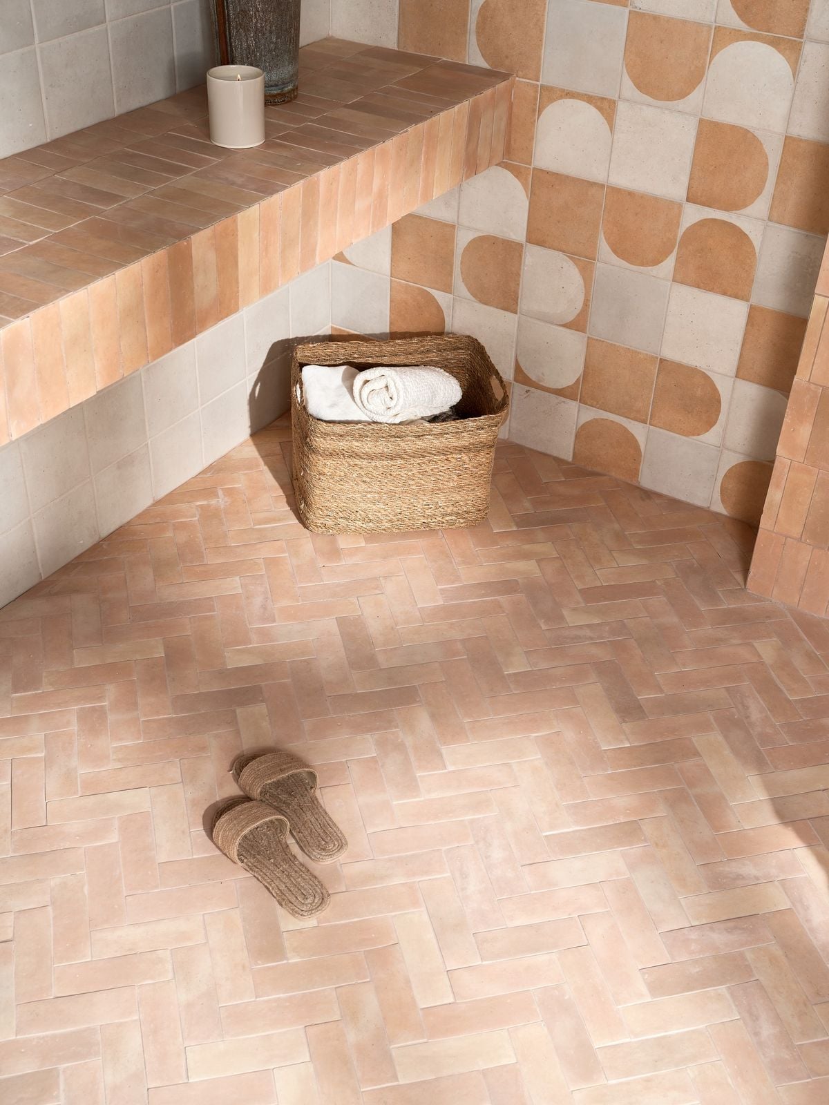
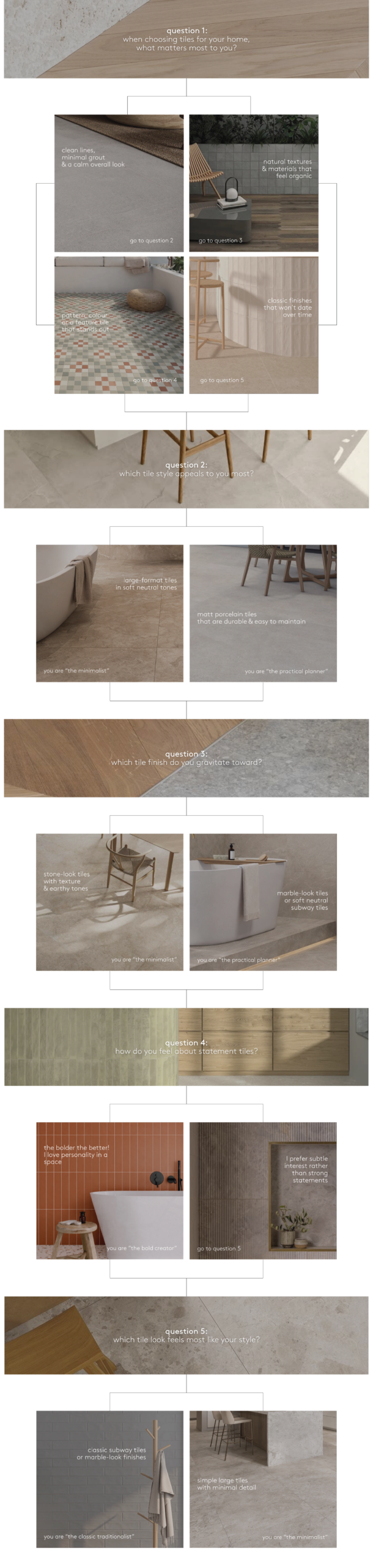
The Naturalist
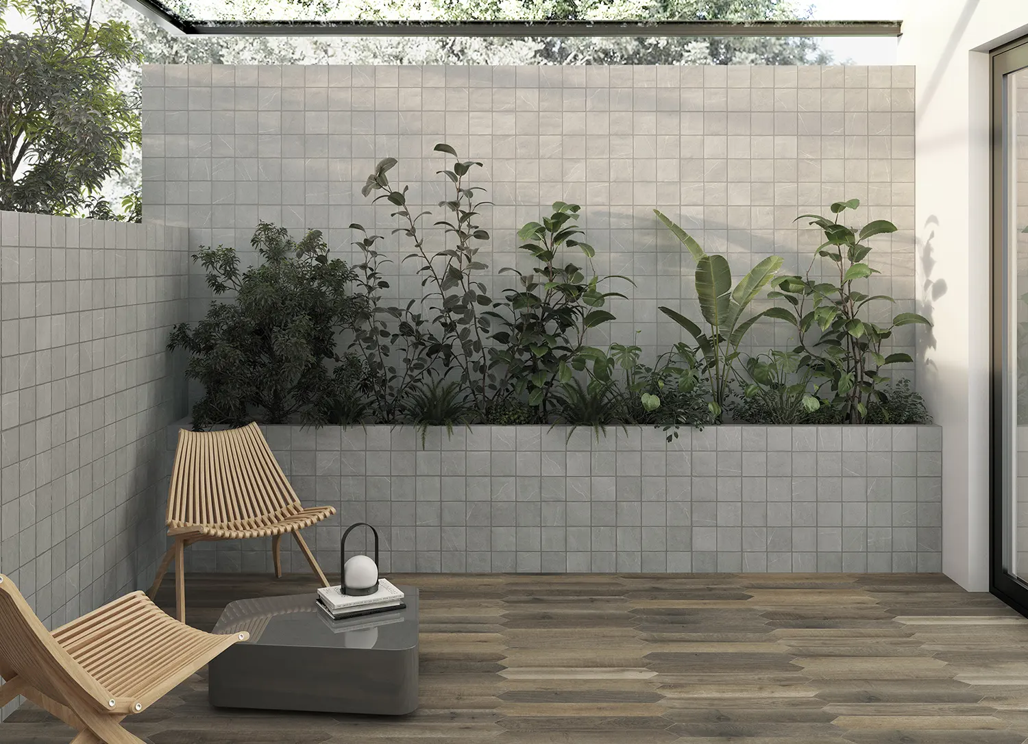
Naturalists gravitate toward organic textures and earthy palettes. They prefer materials that mimic nature and create a sense of calm connection with the environment.
Stone-look tiles, travertine finishes, warm sandy tones and wood look flooring fit perfectly into this aesthetic. These tiles add depth and texture without overwhelming the space.
Naturalist interiors often feel relaxed, layered and timeless.
The Naturalist Collection
The Practical Planner
Practical Planners approach design with functionality in mind. They want spaces that look good but also perform well under everyday use.
Durable porcelain tiles, matt finishes and slip-resistant surfaces are common choices for this personality. These tiles handle foot traffic, moisture and daily wear with ease.
This approach works especially well in busy kitchens, family homes and commercial spaces.
The Practical Planner Collection
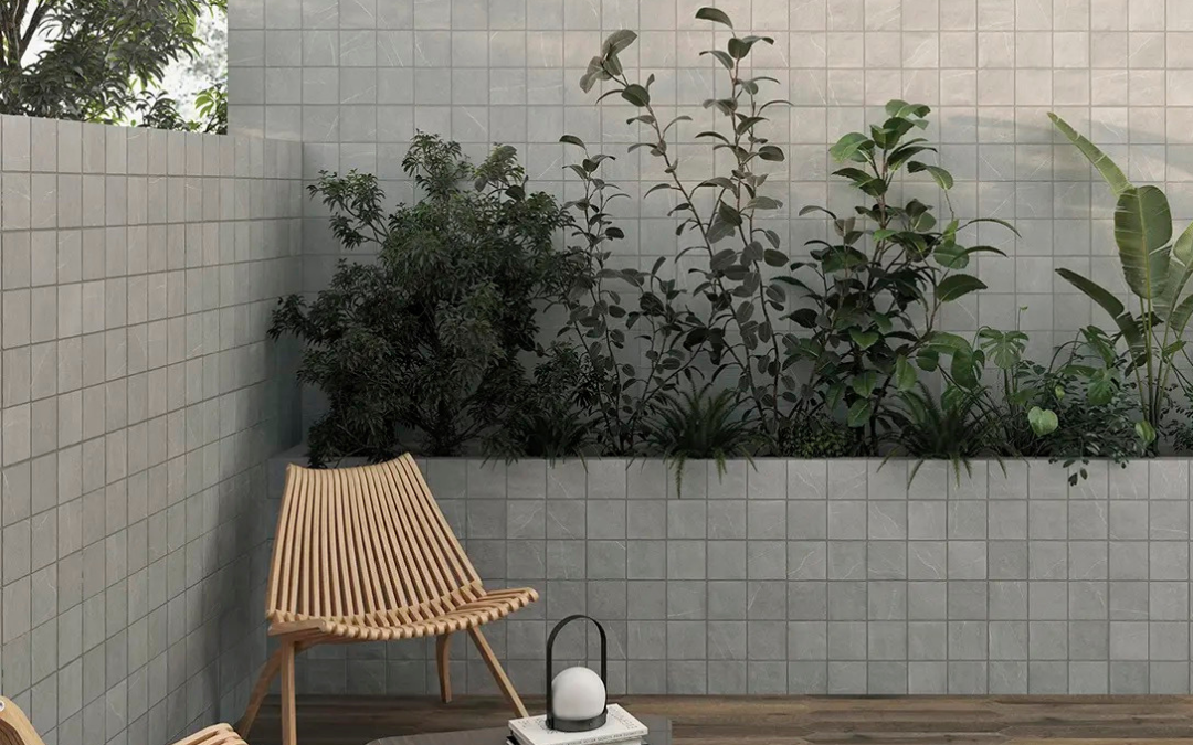
The Classic Traditionalist
Classic Traditionalists appreciate timeless elegance. Their spaces often combine traditional details with refined colour palettes.
Marble-look tiles, classic subway tiles and soft neutral colours are popular choices. These finishes bring a sense of heritage while still feeling fresh in modern homes.
Classic kitchens and bathrooms often feel balanced, welcoming and effortlessly stylish.
The Classic Traditionalist Collection
Why Your Tile Personality Matters
Understanding your tile design personality helps you make decisions that feel natural rather than forced. Instead of chasing trends, you’re choosing materials that genuinely suit how you live and design your space.
The best interiors often happen when personal taste and practical choices align.
Tiles do more than cover floors and walls. They shape how a space feels, how it functions and how it reflects the people who use it.
Whether you’re a Minimalist, Bold Creator, Naturalist, Practical Planner or Classic Traditionalist, choosing tiles that match your design personality helps create spaces that feel authentic and timeless.
Curious which tiles suit your personality best? Explore our full tile collections or visit one of our showrooms to see these styles in person.
bathroom, blog, floors, kitchen, outdoor, renovation tips, walls
Renovation questions we get asked most usually come from homeowners, businesses and designers wanting to make the right decisions before they commit. Renovating can feel overwhelming, especially when there are so many materials, finishes and timelines to consider. Below, we answer the most common renovation questions we hear and give you practical guidance to help you move forward with confidence.
Table of Content:
Where Do I Start?
Do I Choose Tiles or Layout First?
What Tiles Work Best for High-Traffic Areas?
How Do I Calculate How Much Tile I Need?
Are These Tiles Suitable for Commercial Use?
Gloss or Matt Tiles?
How Do I Avoid Choosing Finishes That Date Quickly?
How Long Will the Project Take?
How Do I Know What the Tiles Will Look Like in My Space?
Do I Need Slip-Resistant Tiles?
What Should Architects and Designers Consider When Specifying Tiles?
What Should I Budget For?
How Do We Ensure Tile Consistency Across Large Projects?
Where Do I Start?
Start with how the space will be used. Foot traffic, moisture and daily wear all influence the materials you choose. Once function is clear, selecting tiles, layouts and finishes becomes much easier.
Budget planning early on also helps avoid changes later that can delay a project or increase costs.
Do I Choose Tiles or Layout First?
Layout always comes first. Tile size, pattern and grout lines depend on the layout of the room. Choosing tiles before confirming layout often leads to awkward cuts and unnecessary waste.
A clear layout makes tile selection more accurate and cost effective.
If you’re unsure which layout works best for your space, read our ultimate guide to tile layout patterns for practical examples and inspiration.
What Tiles Work Best for High-Traffic Areas?
High-traffic areas need tiles that can handle constant use. Porcelain tiles are a popular choice for both residential and commercial spaces because they are dense, hard-wearing and moisture resistant.
Matt or non-slip finishes perform better than gloss in busy areas, offering better grip and hiding wear more easily.
For a deeper dive read our guide on choosing the right tiles for high-traffic areas.
How Do I Calculate How Much Tile I Need?
Start by measuring the length and width of the area and calculating the total square metres. From there, factor in cuts, layout patterns and potential breakages.
The most important rule when buying tiles is to always buy more than you need. Extra tiles account for cutting waste, pattern matching and future repairs. Having spare tiles ensures consistency if you need replacements later.
Are These Tiles Suitable for Commercial Use?
Not all tiles are rated for commercial applications. Always check tile ratings for wear resistance, slip resistance and intended use before specifying them for retail, office or hospitality projects.
Using the correct tile ensures longevity and reduces maintenance issues.
Gloss or Matt Tiles?
Matt tiles are usually the better choice for floors. They provide more grip, reduce slip risk and hide marks and scuffs.
Gloss tiles work best on walls or low-traffic areas where light reflection matters more than durability.
If you’re still weighing up the options, read our blog gloss vs matte tiles: what’s the difference? for a detailed breakdown.
How Do I Avoid Choosing Finishes That Date Quickly?
Use timeless materials for permanent surfaces like floors and walls. Neutral tiles, stone looks and simple layouts age better than bold trends.
Trends are best introduced through features that are easier to update, such as tapware, lighting or decorative tiles.
For help finding the right balance, read our guide timeless vs trend: how to choose.
How Long Will the Project Take?
Timelines depend on project size and material availability. Smaller renovations may take a few weeks, while large commercial projects can take several months.
Finalising selections early helps keep timelines realistic and avoids delays during installation.
How Do I Know What the Tiles Will Look Like in My Space?
Tiles can look very different once installed, especially depending on lighting, layout and surrounding finishes. Relying on samples alone can make it hard to visualise the final result.
Using a tile visualiser allows you to see how different tiles will look in your actual space before committing. It helps you compare colours, finishes and layouts with confidence.
Try our online tile visualiser to preview your space before making a decision.
Do I Need Slip-Resistant Tiles?
Slip-resistant tiles are especially important in wet or busy areas, like bathrooms, kitchens, entryways and all commercial spaces.
Non-slip tiles reduce the risk of accidents and are essential in areas open to customers or heavy foot traffic.
If you’re unsure which tiles work best in each space, read How to Choose Tiles by Room: A Room-by-Room Guide for guidance.
What Should Architects and Designers Consider When Specifying Tiles?
Performance comes first. Slip resistance, durability ratings and maintenance requirements should guide tile selection, especially in commercial environments.
Aesthetic choices should support the function of the space while meeting safety and compliance standards.
What Should I Budget For?
Budget should account for materials, installation and a contingency for unexpected costs. Quality tiles and proper installation may cost more upfront but save money long term by reducing repairs and replacements.
Always prioritise performance and safety over short-term savings.
How Do We Ensure Tile Consistency Across Large Projects?
Ordering all tiles from the same batch is essential for colour and finish consistency. This is especially important for large commercial installations.
Ordering extra tiles also helps manage breakages and future repairs without visible differences.
Renovation questions we get asked most often come down to planning, performance and foresight. Whether you’re renovating a home or managing a commercial project, asking the right questions early leads to better outcomes, fewer surprises and spaces that perform long term.
Got a renovation question we didn’t cover? Contact us for expert advice or visit one of our showrooms in Cape Town, Johannesburg or Durban for in-store assistance and inspiration.
blog, interior design tips, kitchen
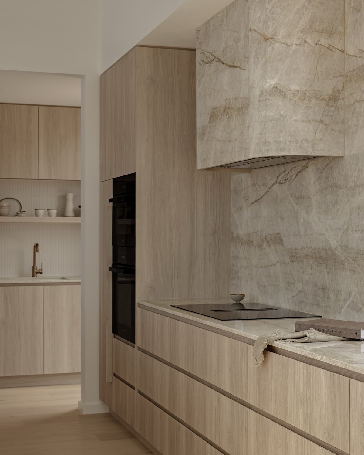
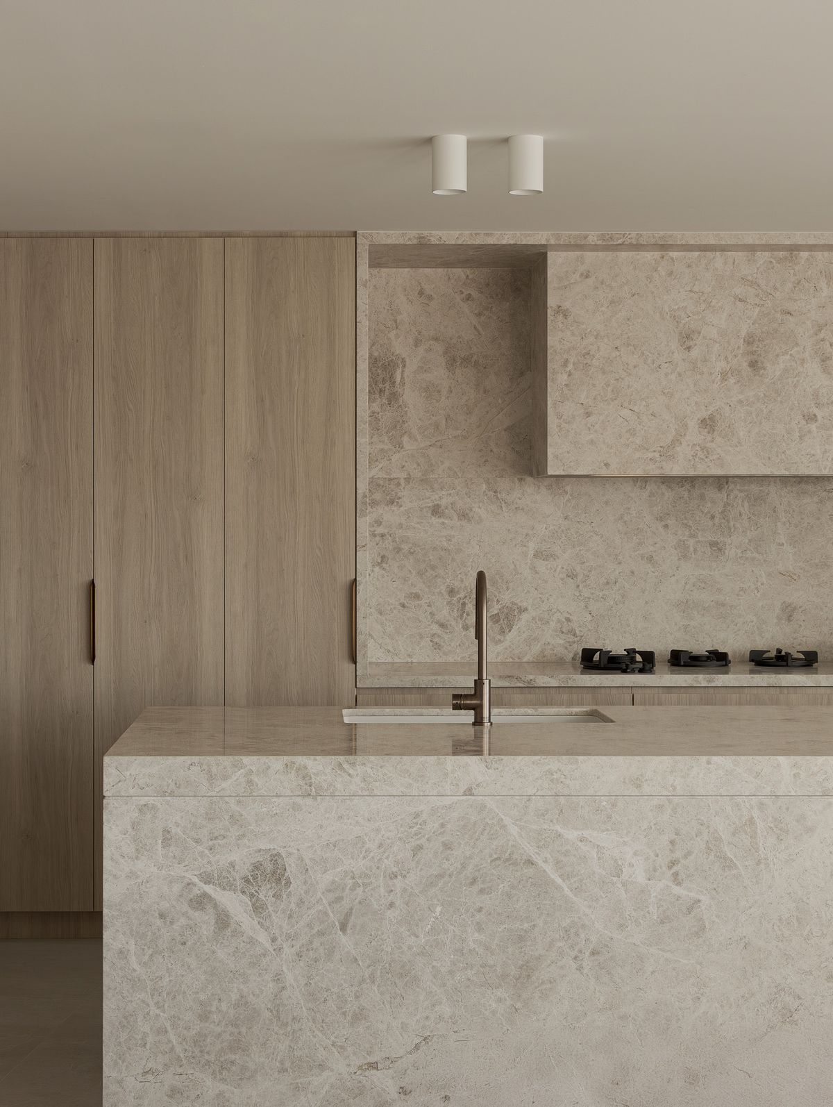
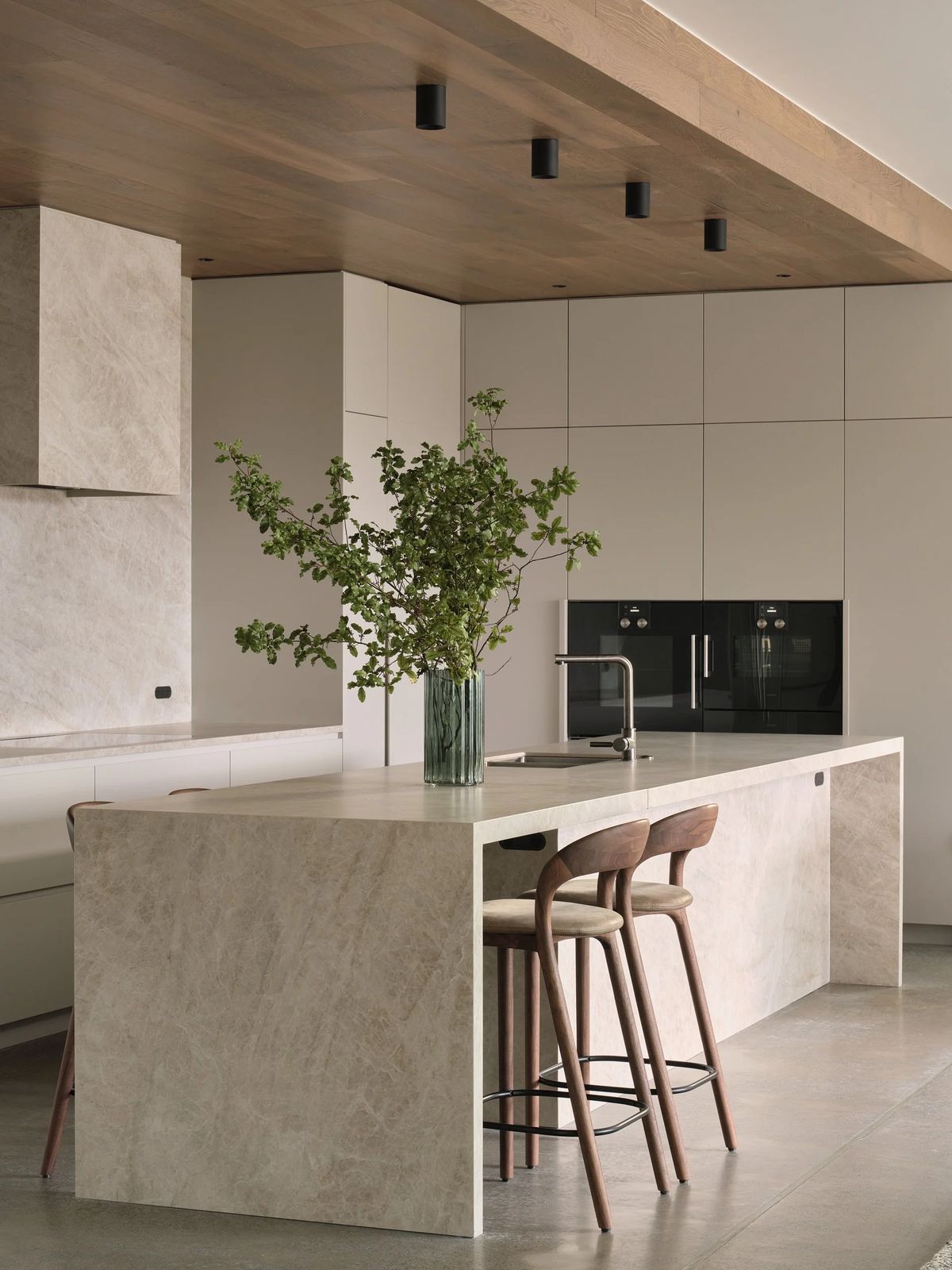
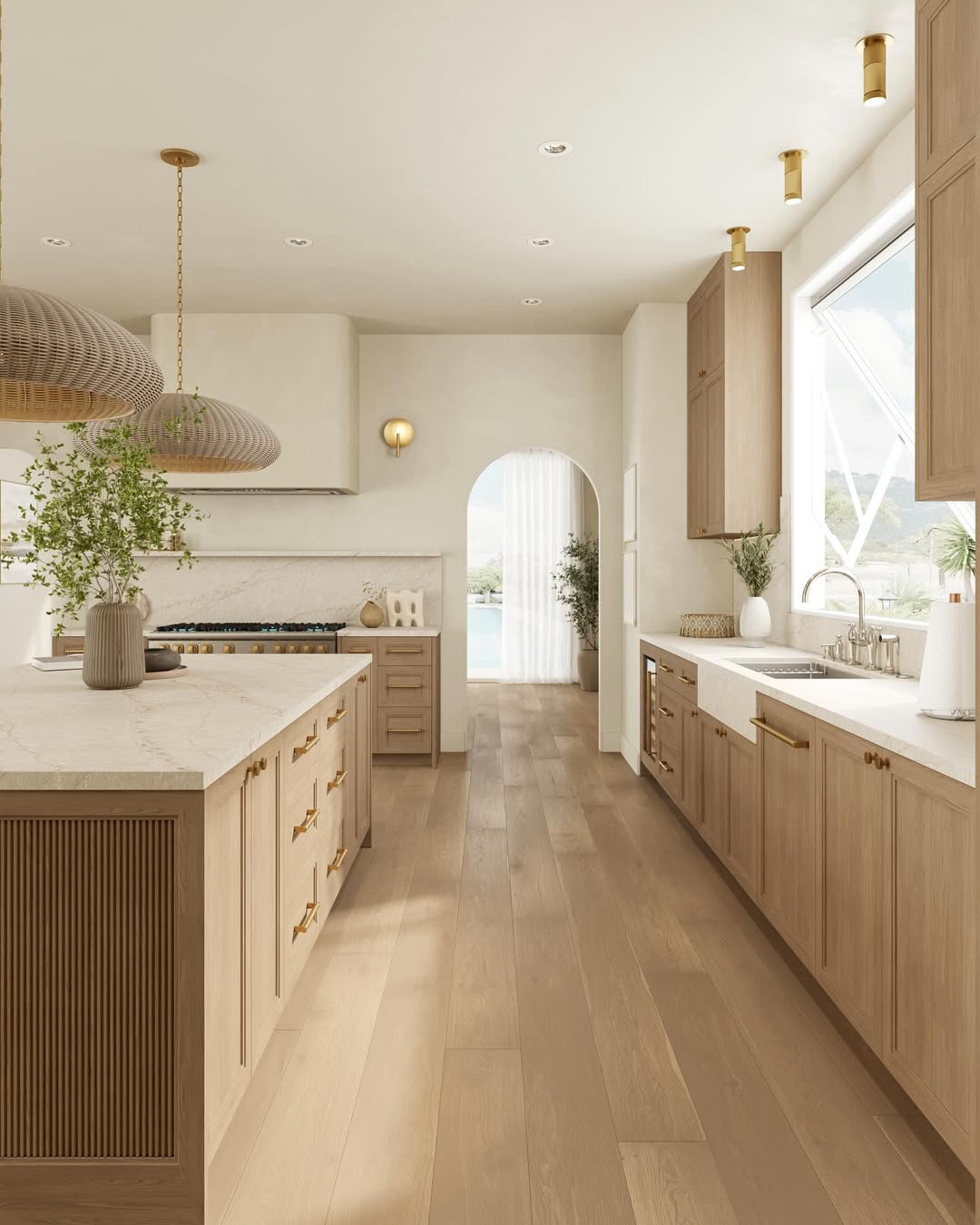
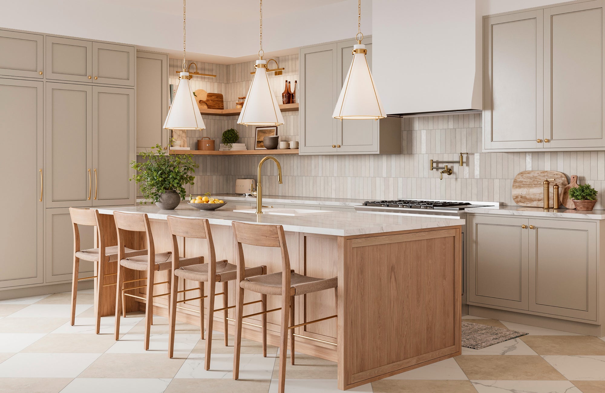
Timeless kitchen colour palettes are the secret to creating a kitchen that still feels stylish years from now. While trends shift quickly, certain colour combinations remain popular because they feel calm, balanced and easy to live with. If you’re planning a renovation or building a new kitchen, choosing a timeless palette helps protect your investment and keeps your space looking relevant for longer.
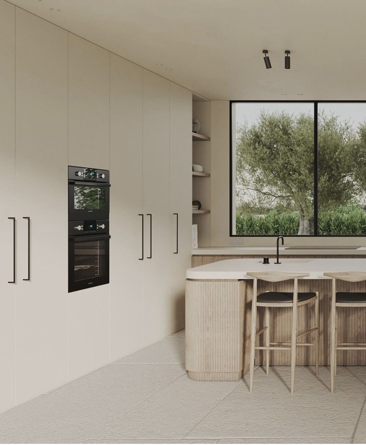
Table of Content:
Timeless Kitchen Colour Palettes Create Long-Term Value
What Colours Are Considered Timeless in Kitchens?
Warmth Makes a Kitchen Feel Timeless
Kitchen Taps Should Match Your Colour Palette
Dark Shades in Timeless Kitchen Colour Palettes
Tiles That Support Timeless Kitchen Colour Palettes
Balance Trends With Timeless Choices
Timeless Kitchen Colour Palettes Create Long-Term Value
A kitchen renovation is a big investment, so the colours you choose should last. Cabinets, tiles and countertops are not items you want to replace every few years. A timeless palette creates a strong foundation that won’t date quickly and allows you to refresh the look with smaller updates like accessories, décor or hardware.
Timeless colours also appeal to more people, which can be a bonus if you ever sell your home.
What Colours Are Considered Timeless in Kitchens?
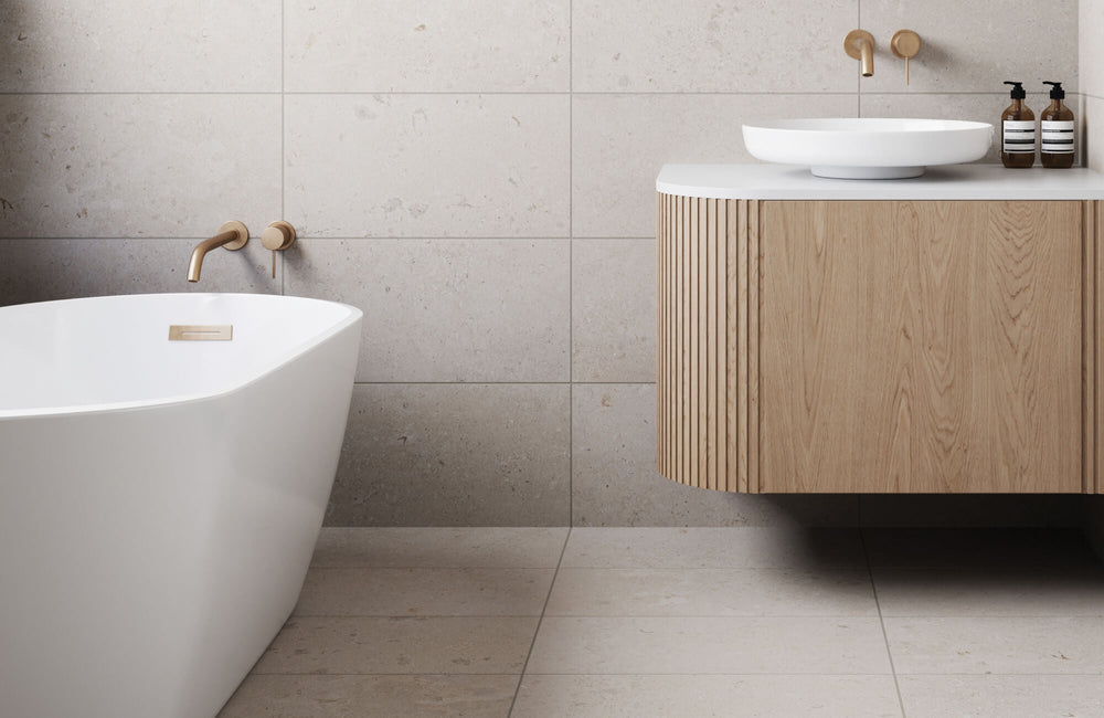
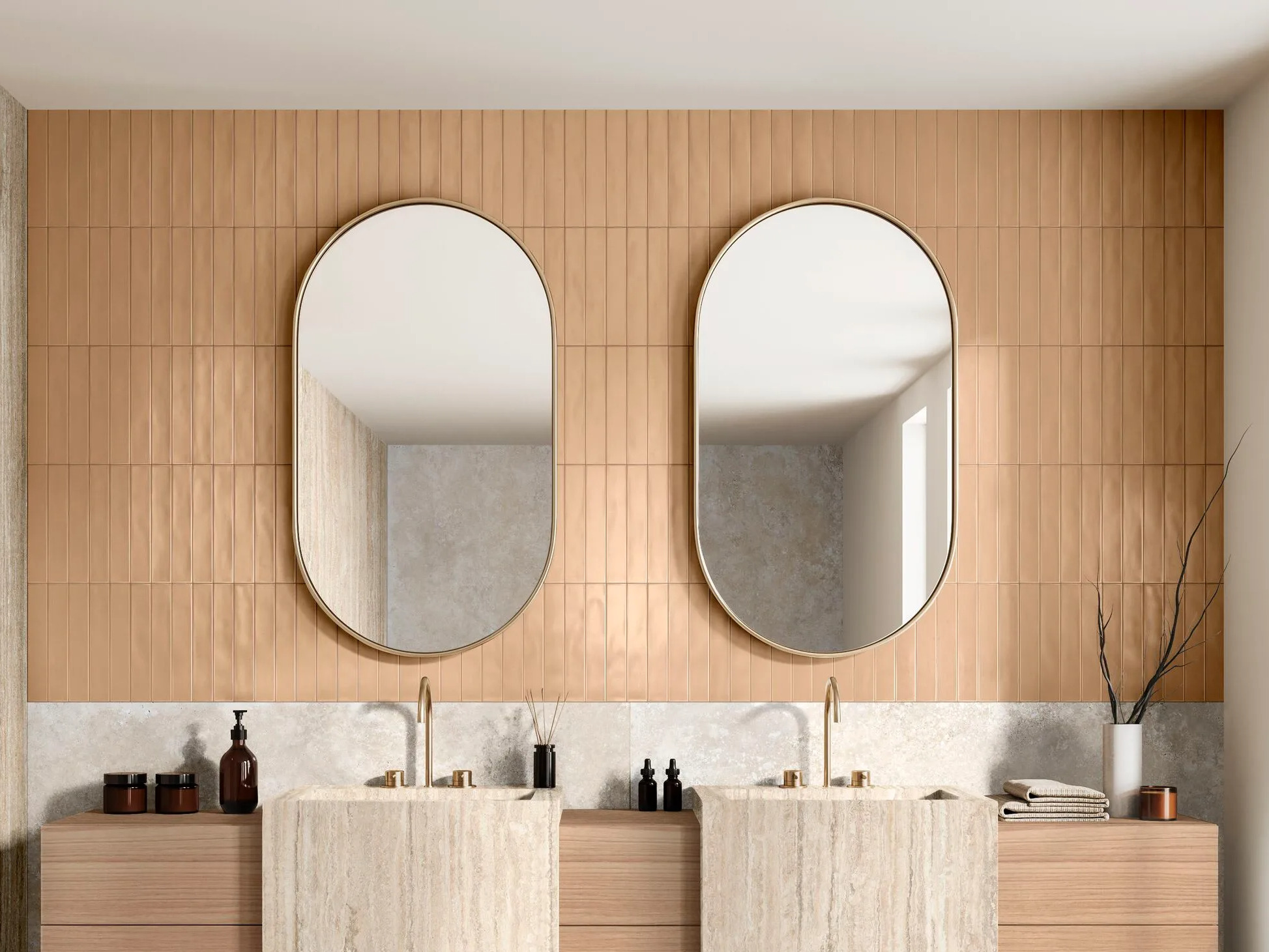
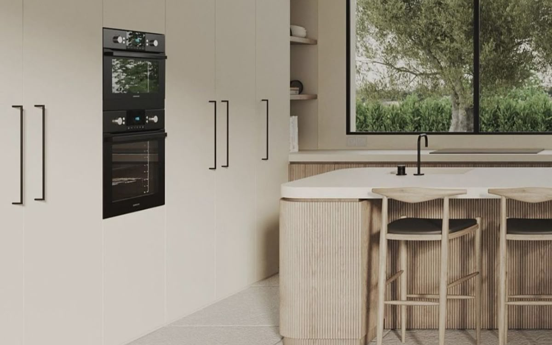
Timeless kitchen colours are usually neutral, earthy or softly contrasted. Shades like white, beige, warm grey, soft taupe and natural wood tones rarely go out of style. These colours reflect light well and make spaces feel calm and inviting.
They also pair beautifully with different materials like stone-look tiles, marble finishes or textured splashbacks.
Warmth Makes a Kitchen Feel Timeless
A timeless kitchen should feel inviting, not cold. Adding warmth through natural wood tones, stone-look tiles or warm-toned flooring helps balance lighter cabinets and walls.
Warmth prevents a kitchen from feeling lifeless and adds depth without relying on trends.
Kitchen Taps Should Match Your Colour Palette
Kitchen taps might seem like a small detail, but they play a big role in the overall look. A tap finish should complement your colour palette rather than compete with it.
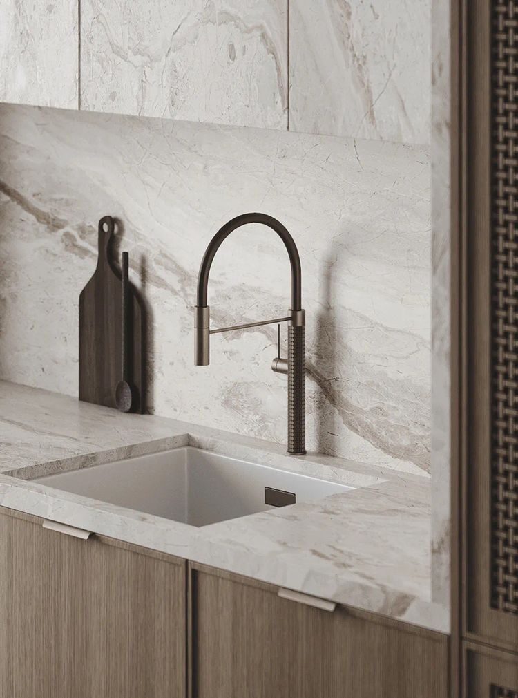
Classic finishes like chrome, brushed gold and soft brass tend to age well and suit timeless kitchens. Matte black taps can also feel timeless when paired with neutral palettes. Choosing a finish that works with your tiles and cabinetry helps create a cohesive look.
Dark Shades in Timeless Kitchen Colour Palettes
Timeless doesn’t always mean light. Deep navy, charcoal and rich brown tones can feel sophisticated and classic when used thoughtfully. These shades work best when balanced with lighter elements so the space doesn’t feel heavy.
Using darker tones on an island or lower cabinets keeps the look grounded while maintaining brightness.
Tiles That Support Timeless Kitchen Colour Palettes
Tiles influence how a colour palette comes together. Large-format neutral kitchen floor tiles create a seamless base that won’t date. Classic subway tiles remain a safe splashback for kitchen walls because of their simplicity.
Stone-look and marble-look tiles are especially timeless since they mimic natural materials that stay in style year after year.
Balance Trends With Timeless Choices
It’s fine to enjoy trends, but they shouldn’t dominate your kitchen. Introduce trendy colours through items that are easy to change like bar stools, décor, accessories or paint.
Keeping major surfaces timeless gives you flexibility to update the space without a full renovation.
Timeless kitchen colour palettes focus on colours that feel natural and adaptable. Neutral bases, warm elements and balanced contrast help create a kitchen that looks good today and still works years down the line.
Timeless design isn’t boring. It’s a smart way to create a kitchen that grows with your lifestyle and stays visually appealing.
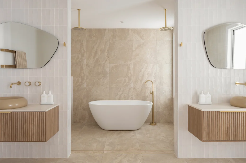
bathroom, blog, floors, kitchen, trends, walls
Timeless vs trend-led design is one of the biggest decisions homeowners face when planning a renovation or refresh. With so many styles and finishes constantly changing, knowing how to choose can save you from costly updates later. The goal is not to avoid trends entirely, but to understand when to embrace them and when to lean on timeless design choices.
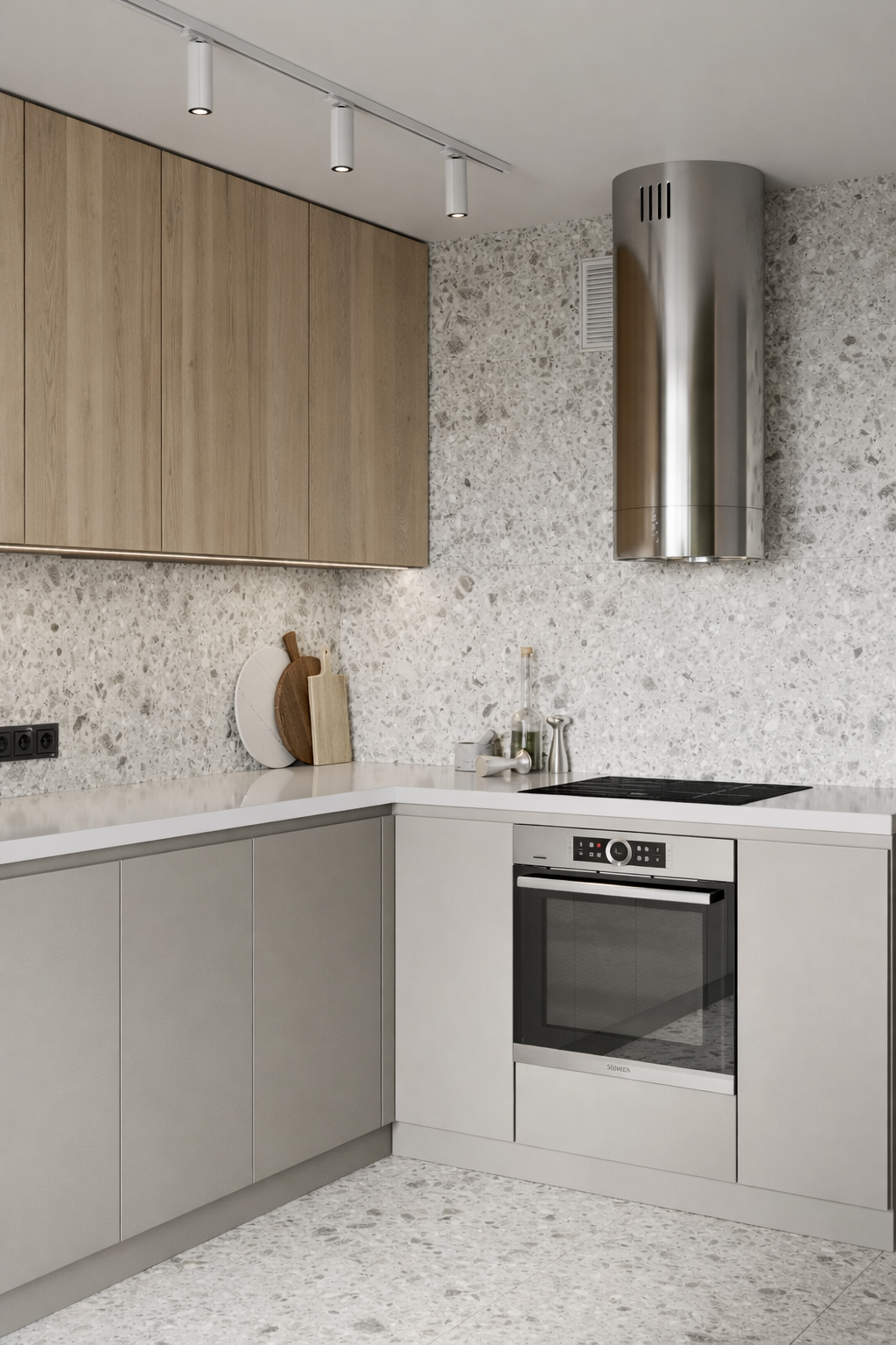
Table of Content:
Timeless vs Trend: Understanding the Difference
Why Timeless Design Is Easier to Live With
Where Trend-Led Design Works Best
Timeless vs Trend: Kitchens and Bathrooms
Timeless vs Trend: How to Choose
Timeless vs Trend: Understanding the Difference
Timeless:
Timeless design is about longevity. It focuses on materials, colours and layouts that stay relevant year after year. Neutral tiles, natural textures and simple forms fall into this category because they adapt easily as styles evolve.
Trend:
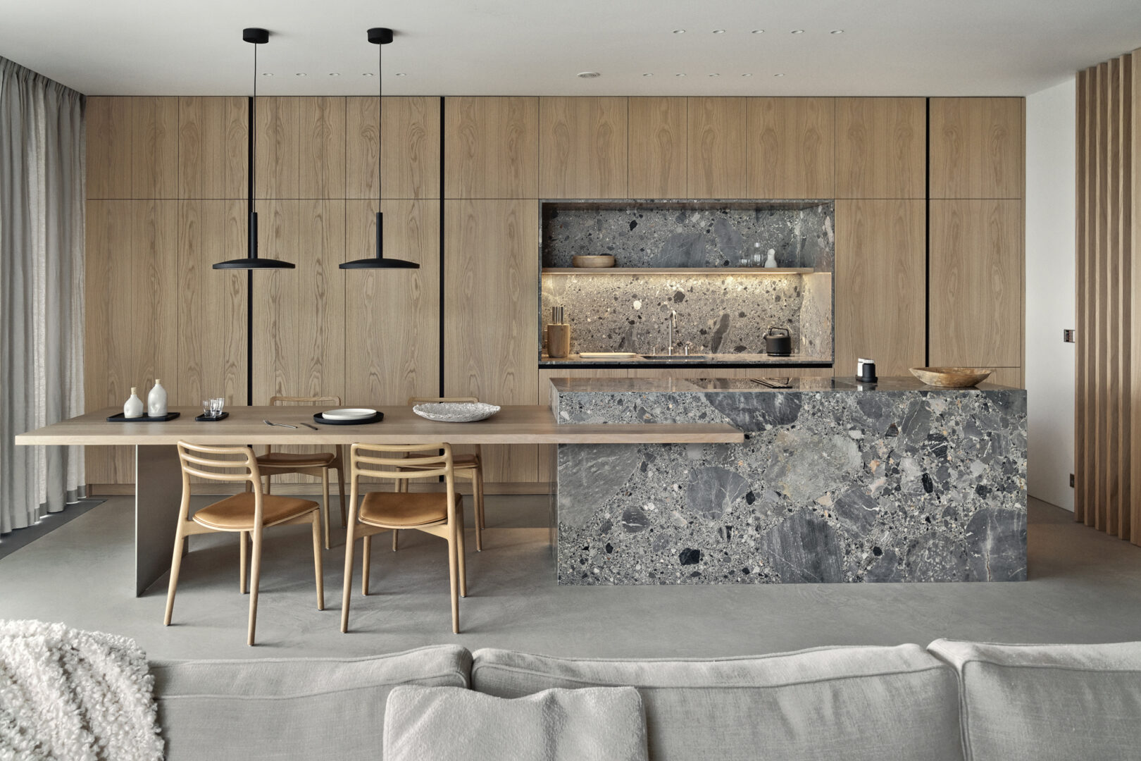
Trend-led design reflects what’s popular right now. Bold colours, statement tiles and eye-catching finishes add personality and energy to a space. While exciting, these choices can date faster if used too heavily.
Why Timeless Design Is Easier to Live With
Timeless design works best as the foundation of a home. Floor tiles, wall tiles and bathroom layouts are expensive to change, so choosing options that won’t feel dated makes sense. These choices create calm, flexible spaces that suit different tastes over time.
This approach is especially important in kitchens and bathrooms where durability and practicality matter most.
If you’re starting fresh or planning updates for the year ahead, our blog on renovation inspiration for the new year offers practical ideas for building a strong, timeless base while still refreshing your home.
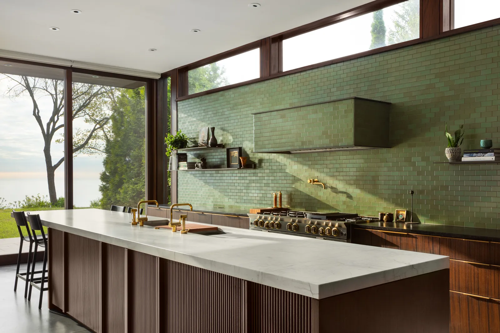
Where Trend-Led Design Works Best
Trend-led design shines when used in smaller, easier-to-update areas. Feature walls, splashbacks, decorative tiles and accessories are perfect places to experiment. These elements bring personality without locking you into a look for years.
image credit: inspivie
Using trends strategically keeps your home feeling current while still being practical.
If you’re curious about what’s shaping interiors right now, take a look at our top trend predictions for 2026 to see which styles are worth embracing and how to use them without overcommitting.
Timeless vs Trend: Kitchens and Bathrooms
Kitchens and bathrooms benefit most from a balanced approach. Choose timeless tiles for floors and main walls, then introduce trend-led elements through tapware, lighting or feature tiles.
This mix keeps the space visually interesting while ensuring it remains functional and easy to update down the line.
Timeless vs Trend: How to Choose
When deciding between timeless vs trend, think about how long you want the look to last. Ask yourself whether you’d still love the choice in five or ten years. If not, keep it limited.
A good rule of thumb is to invest in timeless materials and layer trends through finishes that are easier to replace.
Timeless vs trend-led design is not about choosing one over the other. It’s about knowing how to choose the right balance for your lifestyle and space. When done well, this approach creates interiors that feel current, personal and built to last.