
Colour has the incredible ability to transform a space, affecting both its look and feel. Whether you’re aiming to create a relaxing retreat or an energizing workspace, understanding how to use colour can help you achieve the perfect vibe. In this blog, we’ll explore everything from the psychology of colour to choosing the right palette and adding accents for a visually captivating design. Let’s dive in!
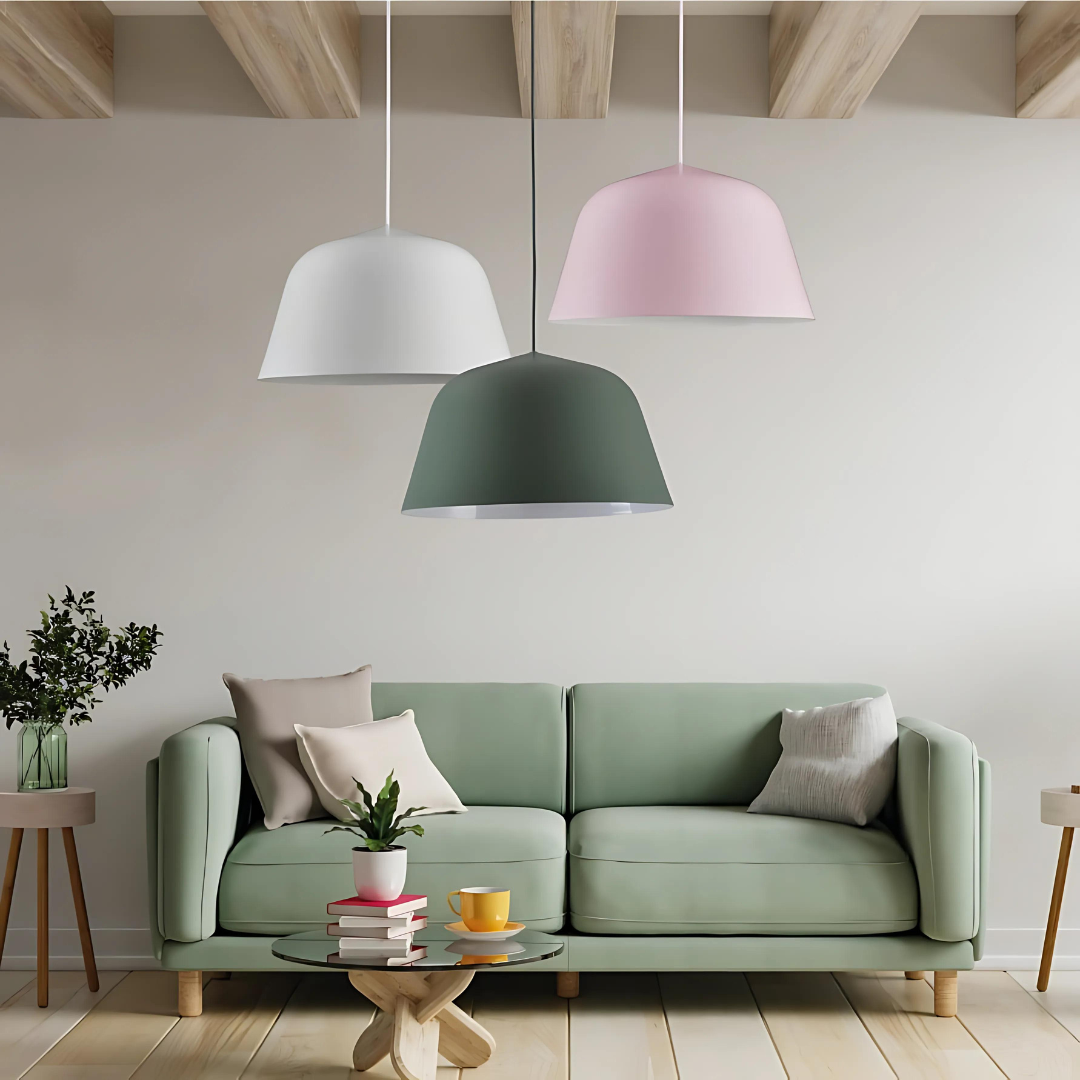
Image Credit: K Light
Table of Content:
The Psychology of Colour: How Colours Affect Your Mood
Choosing the Right Colour Palette: Crafting the Perfect Look
Accentuating with Colour: Bringing Life to Your Space
Prefer to watch?
The Psychology of Colour: How Colours Affect Your Mood
The colours you choose for a room can influence how you feel when you’re in it. This is the essence of colour psychology, and it’s a fantastic tool to guide your design choices.
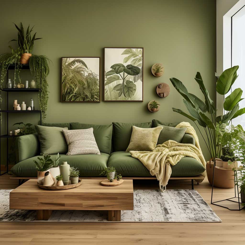
- Green: Associated with nature and harmony, green is perfect for spaces where you want a calm, refreshing atmosphere—think bedrooms or living rooms.
-
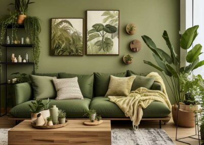
Image Credit: artfasad
-
opal green brillo ceramic 75 x 300 mm
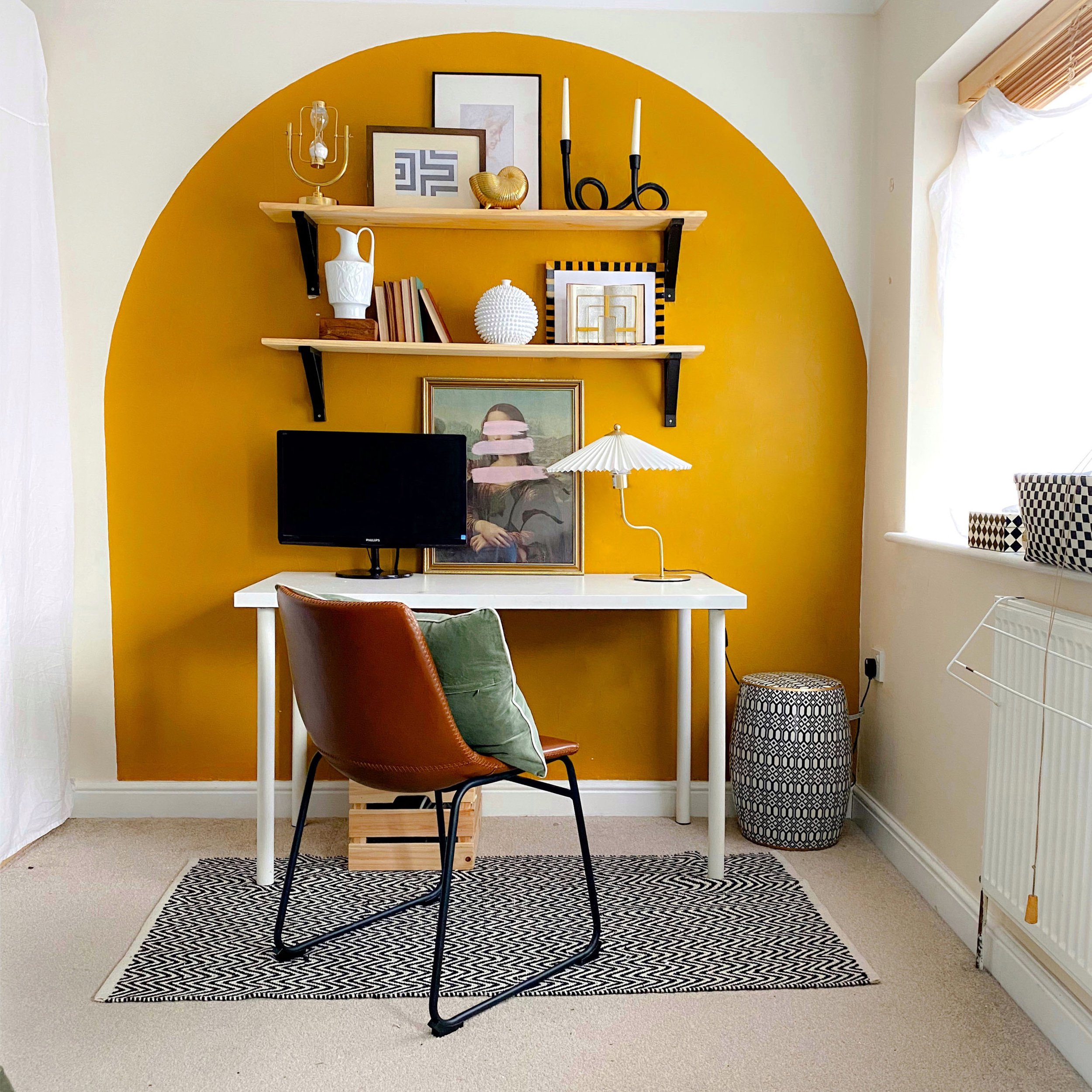
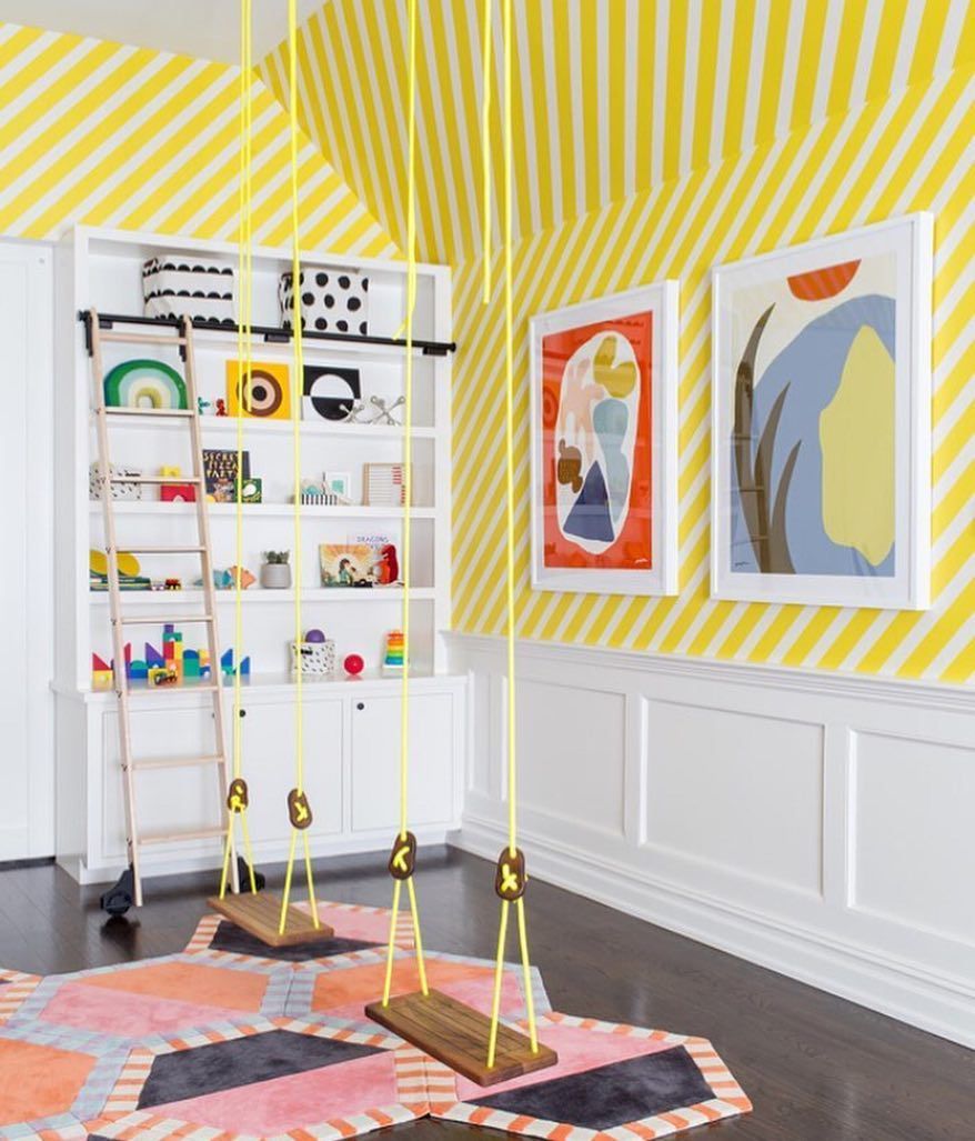
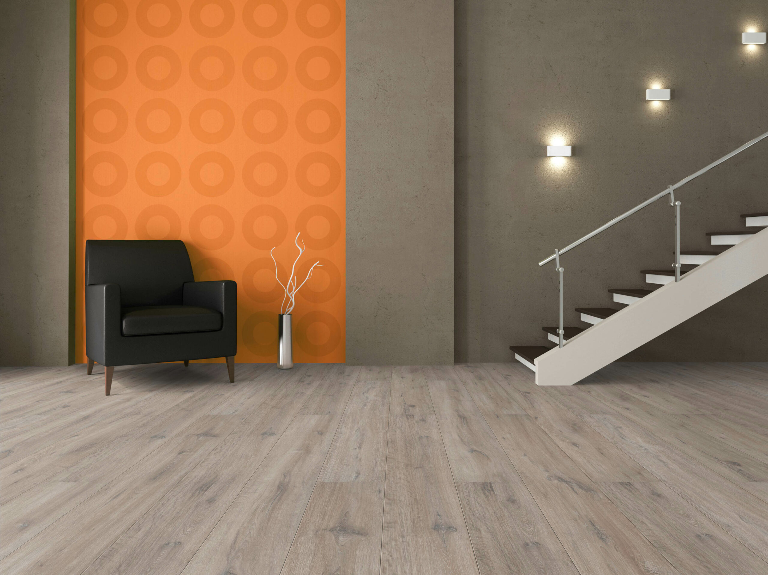
- Warm colours (Red, Orange, Yellow): These vibrant hues are energizing and uplifting, ideal for creative spaces like home offices or children’s playrooms.
-
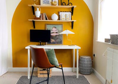
Image Credit: Apartment Therapy
-
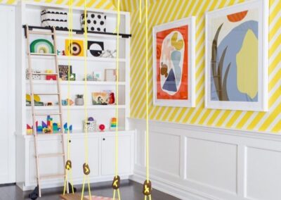
Image Credit: Chango
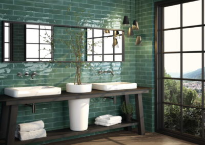
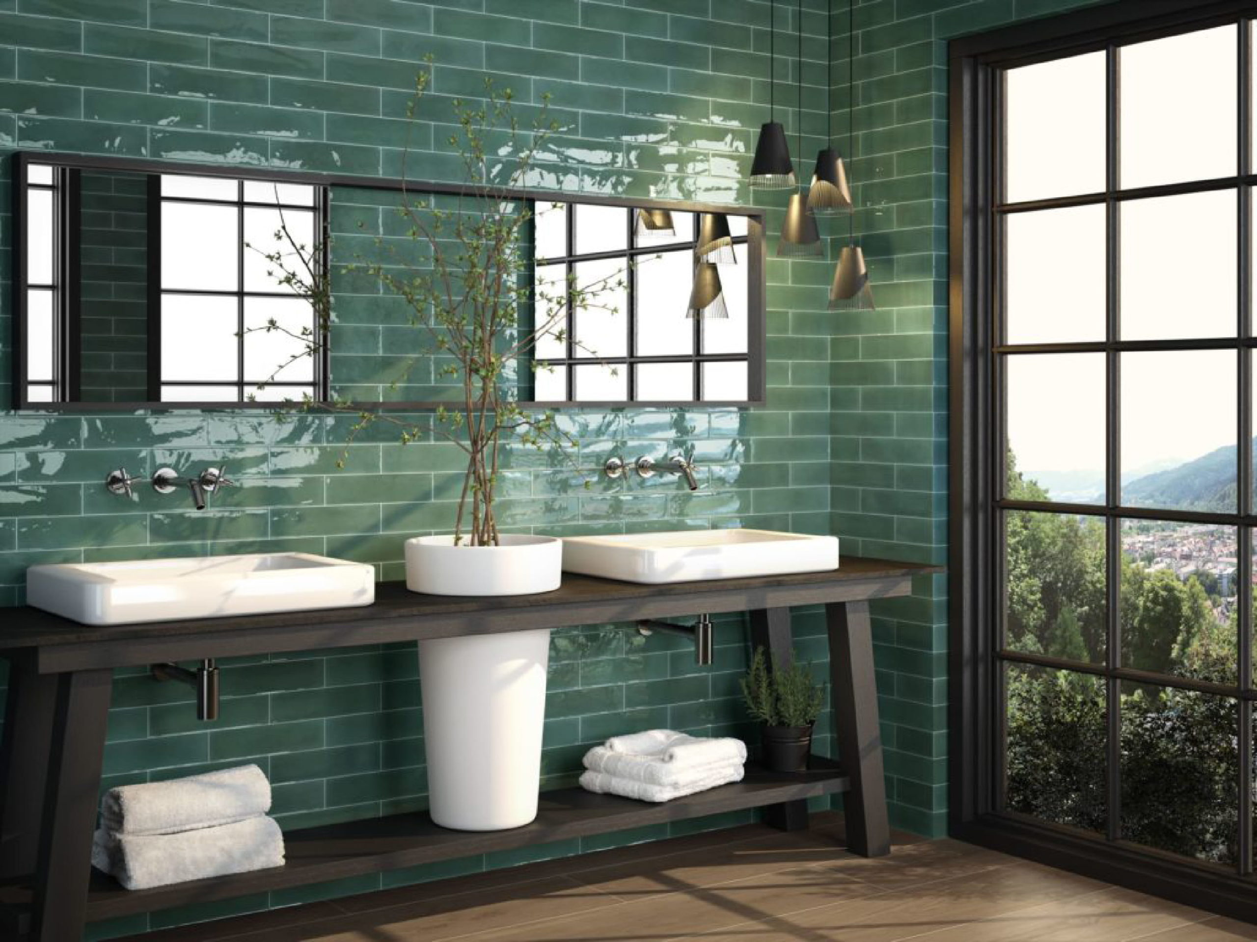
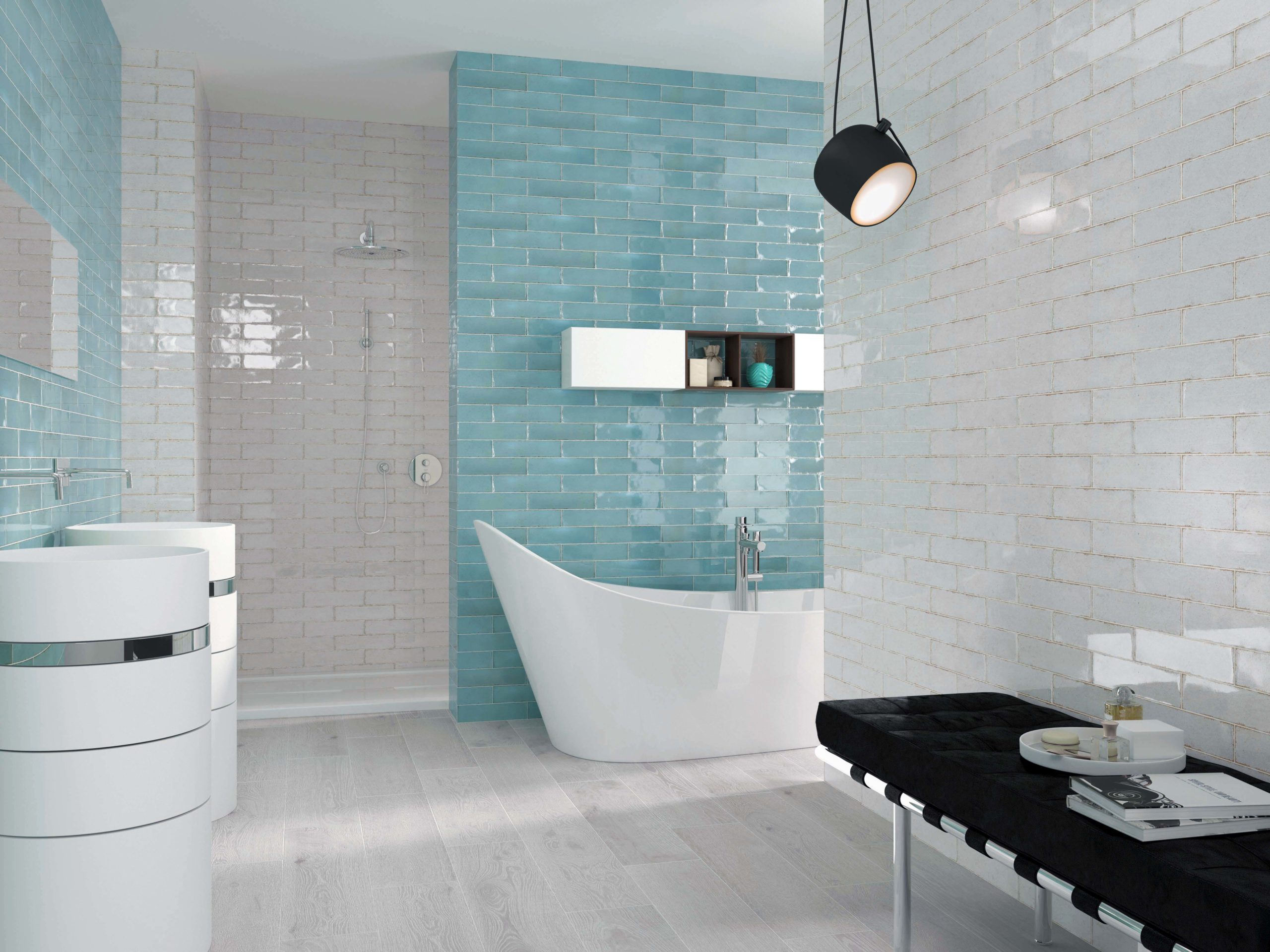
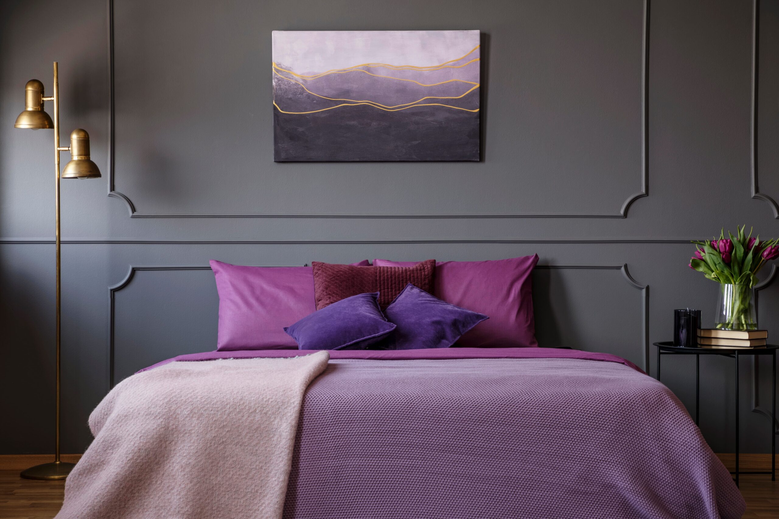
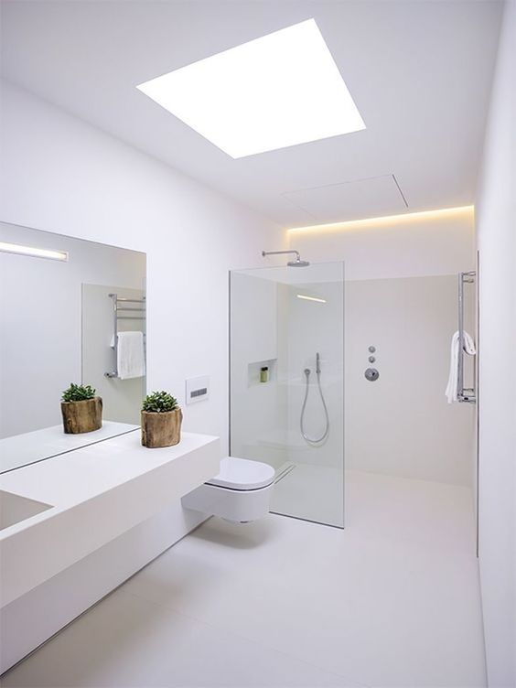
- Cool colours (Blue, Purple): These shades bring a sense of calm and tranquillity, making them ideal for bathrooms or any space where you want to unwind.
-
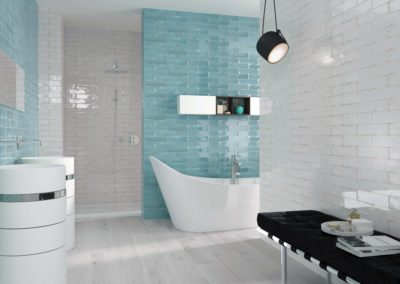
Above: soul aqua ceramic
-
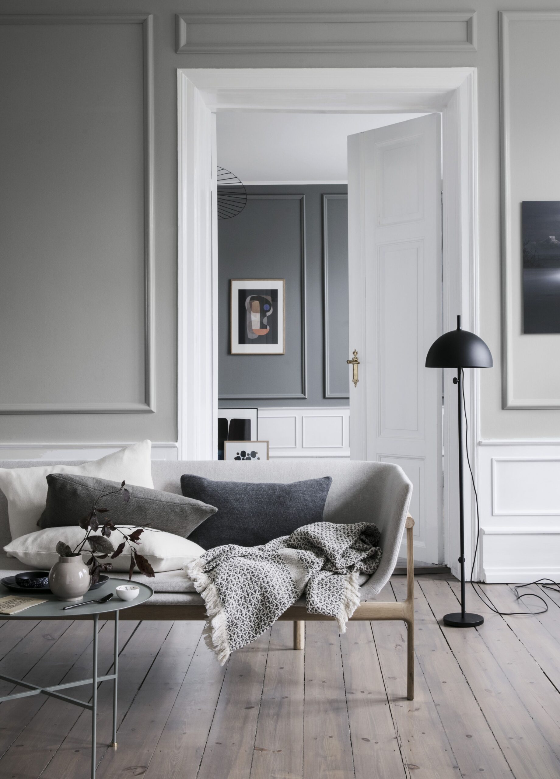
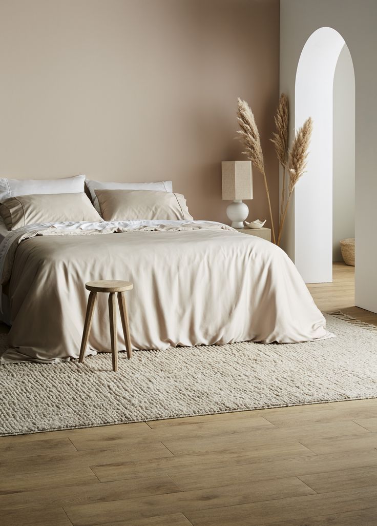
- Neutral colours (White, Grey, Beige): Neutrals are versatile and create a sense of balance. White offers a fresh, clean feel—perfect for bathrooms and kitchens—while grey brings sophistication, and beige adds warmth and coziness.
-
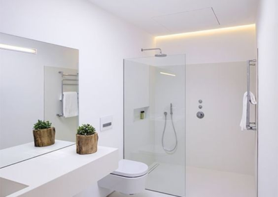
Image Credit: Somosaguas Luxury Living
-
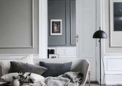
Image Credit: Urban Avenue
-
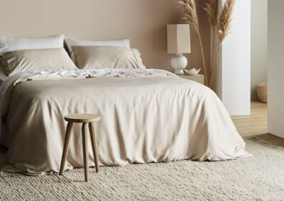
Image Credit: Zesa
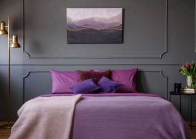
- Black: This bold colour adds drama and elegance, perfect for creating a luxurious feel in any room.
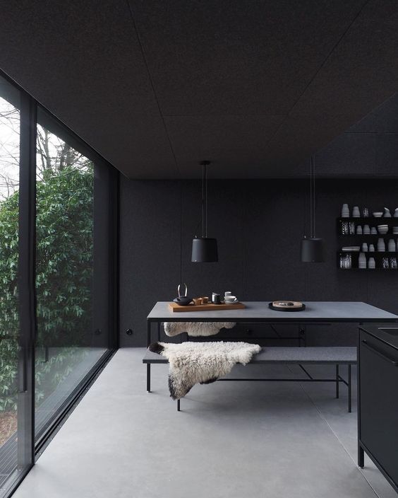
Image Credit: Wen van Woudenberg
By understanding the impact of these colours, you can tailor your spaces to evoke the desired mood, whether it’s a serene retreat or an energetic hub.
Choosing the Right Colour Palette: Crafting the Perfect Look
Selecting the right colour palette is key to creating a harmonious and visually pleasing space. Here are some popular schemes to guide you:
- Monochromatic: This scheme uses different shades, tints, and tones of a single colour, creating a cohesive and serene environment. It’s an elegant option for spaces where simplicity and flow are important.
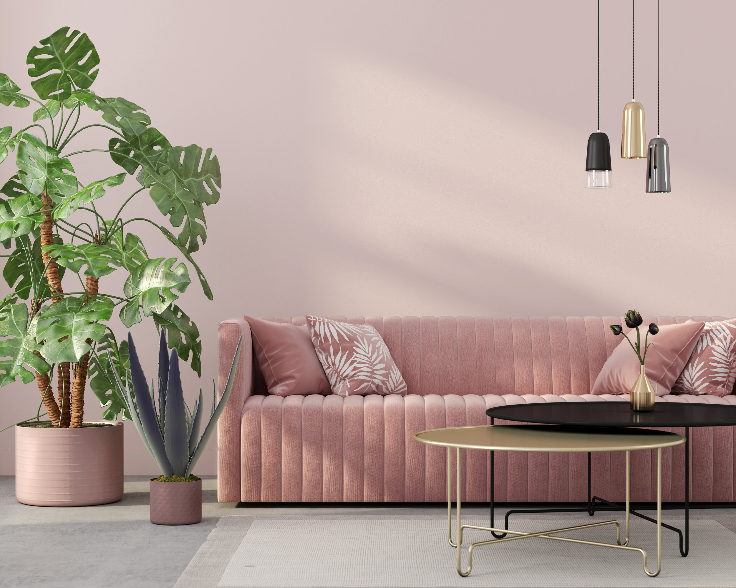
Image Credit: iStock
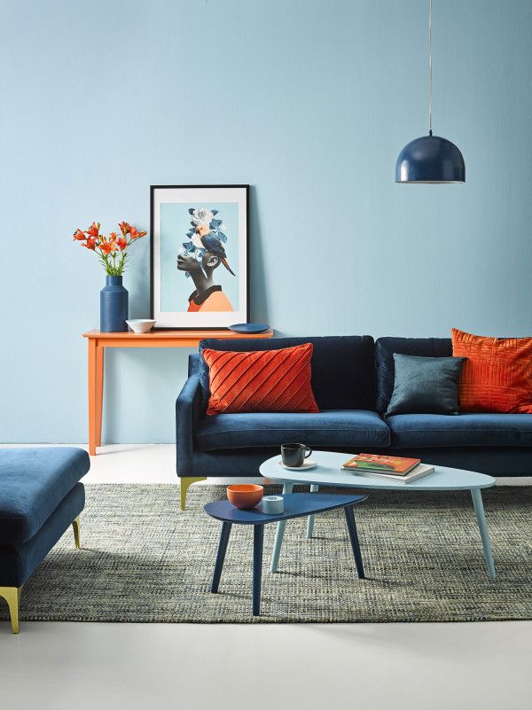
- Complementary: Pairing colours opposite each other on the colour wheel, such as blue and orange, creates a dynamic look with lots of visual interest. This scheme works well when you want certain elements to pop.
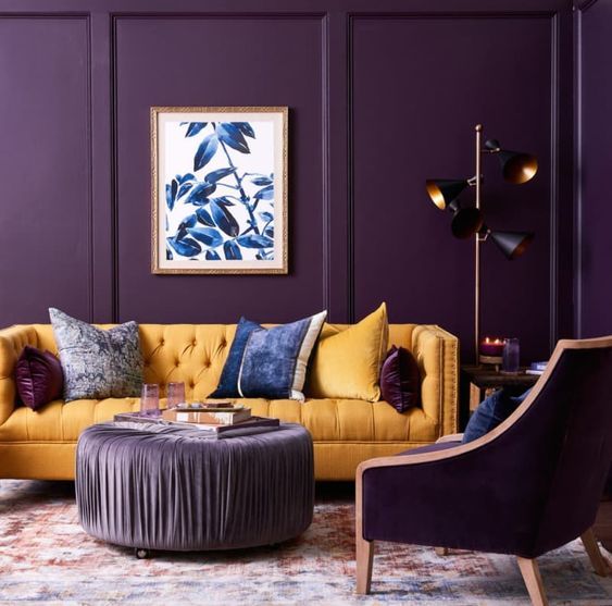
Image Credit: vogue.com.au
- Analogous: These are colours next to each other on the colour wheel, like blue and green. This scheme is naturally harmonious, perfect for creating a unified, peaceful space.
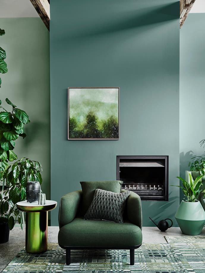
Image Credit: Lisa Cohen
When choosing a palette, consider the size and natural lighting of the room. Lighter colours can make a small space feel bigger, while darker hues create a more intimate vibe. Don’t forget to factor in the emotional impact of the colours you choose to ensure they align with the atmosphere you’re aiming for.
Accentuating with Colour: Bringing Life to Your Space
Once you’ve chosen your primary palette, it’s time to add pops of colour for a bit of flair and personality. Here’s how to do it right:
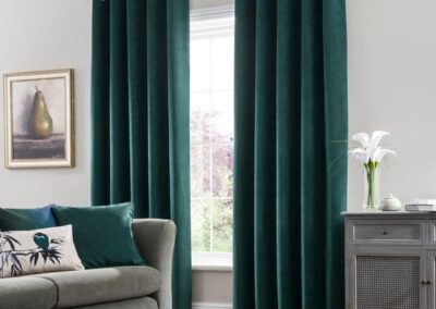
- Accent Walls: Pick a bold colour for one wall to create a striking focal point in the room.
- Furniture and Accessories: Add colourful chairs, cushions, or artwork that stand out against neutral backgrounds. These accents can make the room feel lively and well-coordinated.
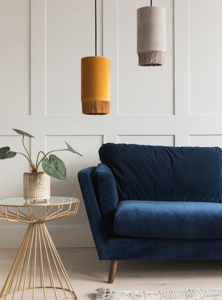
Image Credit: roseandgrey
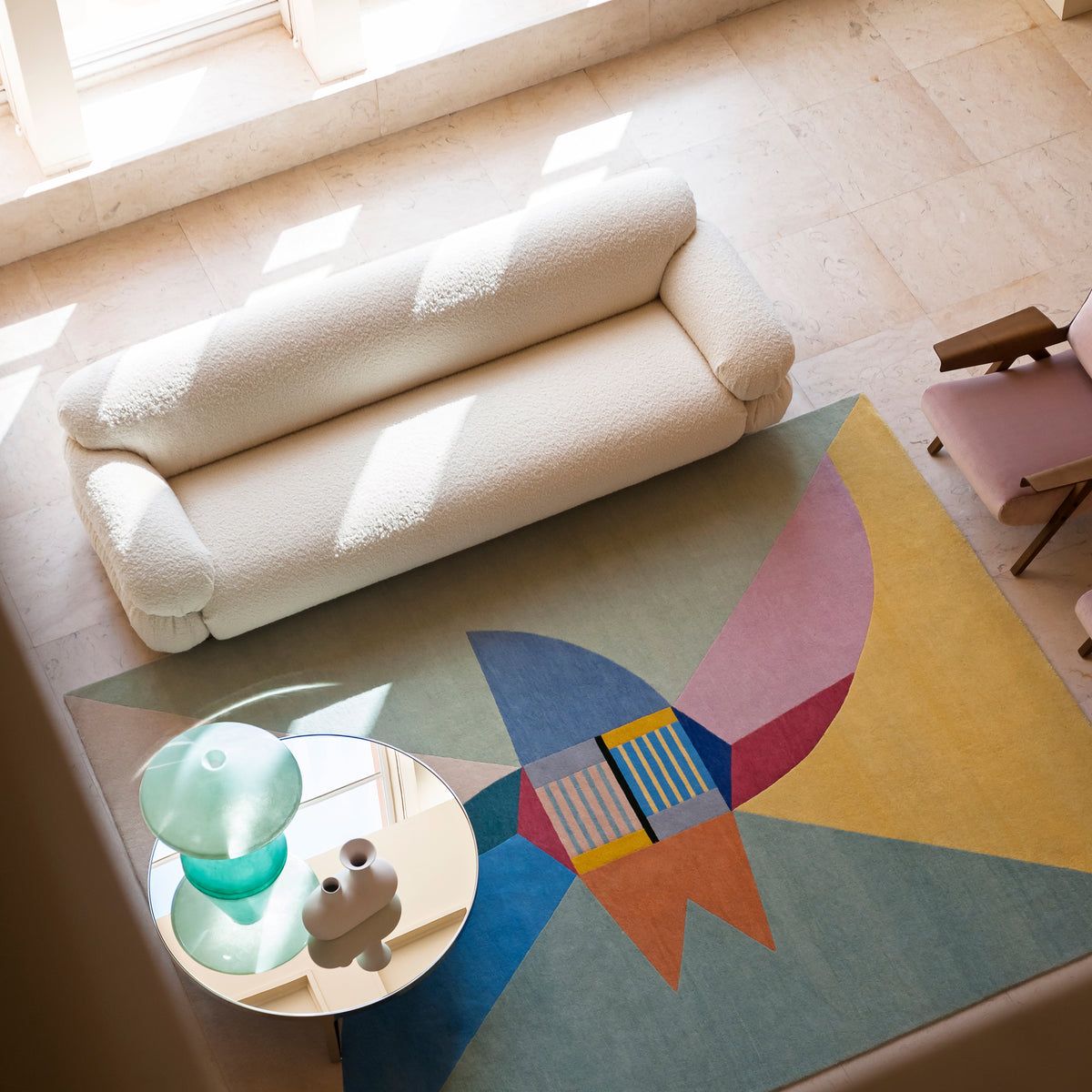
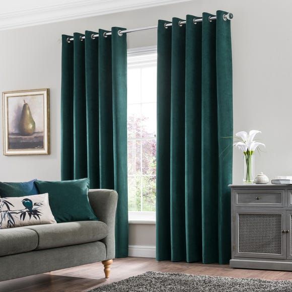
- Rugs and Curtains: These are another easy way to introduce colour and tie the entire room together.
-
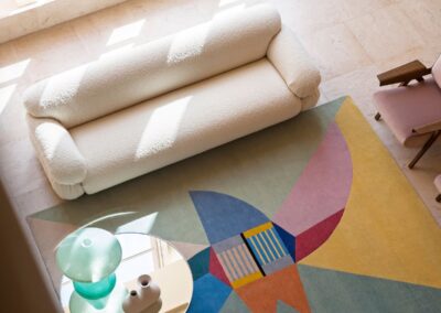
Image Credit: Gianfranco Frattini
-
- Small Accents: Don’t underestimate the power of smaller items like vases, throw pillows, or even plants. These subtle touches can add visual interest without overwhelming the space.
-
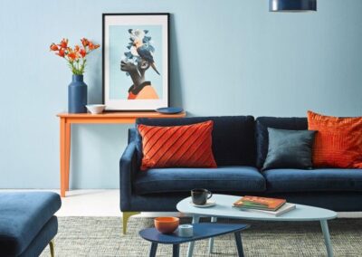
Image Credit: Resene
-
Image Credit: Colour Meanings
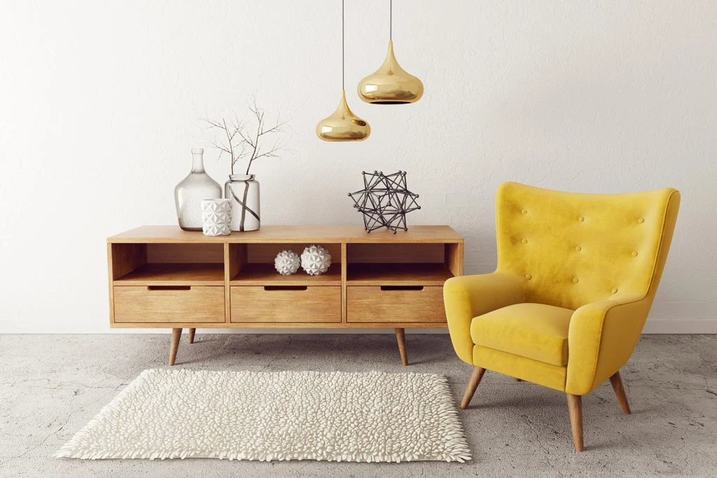
- Lighting: Different colour light features can be used as an accent to a room, adding an extra layer of visual interest.
-
Image Credit: K Light
-
When accentuating with colour, balance is key. You want to enhance the room’s design without it feeling too busy. Using the colour wheel as a guide, choose accent colours that complement your primary palette to create a cohesive look. Even small changes can make a big difference in how a room feels.
Whether you’re starting from scratch or just refreshing a space, the power of colour in interior design is undeniable. From understanding the psychology behind each hue to selecting a colour palette and adding accents, these tips will help you transform any room into a beautiful and functional space.
Ready to get started on your colourful journey? Let us know your favourite ways to use colour in the comments below!
Prefer to watch?
Check out the four three part series below where Ryan and Deon discuss The Power of Colour in Interior Design below