
Choosing the right colour palette can completely transform your home. Whether you’re updating a single room or planning a full renovation, your choice of colours will influence the mood, functionality and longevity of your space. If you’re looking to strike the perfect balance between modern style and timeless appeal, you’re in the right place. Let’s explore the best colour palettes that never go out of fashion.
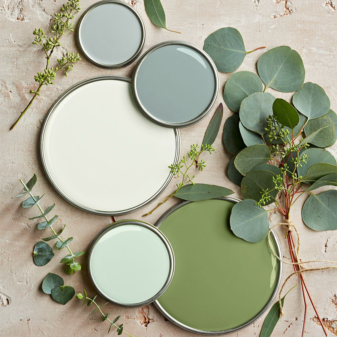
Table of Content:
Warm Neutrals
Monochrome Elegance
Soft Blues & Cool Greys
Earthy Greens & Olive Tones
Classic Greyscale
Muted Terracotta & Dusty Pink
Warm Neutrals
Warm neutrals are a go-to for creating a cosy, inviting space. Think shades of beige, taupe, greige and warm whites. These tones work beautifully in living rooms, bedrooms and kitchens, especially when paired with natural materials like wood and stone. They create a soft, grounded feel that won’t feel outdated in a few years.
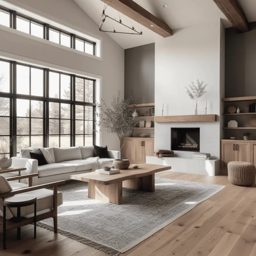
Image Credit: axxla.com
Best for: open-plan spaces, minimalist interiors and layering textures
Pair with: wood look flooring, ceramic tiles and soft furnishings in earthy hues
Monochrome Elegance
A black and white palette is the definition of timeless. It’s bold, clean and endlessly versatile. Monochrome doesn’t mean boring – you can add depth through different finishes, patterns and textures. Think matte black fixtures against crisp white tiles or a dramatic black feature wall in an all-white room.

Image Credit: cosentino.com
Best for: bathrooms, kitchens and modern industrial designs
Pair with: high-contrast tiles, glossy surfaces and simple geometric patterns
Soft Blues & Cool Greys
Looking for a calm and sophisticated vibe? Soft blues paired with cool greys bring serenity into any space. These tones are great for coastal-inspired interiors or minimalist homes with a Scandinavian twist. They also play nicely with natural light, making rooms feel airy and open.
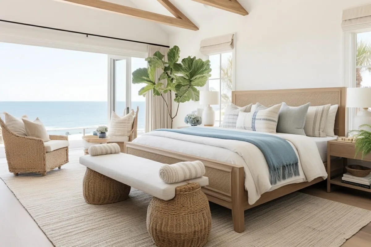
Image Credit: decorilla.com
Best for: bedrooms, bathrooms and small spaces
Pair with: light oak flooring, white accessories and subtle metallic finishes
Earthy Greens & Olive Tones
Nature-inspired colours are huge right now and they’re not going anywhere. Olive green, sage and muted forest shades feel organic and grounding. These colours work especially well when combined with natural textures like stone, clay and rattan.
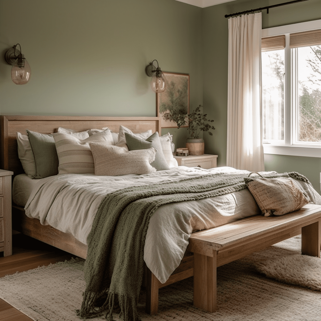
Best for: living areas, entryways and biophilic design schemes
Pair with: terracotta tiles, concrete finishes and indoor plants
Classic Greyscale
From pale dove grey to rich charcoal, greys remain a staple in modern home design. They provide a clean backdrop that lets other design elements shine. Use different tones of grey to create depth and interest without overwhelming the space.
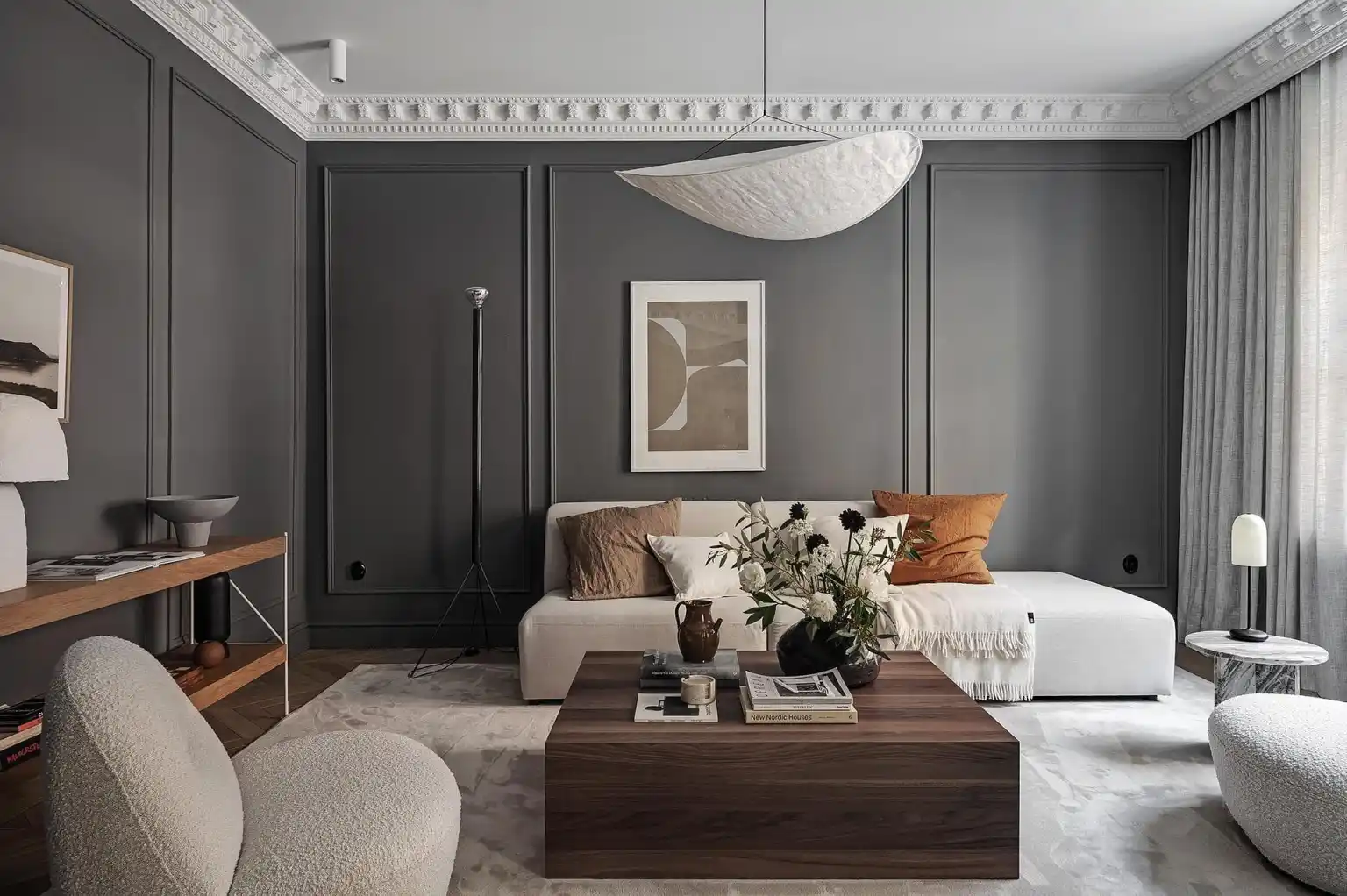
Image Credit: cocolapinedesign.com
Best for: entire home colour schemes or feature walls
Pair with: marble-look tiles, chrome hardware and accent lighting
Muted Terracotta & Dusty Pink
Looking to warm things up without going too bold? Muted terracotta and soft pinks add a sense of comfort and charm. These colours bring in a subtle vibrancy while maintaining a sophisticated grown-up feel.
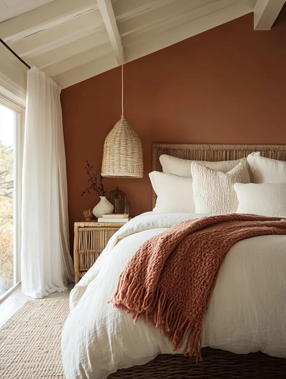
Image credit: Living Bright Interiors
Best for: bedrooms, reading nooks and creative studios
Pair with: warm wood tones, neutral tiles and textured fabrics
The best colour palette for your home should reflect your personal style while standing the test of time. Whether you’re drawn to clean monochromes, calming blues or warm neutrals, there’s a timeless palette that can suit your space. The key is to balance colour with texture, lighting and materials to create a cohesive look that feels modern and lived-in.
Need help choosing tiles or flooring to match your colour scheme? Explore our collections at Tiletoria for timeless finishes that elevate every room.