
Pantone Colour of the Year 2026 Cloud Dancer is already making waves in the world of interior design for its soft, airy feel and effortless versatility. As homeowners and designers move toward calmer, more mindful spaces, Cloud Dancer stands out as the perfect shade to refresh interiors with clarity and warmth. This colour brings a unique blend of serenity and adaptability that fits beautifully into both homes and commercial projects, offering endless ways to elevate a space with a sense of calm and quiet sophistication.
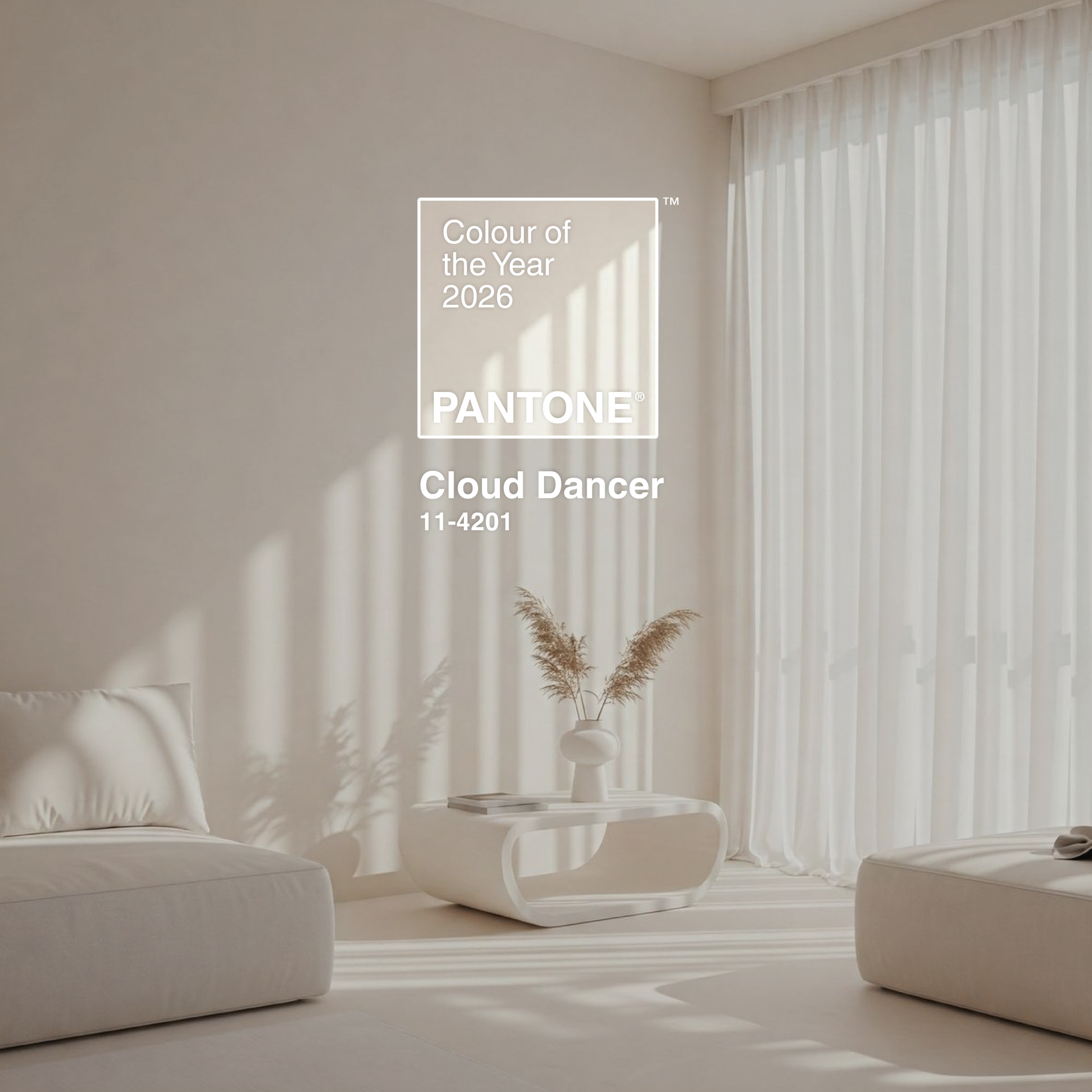
Table of Content:
The Meaning Behind Pantone Colour of the Year 2026 Cloud Dancer — A Whisper of Calm in a Busy World
Pantone Cloud Dancer Colour Palettes
How to Incorporate Pantone Colour of the Year 2026 Cloud Dancer Into Your Interior Design
Why Cloud Dancer Works So Well With Tiles
Pantone Colour of The Year 2026: A Colour for Every Style
The Meaning Behind Pantone Colour of the Year 2026 Cloud Dancer — A Whisper of Calm in a Busy World
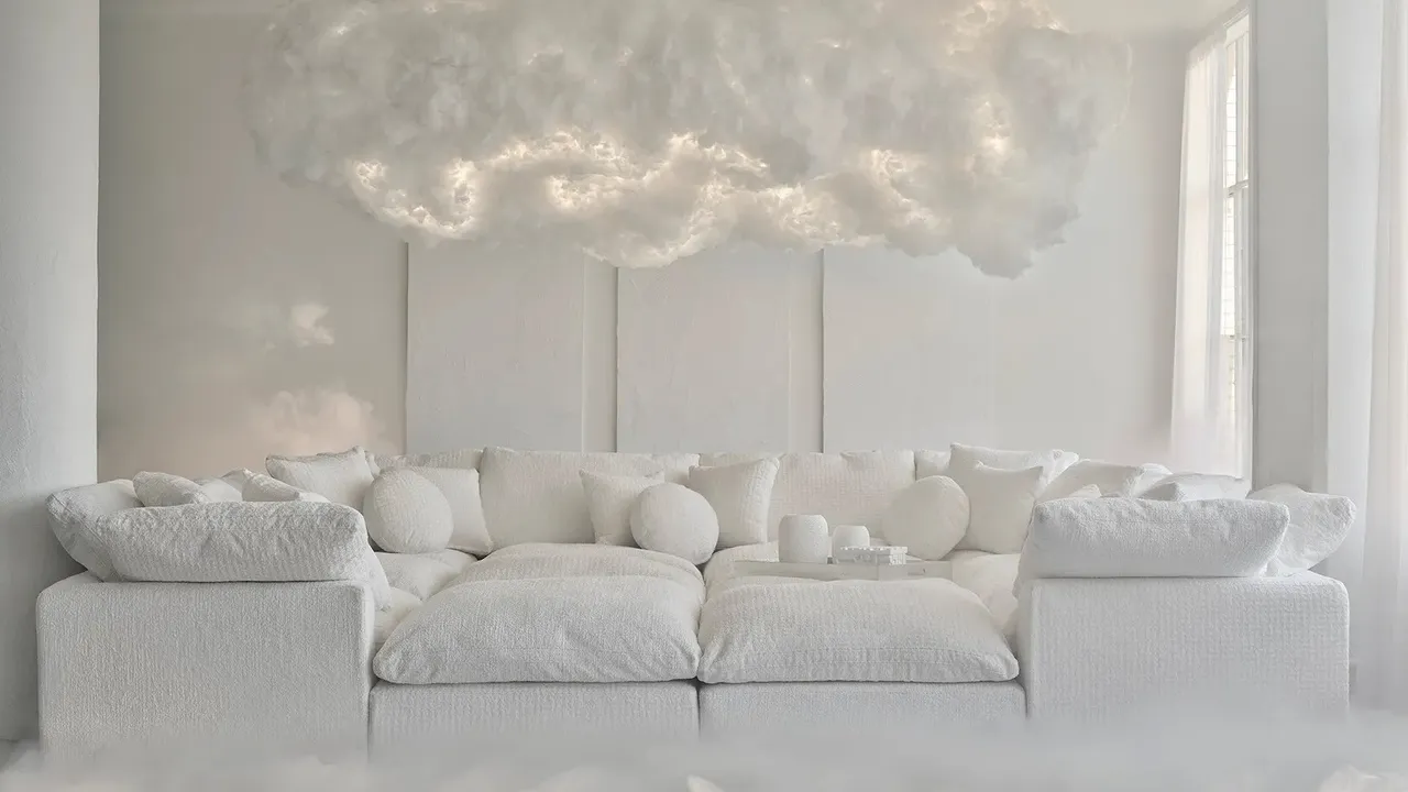
image credit: joybird x pantone
Pantone Colour of the Year 2026 Cloud Dancer brings a sense of stillness at a time when life feels fast and chaotic. This soft, airy white has a calming presence that helps you slow down, breathe and reconnect with your thoughts. It encourages true relaxation and gives your mind the space it needs for clarity and creativity.
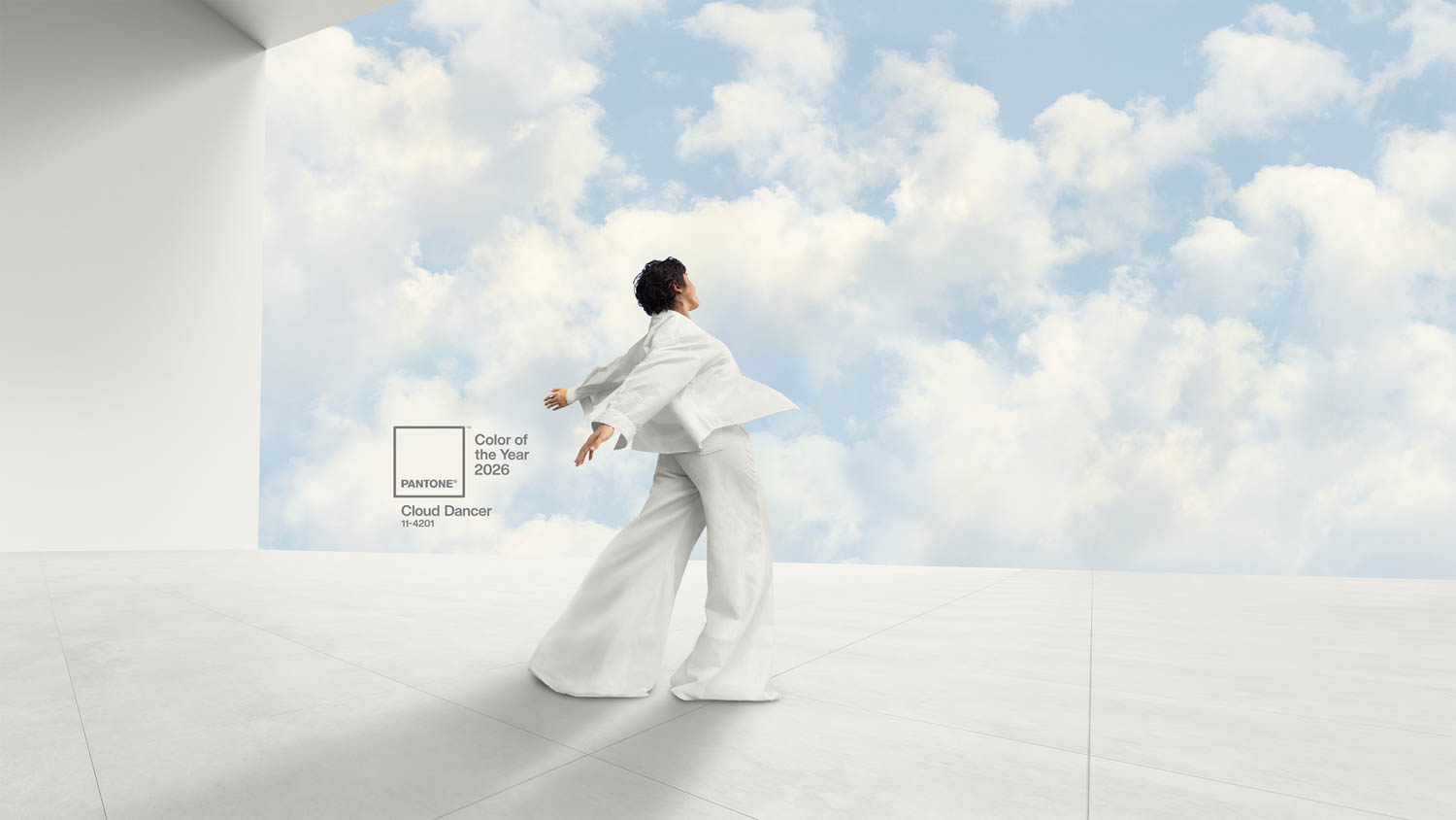
image credit: pantone.com
Cloud Dancer naturally opens up a room, making it feel lighter, cleaner and more spacious. It has a gentle way of blending emotion with practicality, turning any interior into a peaceful retreat. Whether used across a whole room or as a supporting colour, it creates an uplifting environment that feels fresh and soothing.
Pantone Cloud Dancer Colour Palettes
-
image credit: pantone.com
-
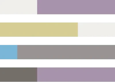
image credit: pantone.com
In a world where colour is deeply linked to self-expression Cloud Dancer earns its place as a versatile favourite. It adapts beautifully to different design styles, complements a range of palettes and can either stand alone or balance richer tones. Its soft brightness brings a sense of breathability to every room it touches.
Powdered Pastels
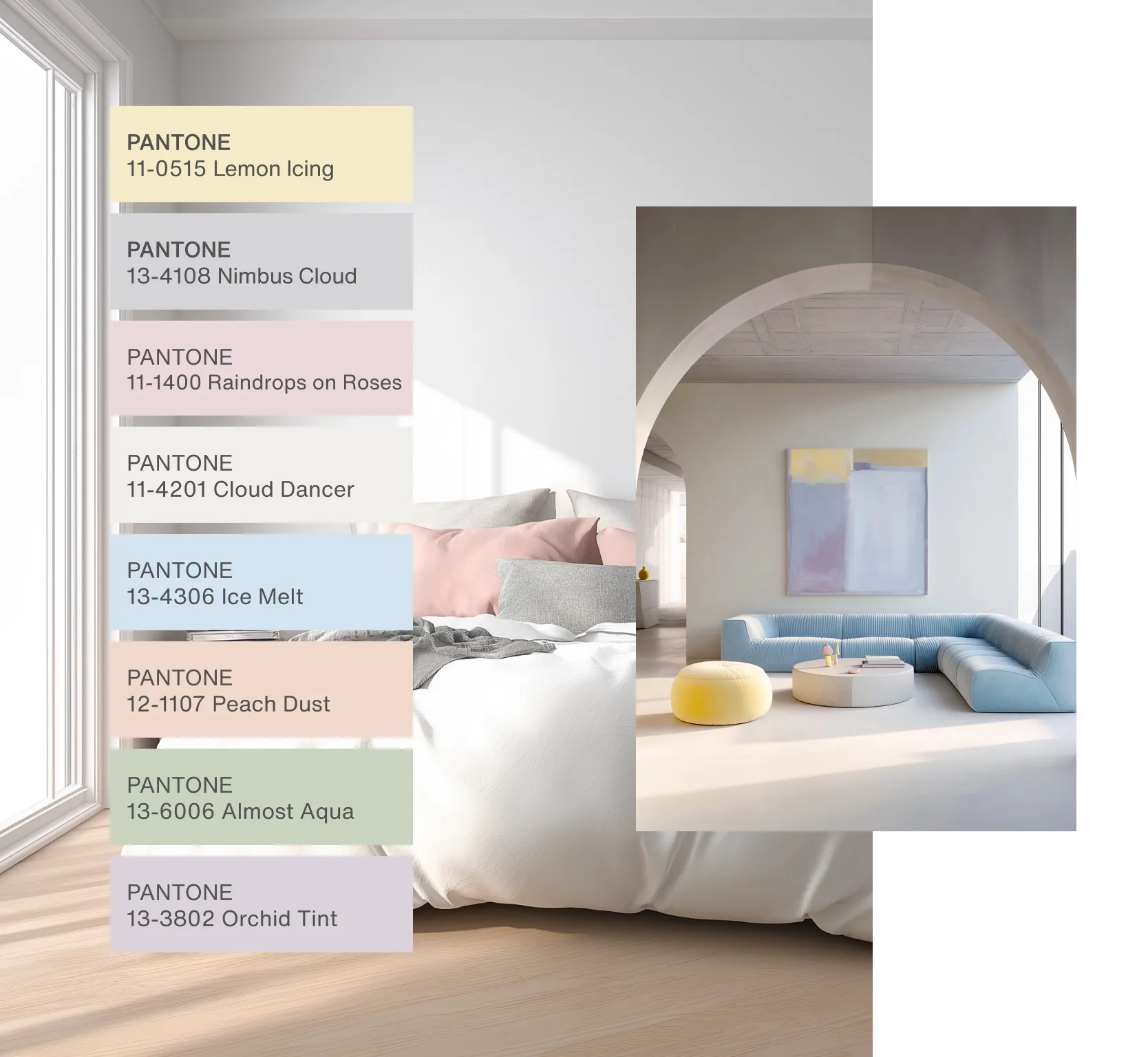
image credit: pantone.com
Cloud Dancer pairs effortlessly with light pastels and gentle neutrals. These combinations offer subtle shifts in tone that feel warm, refined and easy on the eye. If you want a calming look that still feels layered and interesting this palette is a great place to start.
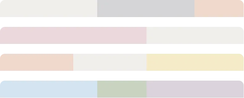
Light & Shadow
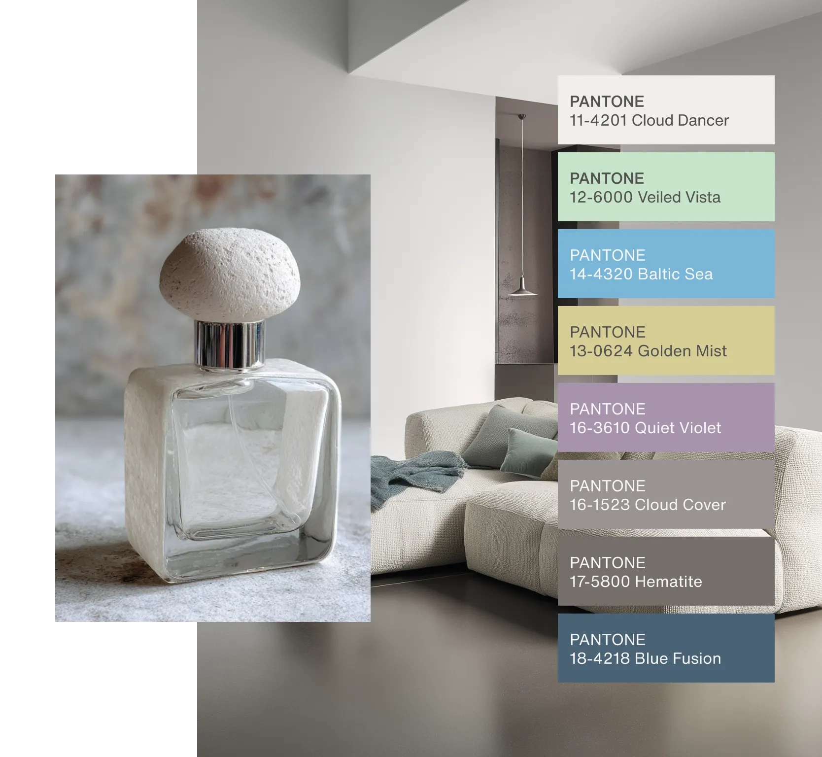
image credit: pantone.com
For a more dramatic atmosphere Cloud Dancer works seamlessly with softened deep tones. When paired with charcoal, muted navy or earthy shadow shades the contrast feels harmonious rather than harsh. This light and dark balance adds depth without weighing a room down.
(pantone.com)
How to Incorporate Pantone Colour of the Year 2026 Cloud Dancer Into Your Interior Design
Cloud Dancer is as functional as it is beautiful, making it easy to introduce into your home whether you prefer minimalist style or warm, cosy design. Here are effortless ways to make it work in your space:
Cloud Dancer Walls for a Clean and Quiet Look
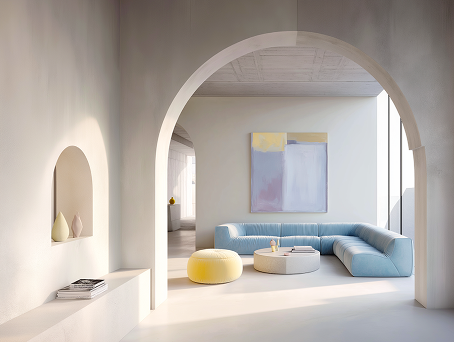
image credit: pantone.com
Painting walls in Cloud Dancer immediately brightens a room while keeping the atmosphere soft rather than stark. It creates a calm backdrop for furniture, décor and statement flooring, especially wood-look vinyl or natural stone tiles.
Use Cloud Dancer Tiles to Elevate Bathrooms and Kitchens
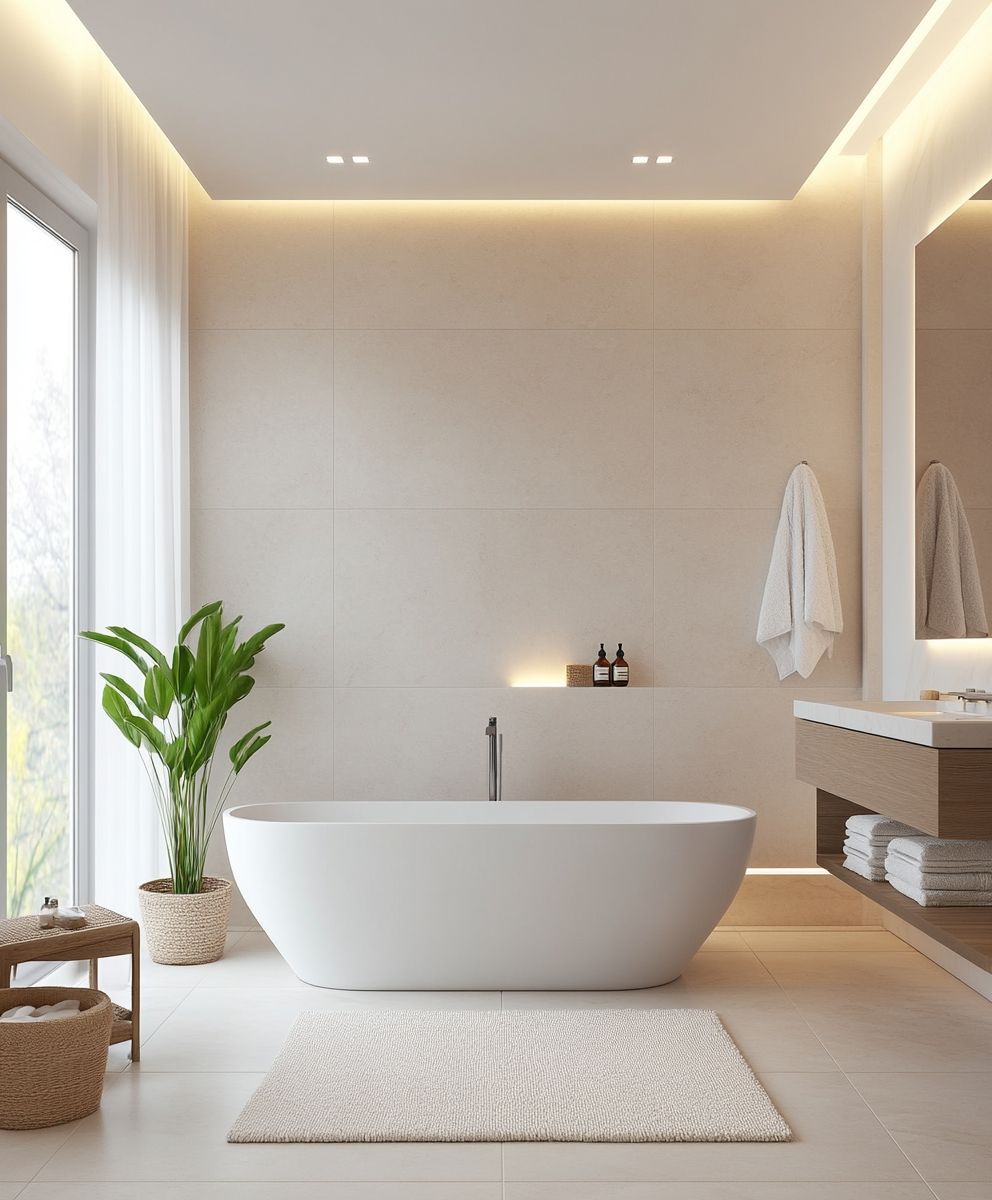
image credit: modern-living-spaces.de
Soft white tiles are timeless and Cloud Dancer-inspired tones work especially well in bathrooms and kitchens where clean design matters most. Pair Cloud Dancer tiles with brushed brass taps, soft greys or pastel accents for a modern finish.
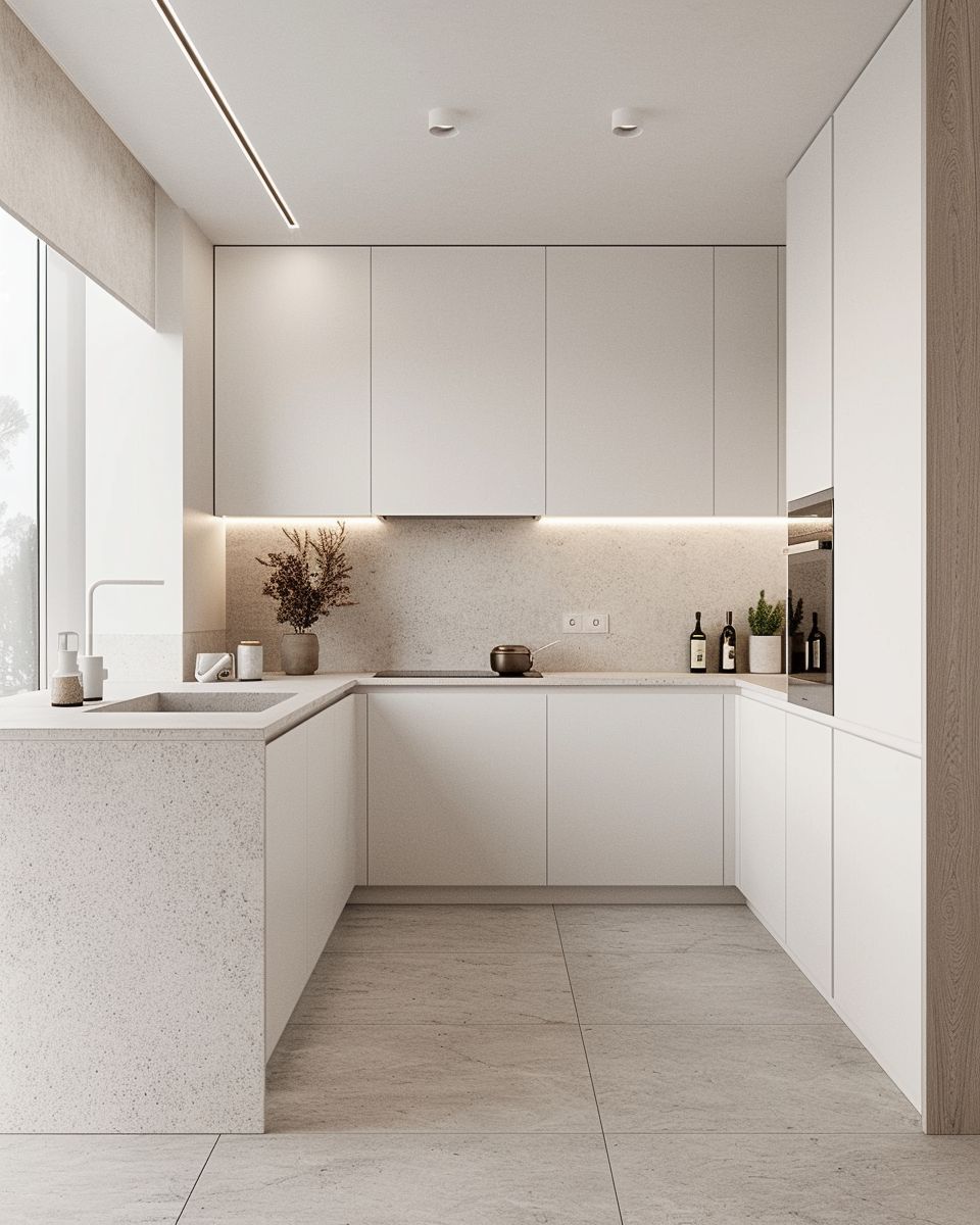
Pair With Warm Flooring for a Balanced Space
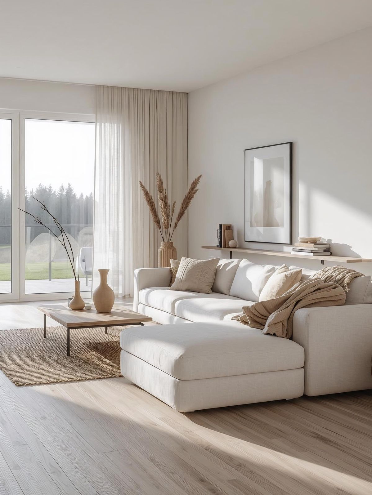
Because Cloud Dancer is airy and light it pairs beautifully with warm flooring such as oak-look laminate, textured vinyl or neutral large-format tiles. This combination creates warmth without losing brightness, making it ideal for living rooms and bedrooms.
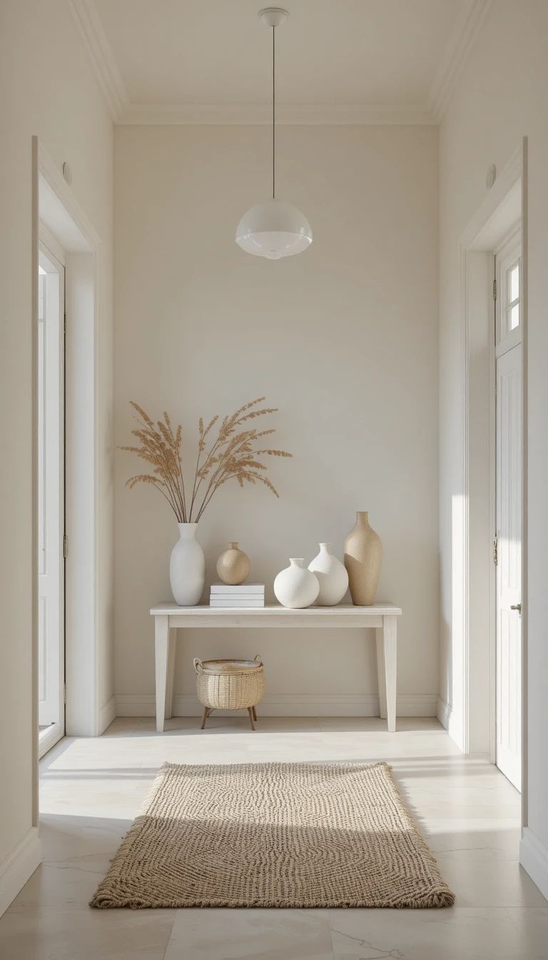
Add Cloud Dancer Through Furniture and Soft Décor
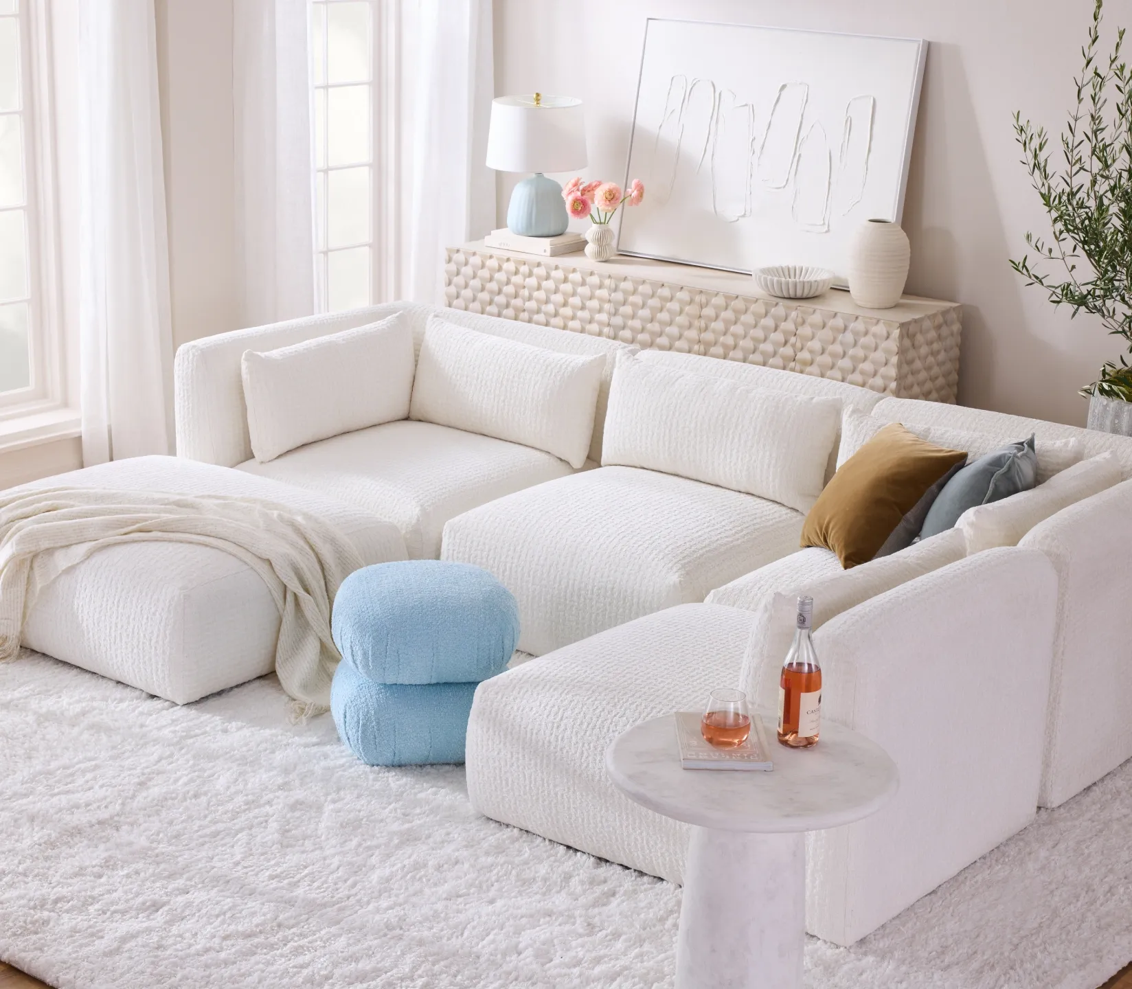
image credit: joybird x pantone
If painting or tiling feels like too big a step try introducing the colour through fabrics, bedding, curtains, cabinetry or upholstered furniture. Its subtle warmth blends easily with any palette.
Contrast With Earthy, Bold or Moody Colours
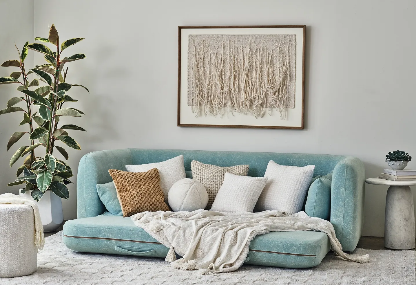
image credit: joybird x pantone
To bring more personality into a room anchor Cloud Dancer with grounding tones like espresso, olive green, mauve or muted teal. These tones pair well with rich textured tiles and modern finishes.
Why Cloud Dancer Works So Well With Tiles
Tiletoria’s range of tiles makes it simple to enhance or contrast Cloud Dancer in any room.
Here’s why the pairing works:
Tiles add texture and depth to Cloud Dancer’s light and airy feel
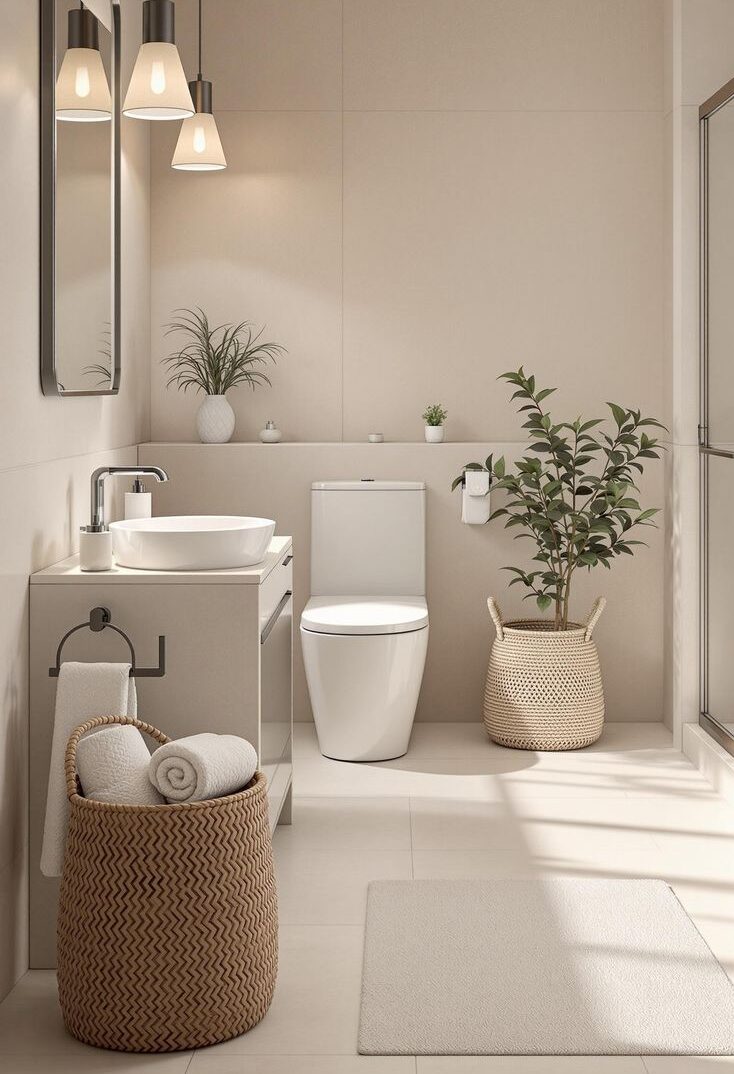
image credit: edwardgeorgelondon.com
Large-format tiles enhance Cloud Dancer’s spacious effect even further
Textured tiles create that sought-after soft shadowing that complements the colour palette
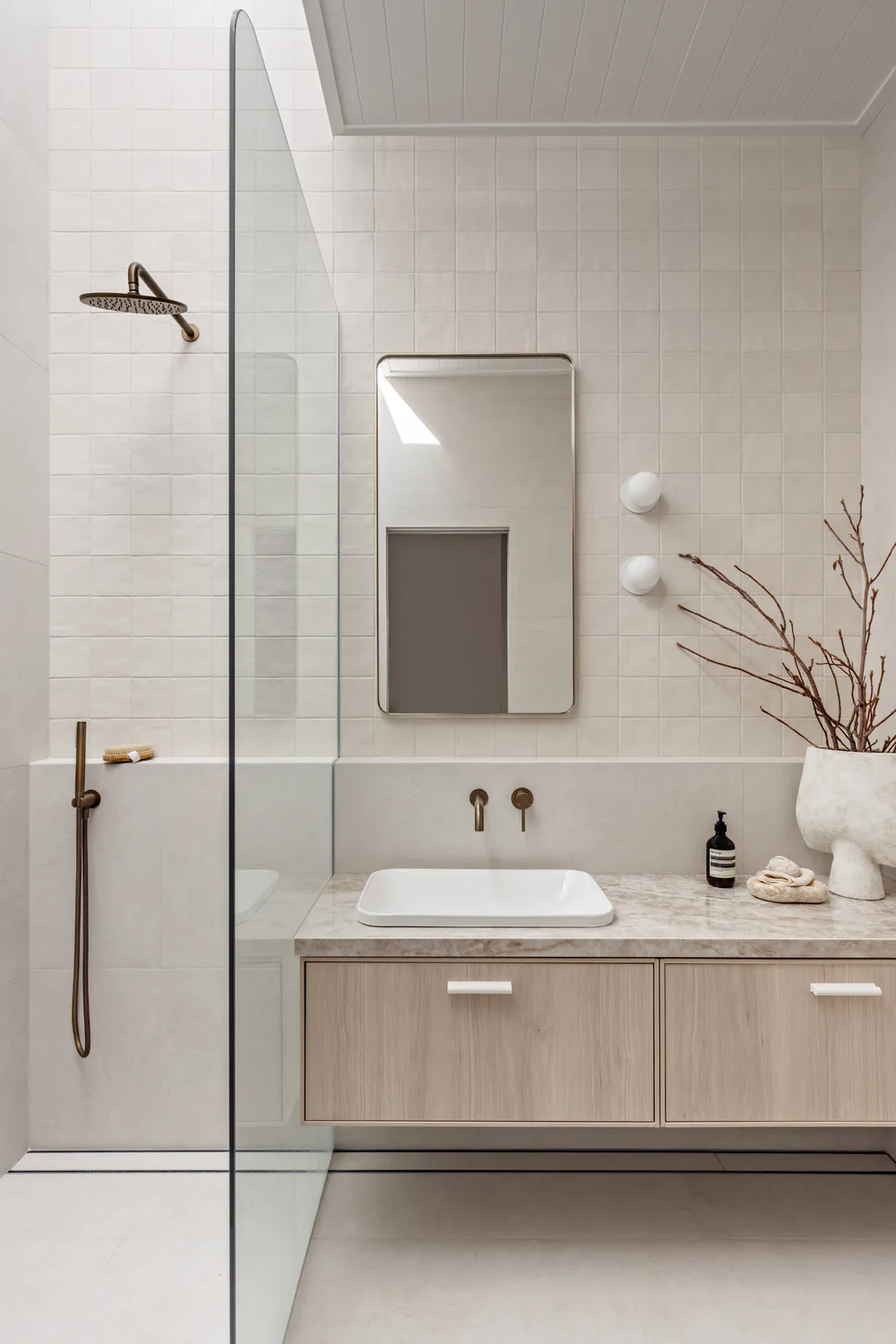
image credit: tilecloud.com.au
Natural stone looks pair beautifully with Cloud Dancer’s clean aesthetic
Whether you love subtle patterns or bold features, Cloud Dancer gives tiles the perfect calm backdrop to shine.
Pantone Colour of The Year 2026: A Colour for Every Style
image credit: pantone.com
Pantone Colour of the Year 2026 Cloud Dancer offers a rare blend of peace, versatility and sophistication. Whether you are refreshing a single room or planning a full renovation this gentle white will bring clarity and warmth into your space. Visit your nearest Tiletoria showroom to explore tiles, flooring and finishes that pair perfectly with Cloud Dancer and bring your vision to life.